23 Time series and outbreak detection
23.1 Overview
This tab demonstrates the use of several packages for time series analysis. It primarily relies on packages from the tidyverts family, but will also use the RECON trending package to fit models that are more appropriate for infectious disease epidemiology.
Note in the below example we use a dataset from the surveillance package on Campylobacter in Germany (see the data chapter, of the handbook for details). However, if you wanted to run the same code on a dataset with multiple countries or other strata, then there is an example code template for this in the r4epis github repo.
Topics covered include:
- Time series data
- Descriptive analysis
- Fitting regressions
- Relation of two time series
- Outbreak detection
- Interrupted time series
23.2 Preparation
Packages
This code chunk shows the loading of packages required for the analyses. In this handbook we emphasize p_load() from pacman, which installs the package if necessary and loads it for use. You can also load packages with library() from base R. See the page on R basics for more information on R packages.
pacman::p_load(rio,          # File import
               here,         # File locator
               tidyverse,    # data management + ggplot2 graphics
               tsibble,      # handle time series datasets
               slider,       # for calculating moving averages
               imputeTS,     # for filling in missing values
               feasts,       # for time series decomposition and autocorrelation
               forecast,     # fit sin and cosin terms to data (note: must load after feasts)
               trending,     # fit and assess models
               tmaptools,    # for getting geocoordinates (lon/lat) based on place names
               ecmwfr,       # for interacting with copernicus sateliate CDS API
               stars,        # for reading in .nc (climate data) files
               units,        # for defining units of measurement (climate data)
               yardstick,    # for looking at model accuracy
               surveillance  # for aberration detection
               )
Load data
You can download all the data used in this handbook via the instructions in the [Download handbook and data] page.
The example dataset used in this section is weekly counts of campylobacter cases reported in Germany between 2001 and 2011. You can click here to download this data file (.xlsx).
This dataset is a reduced version of the dataset available in the surveillance package.
(for details load the surveillance package and see ?campyDE)
Import these data with the import() function from the rio package (it handles many file types like .xlsx, .csv, .rds - see the [Import and export] page for details).
# import the counts into R
counts <- rio::import("campylobacter_germany.xlsx")
The first 10 rows of the counts are displayed below.
Clean data
The code below makes sure that the date column is in the appropriate format.
For this tab we will be using the tsibble package and so the yearweek
function will be used to create a calendar week variable. There are several other
ways of doing this (see the Working with dates
page for details), however for time series its best to keep within one framework (tsibble).
## ensure the date column is in the appropriate format
counts$date <- as.Date(counts$date)

## create a calendar week variable
## fitting ISO definitons of weeks starting on a monday
counts <- counts %>%
     mutate(epiweek = yearweek(date, week_start = 1))
Download climate data
In the relation of two time series section of this page, we will be comparing campylobacter case counts to climate data.
Climate data for anywhere in the world can be downloaded from the EU’s Copernicus Satellite. These are not exact measurements, but based on a model (similar to interpolation), however the benefit is global hourly coverage as well as forecasts.
You can download each of these climate data files from the [Download handbook and data] page.
For purposes of demonstration here, we will show R code to use the ecmwfr package to pull these data from the Copernicus climate data store. You will need to create a free account in order for this to work. The package website has a useful walkthrough of how to do this. Below is example code of how to go about doing this, once you have the appropriate API keys. You have to replace the X’s below with your account IDs. You will need to download one year of data at a time otherwise the server times-out.
If you are not sure of the coordinates for a location you want to download data for, you can use the tmaptools package to pull the coordinates off open street maps. An alternative option is the photon package, however this has not been released on to CRAN yet; the nice thing about photon is that it provides more contextual data for when there are several matches for your search.
## retrieve location coordinates
coords <- geocode_OSM("Germany", geometry = "point")

## pull together long/lats in format for ERA-5 querying (bounding box)
## (as just want a single point can repeat coords)
request_coords <- str_glue_data(coords$coords, "{y}/{x}/{y}/{x}")


## Pulling data modelled from copernicus satellite (ERA-5 reanalysis)
## https://cds.climate.copernicus.eu/cdsapp#!/software/app-era5-explorer?tab=app
## https://github.com/bluegreen-labs/ecmwfr

## set up key for weather data
wf_set_key(user = "XXXXX",
           key = "XXXXXXXXX-XXXX-XXXX-XXXX-XXXXXXXXXXX",
           service = "cds")

## run for each year of interest (otherwise server times out)
for (i in 2002:2011) {

  ## pull together a query
  ## see here for how to do: https://bluegreen-labs.github.io/ecmwfr/articles/cds_vignette.html#the-request-syntax
  ## change request to a list using addin button above (python to list)
  ## Target is the name of the output file!!
  request <- request <- list(
    product_type = "reanalysis",
    format = "netcdf",
    variable = c("2m_temperature", "total_precipitation"),
    year = c(i),
    month = c("01", "02", "03", "04", "05", "06", "07", "08", "09", "10", "11", "12"),
    day = c("01", "02", "03", "04", "05", "06", "07", "08", "09", "10", "11", "12",
            "13", "14", "15", "16", "17", "18", "19", "20", "21", "22", "23", "24",
            "25", "26", "27", "28", "29", "30", "31"),
    time = c("00:00", "01:00", "02:00", "03:00", "04:00", "05:00", "06:00", "07:00",
             "08:00", "09:00", "10:00", "11:00", "12:00", "13:00", "14:00", "15:00",
             "16:00", "17:00", "18:00", "19:00", "20:00", "21:00", "22:00", "23:00"),
    area = request_coords,
    dataset_short_name = "reanalysis-era5-single-levels",
    target = paste0("germany_weather", i, ".nc")
  )

  ## download the file and store it in the current working directory
  file <- wf_request(user     = "XXXXX",  # user ID (for authentication)
                     request  = request,  # the request
                     transfer = TRUE,     # download the file
                     path     = here::here("data", "Weather")) ## path to save the data
  }
Load climate data
Whether you downloaded the climate data via our handbook, or used the code above, you now should have 10 years of “.nc” climate data files stored in the same folder on your computer.
Use the code below to import these files into R with the stars package.
## define path to weather folder
file_paths <- list.files(
  here::here("data", "time_series", "weather"), # replace with your own file path
  full.names = TRUE)

## only keep those with the current name of interest
file_paths <- file_paths[str_detect(file_paths, "germany")]

## read in all the files as a stars object
data <- stars::read_stars(file_paths)
## t2m, tp,
## t2m, tp,
## t2m, tp,
## t2m, tp,
## t2m, tp,
## t2m, tp,
## t2m, tp,
## t2m, tp,
## t2m, tp,
## t2m, tp,Once these files have been imported as the object data, we will convert them to a data frame.
## change to a data frame
temp_data <- as_tibble(data) %>%
  ## add in variables and correct units
  mutate(
    ## create an calendar week variable
    epiweek = tsibble::yearweek(time),
    ## create a date variable (start of calendar week)
    date = as.Date(epiweek),
    ## change temperature from kelvin to celsius
    t2m = set_units(t2m, celsius),
    ## change precipitation from metres to millimetres
    tp  = set_units(tp, mm)) %>%
  ## group by week (keep the date too though)
  group_by(epiweek, date) %>%
  ## get the average per week
  summarise(t2m = as.numeric(mean(t2m)),
            tp = as.numeric(mean(tp)))
## `summarise()` has grouped output by 'epiweek'. You can override using the `.groups` argument.23.3 Time series data
There are a number of different packages for structuring and handling time series data. As said, we will focus on the tidyverts family of packages and so will use the tsibble package to define our time series object. Having a data set defined as a time series object means it is much easier to structure our analysis.
To do this we use the tsibble() function and specify the “index”, i.e. the variable
specifying the time unit of interest. In our case this is the epiweek variable.
If we had a data set with weekly counts by province, for example, we would also
be able to specify the grouping variable using the key = argument.
This would allow us to do analysis for each group.
## define time series object
counts <- tsibble(counts, index = epiweek)
Looking at class(counts) tells you that on top of being a tidy data frame
(“tbl_df”, “tbl”, “data.frame”), it has the additional properties of a time series
data frame (“tbl_ts”).
You can take a quick look at your data by using ggplot2. We see from the plot that there is a clear seasonal pattern, and that there are no missings. However, there seems to be an issue with reporting at the beginning of each year; cases drop in the last week of the year and then increase for the first week of the next year.
## plot a line graph of cases by week
ggplot(counts, aes(x = epiweek, y = case)) +
     geom_line()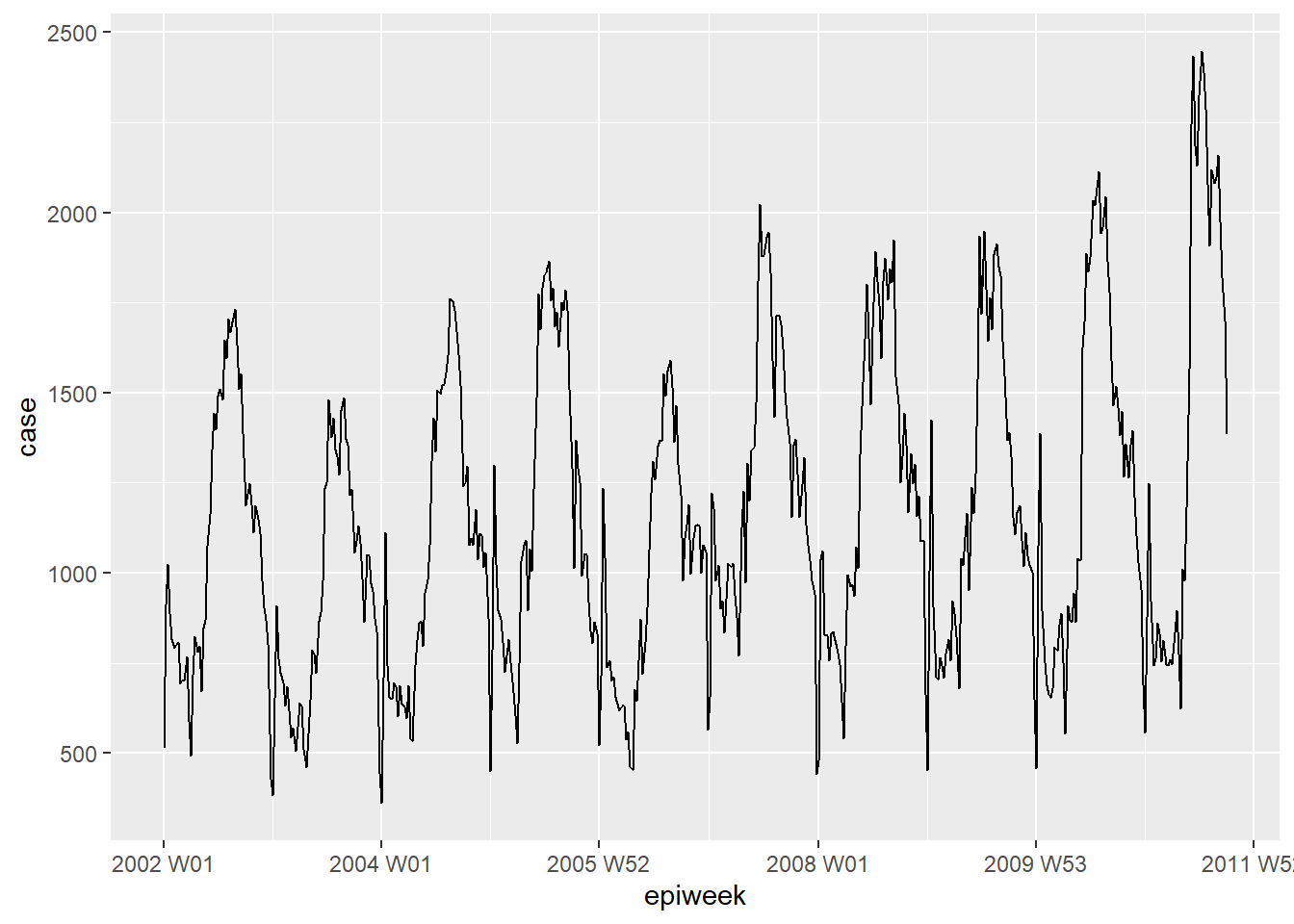
DANGER: Most datasets aren’t as clean as this example. You will need to check for duplicates and missings as below.
Duplicates
tsibble does not allow duplicate observations. So each row will need to be
unique, or unique within the group (key variable).
The package has a few functions that help to identify duplicates. These include
are_duplicated() which gives you a TRUE/FALSE vector of whether the row is a
duplicate, and duplicates() which gives you a data frame of the duplicated rows.
See the page on De-duplication for more details on how to select rows you want.
## get a vector of TRUE/FALSE whether rows are duplicates
are_duplicated(counts, index = epiweek)

## get a data frame of any duplicated rows
duplicates(counts, index = epiweek)
Missings
We saw from our brief inspection above that there are no missings, but we also
saw there seems to be a problem with reporting delay around new year.
One way to address this problem could be to set these values to missing and then
to impute values. The simplest form of time series imputation is to draw
a straight line between the last non-missing and the next non-missing value.
To do this we will use the imputeTS package function na_interpolation().
See the Missing data page for other options for imputation.
Another alternative would be to calculate a moving average, to try and smooth over these apparent reporting issues (see next section, and the page on Moving averages).
## create a variable with missings instead of weeks with reporting issues
counts <- counts %>%
     mutate(case_miss = if_else(
          ## if epiweek contains 52, 53, 1 or 2
          str_detect(epiweek, "W51|W52|W53|W01|W02"),
          ## then set to missing
          NA_real_,
          ## otherwise keep the value in case
          case
     ))

## alternatively interpolate missings by linear trend
## between two nearest adjacent points
counts <- counts %>%
  mutate(case_int = imputeTS::na_interpolation(case_miss)
         )

## to check what values have been imputed compared to the original
ggplot_na_imputations(counts$case_miss, counts$case_int) +
  ## make a traditional plot (with black axes and white background)
  theme_classic()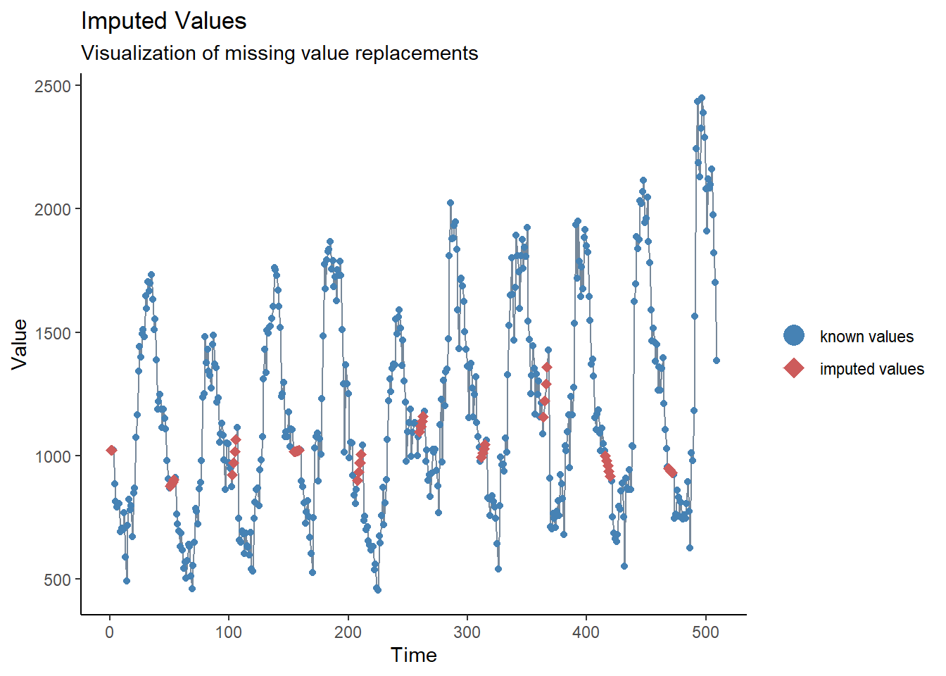
23.4 Descriptive analysis
Moving averages
If data is very noisy (counts jumping up and down) then it can be helpful to calculate a moving average. In the example below, for each week we calculate the average number of cases from the four previous weeks. This smooths the data, to make it more interpretable. In our case this does not really add much, so we will stick to the interpolated data for further analysis. See the Moving averages page for more detail.
## create a moving average variable (deals with missings)
counts <- counts %>%
     ## create the ma_4w variable
     ## slide over each row of the case variable
     mutate(ma_4wk = slider::slide_dbl(case,
                               ## for each row calculate the name
                               ~ mean(.x, na.rm = TRUE),
                               ## use the four previous weeks
                               .before = 4))

## make a quick visualisation of the difference
ggplot(counts, aes(x = epiweek)) +
     geom_line(aes(y = case)) +
     geom_line(aes(y = ma_4wk), colour = "red")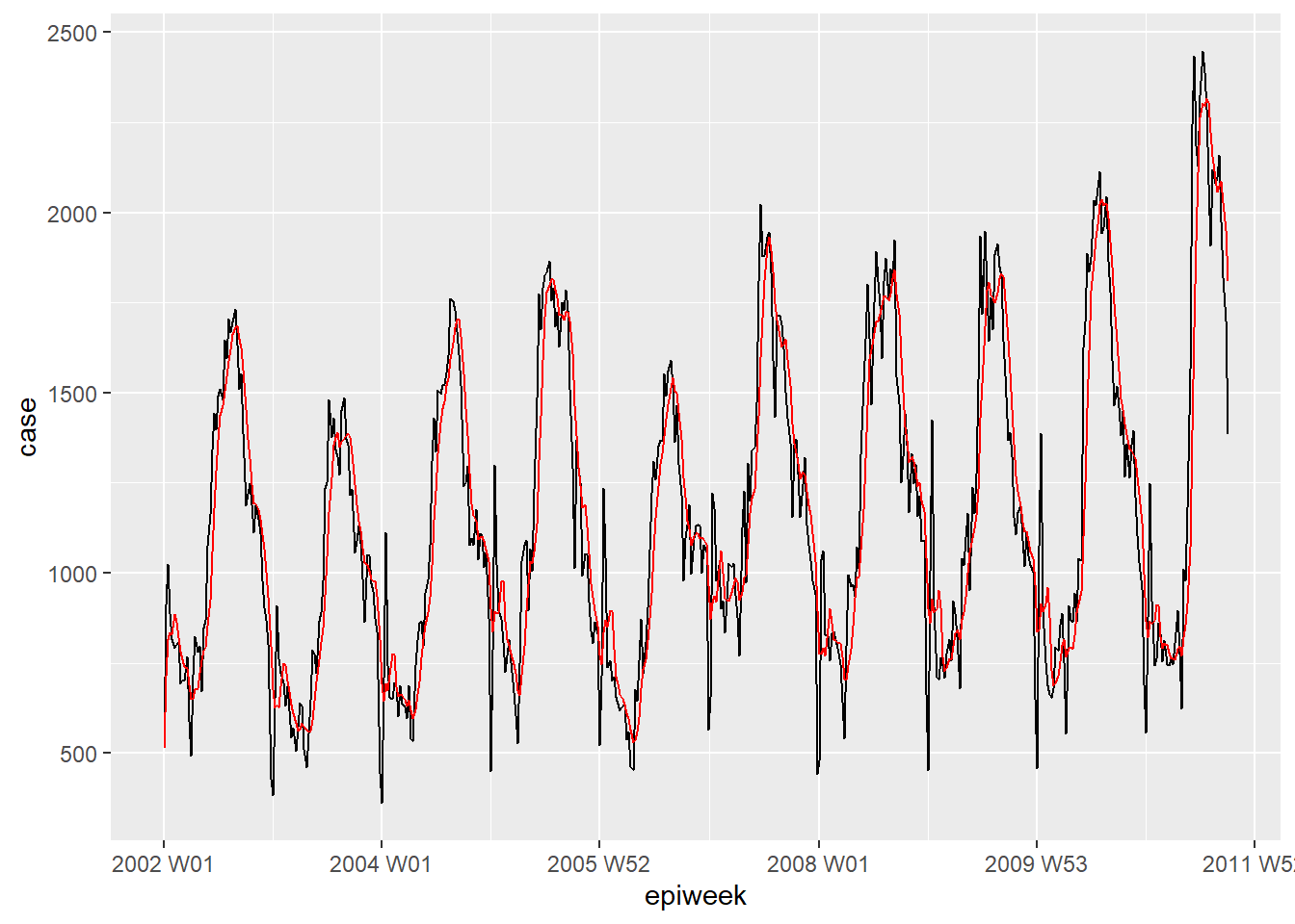
Periodicity
Below we define a custom function to create a periodogram. See the Writing functions page for information about how to write functions in R.
First, the function is defined. Its arguments include a dataset with a column counts, start_week = which is the first week of the dataset, a number to indicate how many periods per year (e.g. 52, 12), and lastly the output style (see details in the code below).
## Function arguments
#####################
## x is a dataset
## counts is variable with count data or rates within x
## start_week is the first week in your dataset
## period is how many units in a year
## output is whether you want return spectral periodogram or the peak weeks
  ## "periodogram" or "weeks"

# Define function
periodogram <- function(x,
                        counts,
                        start_week = c(2002, 1),
                        period = 52,
                        output = "weeks") {


    ## make sure is not a tsibble, filter to project and only keep columns of interest
    prepare_data <- dplyr::as_tibble(x)

    # prepare_data <- prepare_data[prepare_data[[strata]] == j, ]
    prepare_data <- dplyr::select(prepare_data, {{counts}})

    ## create an intermediate "zoo" time series to be able to use with spec.pgram
    zoo_cases <- zoo::zooreg(prepare_data,
                             start = start_week, frequency = period)

    ## get a spectral periodogram not using fast fourier transform
    periodo <- spec.pgram(zoo_cases, fast = FALSE, plot = FALSE)

    ## return the peak weeks
    periodo_weeks <- 1 / periodo$freq[order(-periodo$spec)] * period

    if (output == "weeks") {
      periodo_weeks
    } else {
      periodo
    }

}

## get spectral periodogram for extracting weeks with the highest frequencies
## (checking of seasonality)
periodo <- periodogram(counts,
                       case_int,
                       start_week = c(2002, 1),
                       output = "periodogram")

## pull spectrum and frequence in to a dataframe for plotting
periodo <- data.frame(periodo$freq, periodo$spec)

## plot a periodogram showing the most frequently occuring periodicity
ggplot(data = periodo,
                aes(x = 1/(periodo.freq/52),  y = log(periodo.spec))) +
  geom_line() +
  labs(x = "Period (Weeks)", y = "Log(density)")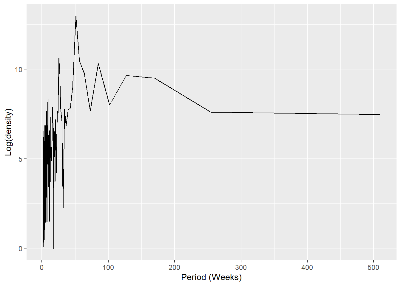
## get a vector weeks in ascending order
peak_weeks <- periodogram(counts,
                          case_int,
                          start_week = c(2002, 1),
                          output = "weeks")
NOTE: It is possible to use the above weeks to add them to sin and cosine terms, however we will use a function to generate these terms (see regression section below)
Decomposition
Classical decomposition is used to break a time series down several parts, which when taken together make up for the pattern you see. These different parts are:
- The trend-cycle (the long-term direction of the data)
- The seasonality (repeating patterns)
- The random (what is left after removing trend and season)
## decompose the counts dataset
counts %>%
  # using an additive classical decomposition model
  model(classical_decomposition(case_int, type = "additive")) %>%
  ## extract the important information from the model
  components() %>%
  ## generate a plot
  autoplot()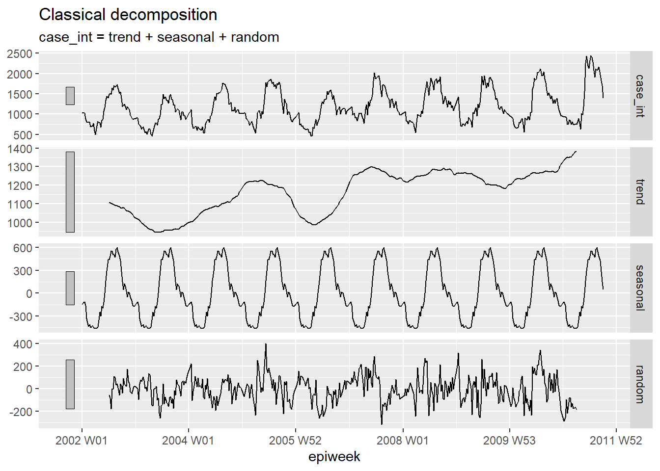
Autocorrelation
Autocorrelation tells you about the relation between the counts of each week and the weeks before it (called lags).
Using the ACF() function, we can produce a plot which shows us a number of lines
for the relation at different lags. Where the lag is 0 (x = 0), this line would
always be 1 as it shows the relation between an observation and itself (not shown here).
The first line shown here (x = 1) shows the relation between each observation
and the observation before it (lag of 1), the second shows the relation between
each observation and the observation before last (lag of 2) and so on until lag of
52 which shows the relation between each observation and the observation from 1
year (52 weeks before).
Using the PACF() function (for partial autocorrelation) shows the same type of relation
but adjusted for all other weeks between. This is less informative for determining
periodicity.
## using the counts dataset
counts %>%
  ## calculate autocorrelation using a full years worth of lags
  ACF(case_int, lag_max = 52) %>%
  ## show a plot
  autoplot()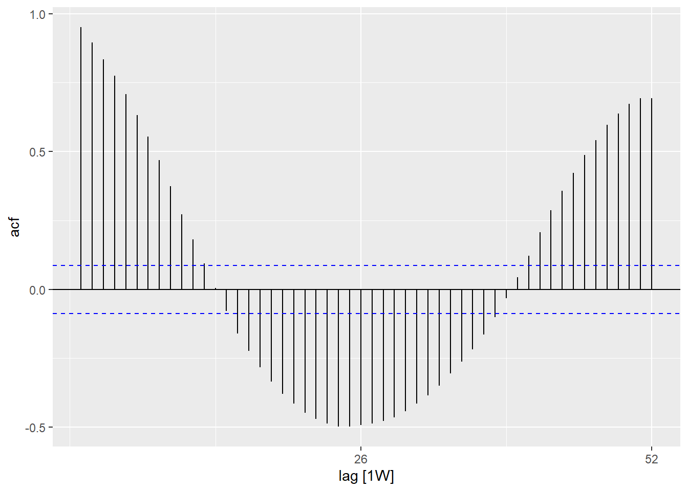
## using the counts data set
counts %>%
  ## calculate the partial autocorrelation using a full years worth of lags
  PACF(case_int, lag_max = 52) %>%
  ## show a plot
  autoplot()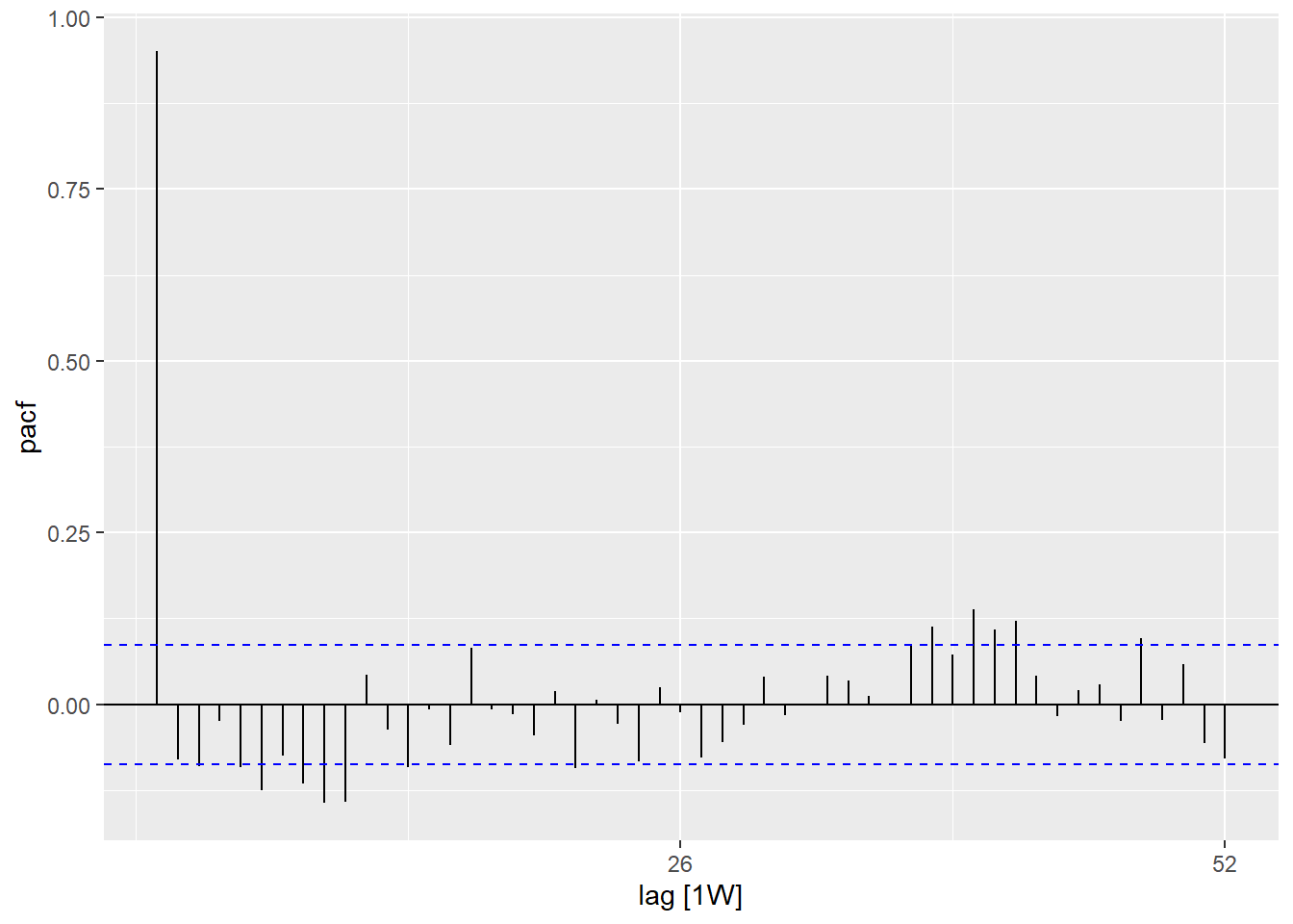
You can formally test the null hypothesis of independence in a time series (i.e. that it is not autocorrelated) using the Ljung-Box test (in the stats package). A significant p-value suggests that there is autocorrelation in the data.
## test for independance
Box.test(counts$case_int, type = "Ljung-Box")
##
## Box-Ljung test
##
## data: counts$case_int
## X-squared = 462.65, df = 1, p-value < 2.2e-1623.5 Fitting regressions
It is possible to fit a large number of different regressions to a time series, however, here we will demonstrate how to fit a negative binomial regression - as this is often the most appropriate for counts data in infectious diseases.
Fourier terms
Fourier terms are the equivalent of sin and cosin curves. The difference is that these are fit based on finding the most appropriate combination of curves to explain your data.
If only fitting one fourier term, this would be the equivalent of fitting a sin
and a cosin for your most frequently occurring lag seen in your periodogram (in our
case 52 weeks). We use the fourier() function from the forecast package.
In the below code we assign using the $, as fourier() returns two columns (one
for sin one for cosin) and so these are added to the dataset as a list, called
“fourier” - but this list can then be used as a normal variable in regression.
## add in fourier terms using the epiweek and case_int variabless
counts$fourier <- select(counts, epiweek, case_int) %>%
  fourier(K = 1)
Negative binomial
It is possible to fit regressions using base stats or MASS
functions (e.g. lm(), glm() and glm.nb()). However we will be using those from
the trending package, as this allows for calculating appropriate confidence
and prediction intervals (which are otherwise not available).
The syntax is the same, and you specify an outcome variable then a tilde (~)
and then add your various exposure variables of interest separated by a plus (+).
The other difference is that we first define the model and then fit() it to the
data. This is useful because it allows for comparing multiple different models
with the same syntax.
TIP: If you wanted to use rates, rather than
counts you could include the population variable as a logarithmic offset term, by adding
offset(log(population). You would then need to set population to be 1, before
using predict() in order to produce a rate.
TIP: For fitting more complex models such as ARIMA or prophet, see the fable package.
## define the model you want to fit (negative binomial)
model <- glm_nb_model(
  ## set number of cases as outcome of interest
  case_int ~
    ## use epiweek to account for the trend
    epiweek +
    ## use the fourier terms to account for seasonality
    fourier)

## fit your model using the counts dataset
fitted_model <- trending::fit(model, counts)

## calculate confidence intervals and prediction intervals
observed <- predict(fitted_model, simulate_pi = FALSE)

## plot your regression
ggplot(data = observed, aes(x = epiweek)) +
  ## add in a line for the model estimate
  geom_line(aes(y = estimate),
            col = "Red") +
  ## add in a band for the prediction intervals
  geom_ribbon(aes(ymin = lower_pi,
                  ymax = upper_pi),
              alpha = 0.25) +
  ## add in a line for your observed case counts
  geom_line(aes(y = case_int),
            col = "black") +
  ## make a traditional plot (with black axes and white background)
  theme_classic()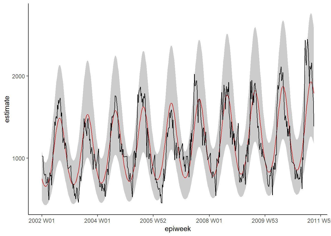
Residuals
To see how well our model fits the observed data we need to look at the residuals.
The residuals are the difference between the observed counts and the counts
estimated from the model. We could calculate this simply by using case_int - estimate,
but the residuals() function extracts this directly from the regression for us.
What we see from the below, is that we are not explaining all of the variation that we could with the model. It might be that we should fit more fourier terms, and address the amplitude. However for this example we will leave it as is. The plots show that our model does worse in the peaks and troughs (when counts are at their highest and lowest) and that it might be more likely to underestimate the observed counts.
## calculate the residuals
observed <- observed %>%
  mutate(resid = residuals(fitted_model$fitted_model, type = "response"))

## are the residuals fairly constant over time (if not: outbreaks? change in practice?)
observed %>%
  ggplot(aes(x = epiweek, y = resid)) +
  geom_line() +
  geom_point() +
  labs(x = "epiweek", y = "Residuals")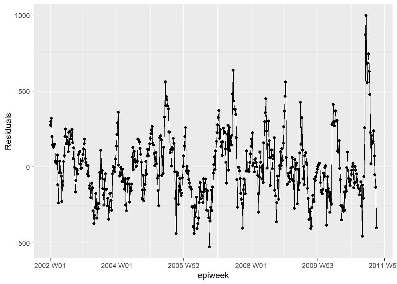
## is there autocorelation in the residuals (is there a pattern to the error?)
observed %>%
  as_tsibble(index = epiweek) %>%
  ACF(resid, lag_max = 52) %>%
  autoplot()
## are residuals normally distributed (are under or over estimating?)
observed %>%
  ggplot(aes(x = resid)) +
  geom_histogram(binwidth = 100) +
  geom_rug() +
labs(y = "count") 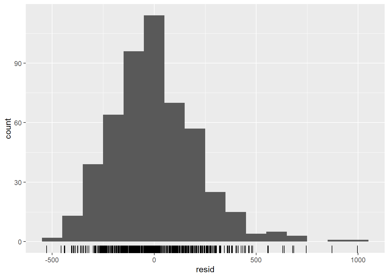
## compare observed counts to their residuals
  ## should also be no pattern
observed %>%
  ggplot(aes(x = estimate, y = resid)) +
  geom_point() +
  labs(x = "Fitted", y = "Residuals")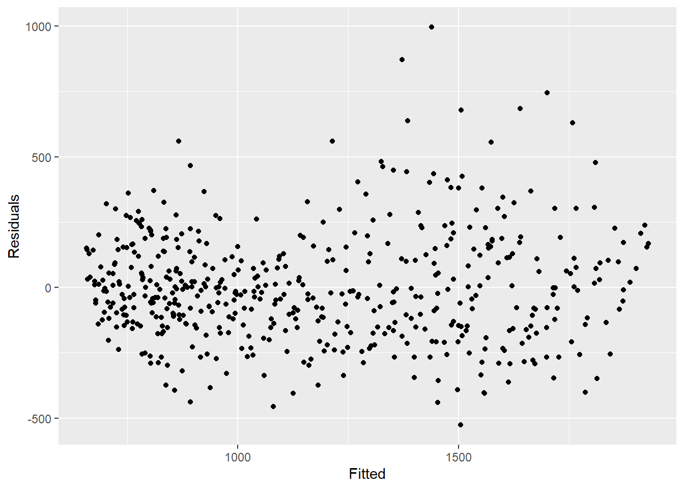
## formally test autocorrelation of the residuals
## H0 is that residuals are from a white-noise series (i.e. random)
## test for independence
## if p value significant then non-random
Box.test(observed$resid, type = "Ljung-Box")
##
## Box-Ljung test
##
## data: observed$resid
## X-squared = 346.64, df = 1, p-value < 2.2e-1623.6 Relation of two time series
Here we look at using weather data (specifically the temperature) to explain campylobacter case counts.
Merging datasets
We can join our datasets using the week variable. For more on merging see the handbook section on joining.
## left join so that we only have the rows already existing in counts
## drop the date variable from temp_data (otherwise is duplicated)
counts <- left_join(counts,
                    select(temp_data, -date),
                    by = "epiweek")
Descriptive analysis
First plot your data to see if there is any obvious relation. The plot below shows that there is a clear relation in the seasonality of the two variables, and that temperature might peak a few weeks before the case number. For more on pivoting data, see the handbook section on pivoting data.
counts %>%
  ## keep the variables we are interested
  select(epiweek, case_int, t2m) %>%
  ## change your data in to long format
  pivot_longer(
    ## use epiweek as your key
    !epiweek,
    ## move column names to the new "measure" column
    names_to = "measure",
    ## move cell values to the new "values" column
    values_to = "value") %>%
  ## create a plot with the dataset above
  ## plot epiweek on the x axis and values (counts/celsius) on the y
  ggplot(aes(x = epiweek, y = value)) +
    ## create a separate plot for temperate and case counts
    ## let them set their own y-axes
    facet_grid(measure ~ ., scales = "free_y") +
    ## plot both as a line
    geom_line()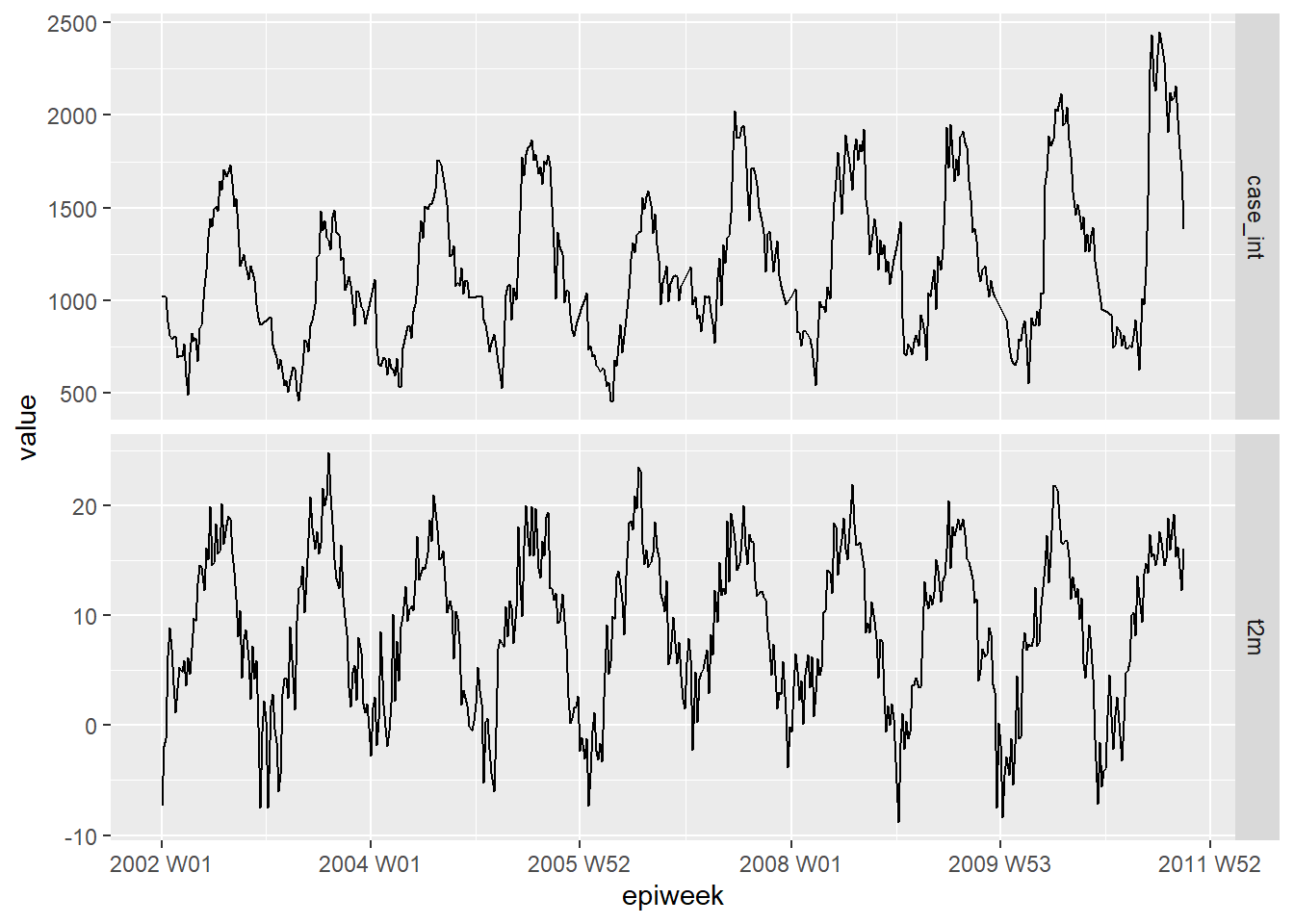
Lags and cross-correlation
To formally test which weeks are most highly related between cases and temperature.
We can use the cross-correlation function (CCF()) from the feasts package.
You could also visualise (rather than using arrange) using the autoplot() function.
counts %>%
  ## calculate cross-correlation between interpolated counts and temperature
  CCF(case_int, t2m,
      ## set the maximum lag to be 52 weeks
      lag_max = 52,
      ## return the correlation coefficient
      type = "correlation") %>%
  ## arange in decending order of the correlation coefficient
  ## show the most associated lags
  arrange(-ccf) %>%
  ## only show the top ten
  slice_head(n = 10)
## # A tsibble: 10 x 2 [1W]
## lag ccf
## <lag> <dbl>
## 1 4W 0.749
## 2 5W 0.745
## 3 3W 0.735
## 4 6W 0.729
## 5 2W 0.727
## 6 7W 0.704
## 7 1W 0.695
## 8 8W 0.671
## 9 0W 0.649
## 10 -47W 0.638We see from this that a lag of 4 weeks is most highly correlated, so we make a lagged temperature variable to include in our regression.
DANGER: Note that the first four weeks of our data
in the lagged temperature variable are missing (NA) - as there are not four
weeks prior to get data from. In order to use this dataset with the trending
predict() function, we need to use the the simulate_pi = FALSE argument within
predict() further down. If we did want to use the simulate option, then
we have to drop these missings and store as a new data set by adding drop_na(t2m_lag4)
to the code chunk below.
counts <- counts %>%
  ## create a new variable for temperature lagged by four weeks
  mutate(t2m_lag4 = lag(t2m, n = 4))
Negative binomial with two variables
We fit a negative binomial regression as done previously. This time we add the temperature variable lagged by four weeks.
CAUTION: Note the use of simulate_pi = FALSE
within the predict() argument. This is because the default behaviour of trending
is to use the ciTools package to estimate a prediction interval. This does not
work if there are NA counts, and also produces more granular intervals.
See ?trending::predict.trending_model_fit for details.
## define the model you want to fit (negative binomial)
model <- glm_nb_model(
  ## set number of cases as outcome of interest
  case_int ~
    ## use epiweek to account for the trend
    epiweek +
    ## use the fourier terms to account for seasonality
    fourier +
    ## use the temperature lagged by four weeks
    t2m_lag4
    )

## fit your model using the counts dataset
fitted_model <- trending::fit(model, counts)

## calculate confidence intervals and prediction intervals
observed <- predict(fitted_model, simulate_pi = FALSE)
To investigate the individual terms, we can pull the original negative binomial
regression out of the trending format using get_model() and pass this to the
broom package tidy() function to retrieve exponentiated estimates and associated
confidence intervals.
What this shows us is that lagged temperature, after controlling for trend and seasonality, is similar to the case counts (estimate ~ 1) and significantly associated. This suggests that it might be a good variable for use in predicting future case numbers (as climate forecasts are readily available).
fitted_model %>%
  ## extract original negative binomial regression
  get_model() %>%
  ## get a tidy dataframe of results
  tidy(exponentiate = TRUE,
       conf.int = TRUE)
## # A tibble: 5 x 7
## term estimate std.error statistic p.value conf.low conf.high
## <chr> <dbl> <dbl> <dbl> <dbl> <dbl> <dbl>
## 1 (Intercept) 339. 0.108 53.8 0 274. 419.
## 2 epiweek 1.00 0.00000774 10.9 8.13e-28 1.00 1.00
## 3 fourierS1-52 0.752 0.0214 -13.3 1.84e-40 0.721 0.784
## 4 fourierC1-52 0.823 0.0200 -9.78 1.35e-22 0.791 0.855
## 5 t2m_lag4 1.01 0.00269 2.48 1.30e- 2 1.00 1.01A quick visual inspection of the model shows that it might do a better job of estimating the observed case counts.
## plot your regression
ggplot(data = observed, aes(x = epiweek)) +
  ## add in a line for the model estimate
  geom_line(aes(y = estimate),
            col = "Red") +
  ## add in a band for the prediction intervals
  geom_ribbon(aes(ymin = lower_pi,
                  ymax = upper_pi),
              alpha = 0.25) +
  ## add in a line for your observed case counts
  geom_line(aes(y = case_int),
            col = "black") +
  ## make a traditional plot (with black axes and white background)
  theme_classic()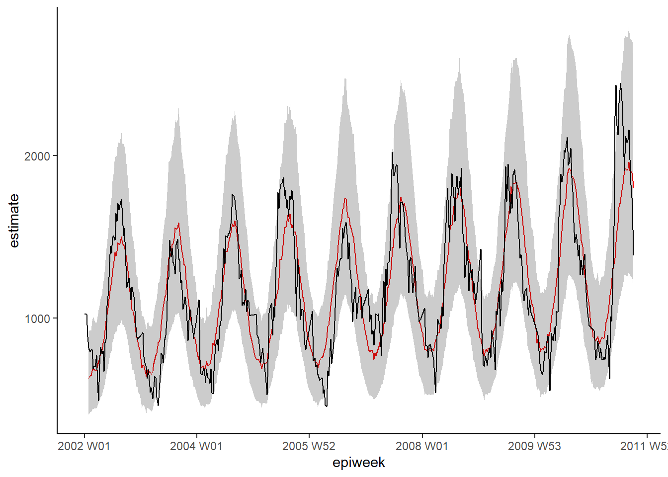
Residuals
We investigate the residuals again to see how well our model fits the observed data. The results and interpretation here are similar to those of the previous regression, so it may be more feasible to stick with the simpler model without temperature.
## calculate the residuals
observed <- observed %>%
  mutate(resid = case_int - estimate)

## are the residuals fairly constant over time (if not: outbreaks? change in practice?)
observed %>%
  ggplot(aes(x = epiweek, y = resid)) +
  geom_line() +
  geom_point() +
  labs(x = "epiweek", y = "Residuals")
## Warning: Removed 4 row(s) containing missing values (geom_path).## Warning: Removed 4 rows containing missing values (geom_point).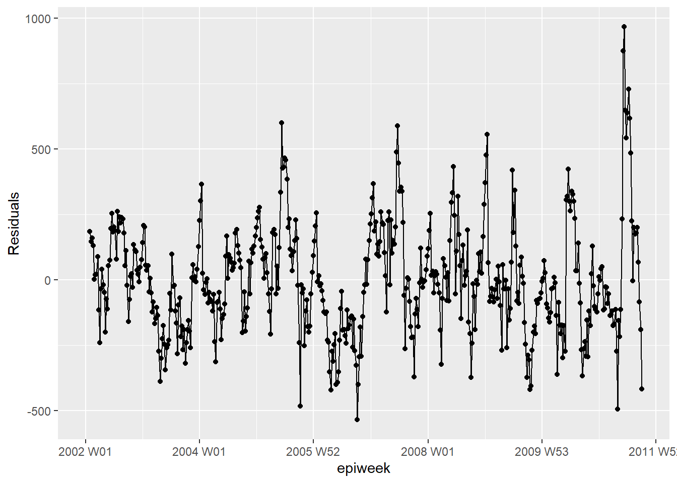
## is there autocorelation in the residuals (is there a pattern to the error?)
observed %>%
  as_tsibble(index = epiweek) %>%
  ACF(resid, lag_max = 52) %>%
  autoplot()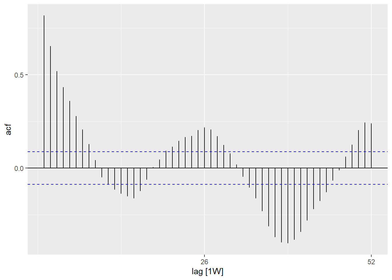
## are residuals normally distributed (are under or over estimating?)
observed %>%
  ggplot(aes(x = resid)) +
  geom_histogram(binwidth = 100) +
  geom_rug() +
  labs(y = "count")
## Warning: Removed 4 rows containing non-finite values (stat_bin).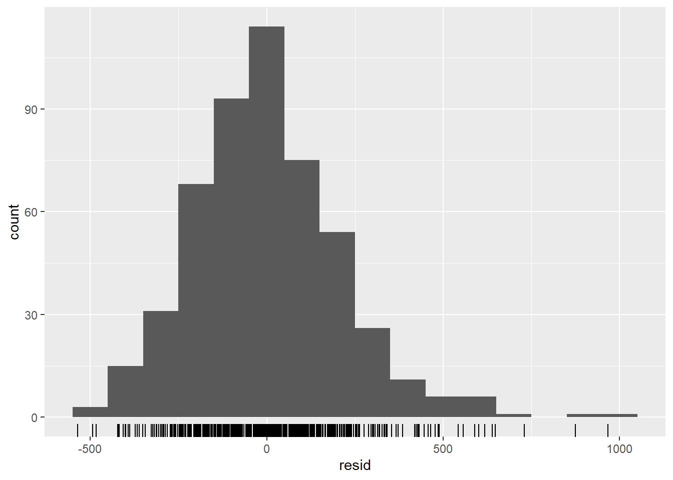
## compare observed counts to their residuals
  ## should also be no pattern
observed %>%
  ggplot(aes(x = estimate, y = resid)) +
  geom_point() +
  labs(x = "Fitted", y = "Residuals")
## Warning: Removed 4 rows containing missing values (geom_point).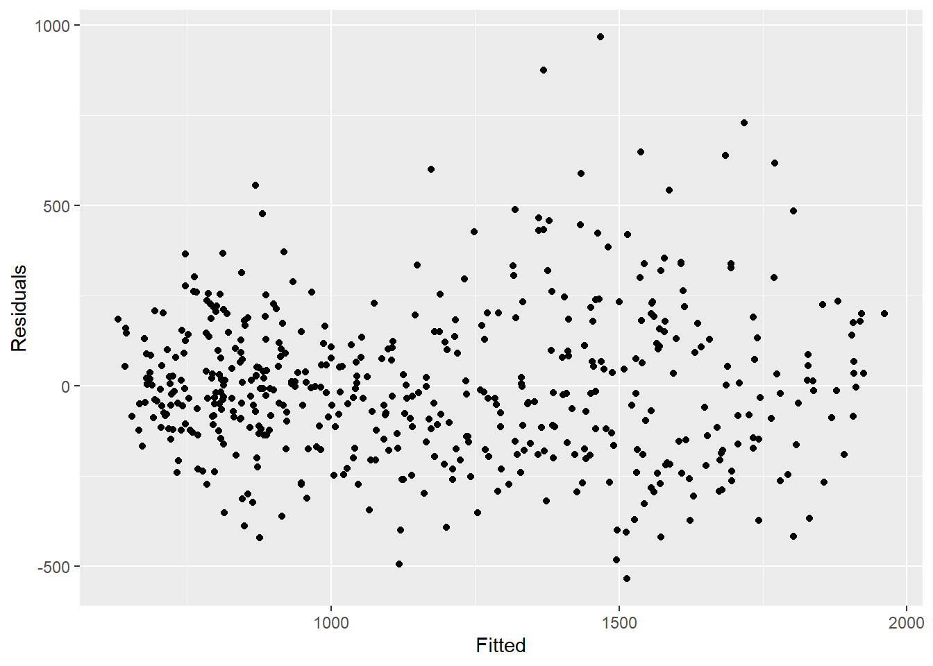
## formally test autocorrelation of the residuals
## H0 is that residuals are from a white-noise series (i.e. random)
## test for independence
## if p value significant then non-random
Box.test(observed$resid, type = "Ljung-Box")
##
## Box-Ljung test
##
## data: observed$resid
## X-squared = 339.52, df = 1, p-value < 2.2e-1623.7 Outbreak detection
We will demonstrate two (similar) methods of detecting outbreaks here. The first builds on the sections above. We use the trending package to fit regressions to previous years, and then predict what we expect to see in the following year. If observed counts are above what we expect, then it could suggest there is an outbreak. The second method is based on similar principles but uses the surveillance package, which has a number of different algorithms for aberration detection.
CAUTION: Normally, you are interested in the current year (where you only know counts up to the present week). So in this example we are pretending to be in week 39 of 2011.
trending package
For this method we define a baseline (which should usually be about 5 years of data). We fit a regression to the baseline data, and then use that to predict the estimates for the next year.
Cut-off date
It is easier to define your dates in one place and then use these throughout the rest of your code.
Here we define a start date (when our observations started) and a cut-off date (the end of our baseline period - and when the period we want to predict for starts). ~We also define how many weeks are in our year of interest (the one we are going to be predicting)~. We also define how many weeks are between our baseline cut-off and the end date that we are interested in predicting for.
NOTE: In this example we pretend to currently be at the end of September 2011 (“2011 W39”).
## define start date (when observations began)
start_date <- min(counts$epiweek)

## define a cut-off week (end of baseline, start of prediction period)
cut_off <- yearweek("2010-12-31")

## define the last date interested in (i.e. end of prediction)
end_date <- yearweek("2011-12-31")

## find how many weeks in period (year) of interest
num_weeks <- as.numeric(end_date - cut_off)
Add rows
To be able to forecast in a tidyverse format, we need to have the right number
of rows in our dataset, i.e. one row for each week up to the end_datedefined above.
The code below allows you to add these rows for by a grouping variable - for example
if we had multiple countries in one dataset, we could group by country and then
add rows appropriately for each.
The group_by_key() function from tsibble allows us to do this grouping
and then pass the grouped data to dplyr functions, group_modify() and
add_row(). Then we specify the sequence of weeks between one after the maximum week
currently available in the data and the end week.
Fourier terms
We need to redefine our fourier terms - as we want to fit them to the baseline
date only and then predict (extrapolate) those terms for the next year.
To do this we need to combine two output lists from the fourier() function together;
the first one is for the baseline data, and the second one predicts for the
year of interest (by defining the h argument).
N.b. to bind rows we have to use rbind() (rather than tidyverse bind_rows) as
the fourier columns are a list (so not named individually).
## define fourier terms (sincos)
counts <- counts %>%
  mutate(
    ## combine fourier terms for weeks prior to  and after 2010 cut-off date
    ## (nb. 2011 fourier terms are predicted)
    fourier = rbind(
      ## get fourier terms for previous years
      fourier(
        ## only keep the rows before 2011
        filter(counts,
               epiweek <= cut_off),
        ## include one set of sin cos terms
        K = 1
        ),
      ## predict the fourier terms for 2011 (using baseline data)
      fourier(
        ## only keep the rows before 2011
        filter(counts,
               epiweek <= cut_off),
        ## include one set of sin cos terms
        K = 1,
        ## predict 52 weeks ahead
        h = num_weeks
        )
      )
    )
Split data and fit regression
We now have to split our dataset in to the baseline period and the prediction
period. This is done using the dplyr group_split() function after group_by(),
and will create a list with two data frames, one for before your cut-off and one
for after.
We then use the purrr package pluck() function to pull the datasets out of the
list (equivalent of using square brackets, e.g. dat[[1]]), and can then fit
our model to the baseline data, and then use the predict() function for our data
of interest after the cut-off.
See the page on Iteration, loops, and lists to learn more about purrr.
CAUTION: Note the use of simulate_pi = FALSE
within the predict() argument. This is because the default behaviour of trending
is to use the ciTools package to estimate a prediction interval. This does not
work if there are NA counts, and also produces more granular intervals.
See ?trending::predict.trending_model_fit for details.
# split data for fitting and prediction
dat <- counts %>%
  group_by(epiweek <= cut_off) %>%
  group_split()

## define the model you want to fit (negative binomial)
model <- glm_nb_model(
  ## set number of cases as outcome of interest
  case_int ~
    ## use epiweek to account for the trend
    epiweek +
    ## use the furier terms to account for seasonality
    fourier
)

# define which data to use for fitting and which for predicting
fitting_data <- pluck(dat, 2)
pred_data <- pluck(dat, 1) %>%
  select(case_int, epiweek, fourier)

# fit model
fitted_model <- trending::fit(model, fitting_data)

# get confint and estimates for fitted data
observed <- fitted_model %>%
  predict(simulate_pi = FALSE)

# forecast with data want to predict with
forecasts <- fitted_model %>%
  predict(pred_data, simulate_pi = FALSE)

## combine baseline and predicted datasets
observed <- bind_rows(observed, forecasts)
As previously, we can visualise our model with ggplot. We highlight alerts with red dots for observed counts above the 95% prediction interval. This time we also add a vertical line to label when the forecast starts.
## plot your regression
ggplot(data = observed, aes(x = epiweek)) +
  ## add in a line for the model estimate
  geom_line(aes(y = estimate),
            col = "grey") +
  ## add in a band for the prediction intervals
  geom_ribbon(aes(ymin = lower_pi,
                  ymax = upper_pi),
              alpha = 0.25) +
  ## add in a line for your observed case counts
  geom_line(aes(y = case_int),
            col = "black") +
  ## plot in points for the observed counts above expected
  geom_point(
    data = filter(observed, case_int > upper_pi),
    aes(y = case_int),
    colour = "red",
    size = 2) +
  ## add vertical line and label to show where forecasting started
  geom_vline(
           xintercept = as.Date(cut_off),
           linetype = "dashed") +
  annotate(geom = "text",
           label = "Forecast",
           x = cut_off,
           y = max(observed$upper_pi) - 250,
           angle = 90,
           vjust = 1
           ) +
  ## make a traditional plot (with black axes and white background)
  theme_classic()
## Warning: Removed 13 row(s) containing missing values (geom_path).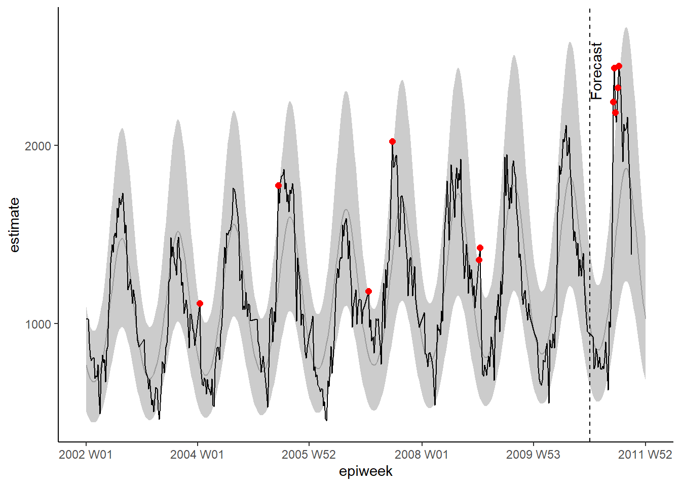
Prediction validation
Beyond inspecting residuals, it is important to investigate how good your model is at predicting cases in the future. This gives you an idea of how reliable your threshold alerts are.
The traditional way of validating is to see how well you can predict the latest year before the present one (because you don’t yet know the counts for the “current year”). For example in our data set we would use the data from 2002 to 2009 to predict 2010, and then see how accurate those predictions are. Then refit the model to include 2010 data and use that to predict 2011 counts.
As can be seen in the figure below by Hyndman et al in “Forecasting principles and practice”.
 figure reproduced with permission from the authors
The downside of this is that you are not using all the data available to you, and it is not the final model that you are using for prediction.
An alternative is to use a method called cross-validation. In this scenario you
roll over all of the data available to fit multiple models to predict one year ahead.
You use more and more data in each model, as seen in the figure below from the
same [Hyndman et al text]((https://otexts.com/fpp3/).
For example, the first model uses 2002 to predict 2003, the second uses 2002 and
2003 to predict 2004, and so on.
 figure reproduced with permission from the authors
In the below we use purrr package map() function to loop over each dataset.
We then put estimates in one data set and merge with the original case counts,
to use the yardstick package to compute measures of accuracy.
We compute four measures including: Root mean squared error (RMSE), Mean absolute error
(MAE), Mean absolute scaled error (MASE), Mean absolute percent error (MAPE).
CAUTION: Note the use of simulate_pi = FALSE
within the predict() argument. This is because the default behaviour of trending
is to use the ciTools package to estimate a prediction interval. This does not
work if there are NA counts, and also produces more granular intervals.
See ?trending::predict.trending_model_fit for details.
## Cross validation: predicting week(s) ahead based on sliding window

## expand your data by rolling over in 52 week windows (before + after)
## to predict 52 week ahead
## (creates longer and longer chains of observations - keeps older data)

## define window want to roll over
roll_window <- 52

## define weeks ahead want to predict
weeks_ahead <- 52

## create a data set of repeating, increasingly long data
## label each data set with a unique id
## only use cases before year of interest (i.e. 2011)
case_roll <- counts %>%
  filter(epiweek < cut_off) %>%
  ## only keep the week and case counts variables
  select(epiweek, case_int) %>%
    ## drop the last x observations
    ## depending on how many weeks ahead forecasting
    ## (otherwise will be an actual forecast to "unknown")
    slice(1:(n() - weeks_ahead)) %>%
    as_tsibble(index = epiweek) %>%
    ## roll over each week in x after windows to create grouping ID
    ## depending on what rolling window specify
    stretch_tsibble(.init = roll_window, .step = 1) %>%
  ## drop the first couple - as have no "before" cases
  filter(.id > roll_window)


## for each of the unique data sets run the code below
forecasts <- purrr::map(unique(case_roll$.id),
                        function(i) {

  ## only keep the current fold being fit
  mini_data <- filter(case_roll, .id == i) %>%
    as_tibble()

  ## create an empty data set for forecasting on
  forecast_data <- tibble(
    epiweek = seq(max(mini_data$epiweek) + 1,
                  max(mini_data$epiweek) + weeks_ahead,
                  by = 1),
    case_int = rep.int(NA, weeks_ahead),
    .id = rep.int(i, weeks_ahead)
  )

  ## add the forecast data to the original
  mini_data <- bind_rows(mini_data, forecast_data)

  ## define the cut off based on latest non missing count data
  cv_cut_off <- mini_data %>%
    ## only keep non-missing rows
    drop_na(case_int) %>%
    ## get the latest week
    summarise(max(epiweek)) %>%
    ## extract so is not in a dataframe
    pull()

  ## make mini_data back in to a tsibble
  mini_data <- tsibble(mini_data, index = epiweek)

  ## define fourier terms (sincos)
  mini_data <- mini_data %>%
    mutate(
    ## combine fourier terms for weeks prior to  and after cut-off date
    fourier = rbind(
      ## get fourier terms for previous years
      forecast::fourier(
        ## only keep the rows before cut-off
        filter(mini_data,
               epiweek <= cv_cut_off),
        ## include one set of sin cos terms
        K = 1
        ),
      ## predict the fourier terms for following year (using baseline data)
      fourier(
        ## only keep the rows before cut-off
        filter(mini_data,
               epiweek <= cv_cut_off),
        ## include one set of sin cos terms
        K = 1,
        ## predict 52 weeks ahead
        h = weeks_ahead
        )
      )
    )


  # split data for fitting and prediction
  dat <- mini_data %>%
    group_by(epiweek <= cv_cut_off) %>%
    group_split()

  ## define the model you want to fit (negative binomial)
  model <- glm_nb_model(
    ## set number of cases as outcome of interest
    case_int ~
      ## use epiweek to account for the trend
      epiweek +
      ## use the furier terms to account for seasonality
      fourier
  )

  # define which data to use for fitting and which for predicting
  fitting_data <- pluck(dat, 2)
  pred_data <- pluck(dat, 1)

  # fit model
  fitted_model <- trending::fit(model, fitting_data)

  # forecast with data want to predict with
  forecasts <- fitted_model %>%
    predict(pred_data, simulate_pi = FALSE) %>%
    ## only keep the week and the forecast estimate
    select(epiweek, estimate)

  }
  )

## make the list in to a data frame with all the forecasts
forecasts <- bind_rows(forecasts)

## join the forecasts with the observed
forecasts <- left_join(forecasts,
                       select(counts, epiweek, case_int),
                       by = "epiweek")

## using {yardstick} compute metrics
  ## RMSE: Root mean squared error
  ## MAE:  Mean absolute error
  ## MASE: Mean absolute scaled error
  ## MAPE: Mean absolute percent error
model_metrics <- bind_rows(
  ## in your forcasted dataset compare the observed to the predicted
  rmse(forecasts, case_int, estimate),
  mae( forecasts, case_int, estimate),
  mase(forecasts, case_int, estimate),
  mape(forecasts, case_int, estimate),
  ) %>%
  ## only keep the metric type and its output
  select(Metric  = .metric,
         Measure = .estimate) %>%
  ## make in to wide format so can bind rows after
  pivot_wider(names_from = Metric, values_from = Measure)

## return model metrics
model_metrics
## # A tibble: 1 x 4
## rmse mae mase mape
## <dbl> <dbl> <dbl> <dbl>
## 1 252. 199. 1.96 17.3surveillance package
In this section we use the surveillance package to create alert thresholds based on outbreak detection algorithms. There are several different methods available in the package, however we will focus on two options here. For details, see these papers on the application and theory of the alogirthms used.
The first option uses the improved Farrington method. This fits a negative binomial glm (including trend) and down-weights past outbreaks (outliers) to create a threshold level.
The second option use the glrnb method. This also fits a negative binomial glm but includes trend and fourier terms (so is favoured here). The regression is used to calculate the “control mean” (~fitted values) - it then uses a computed generalized likelihood ratio statistic to assess if there is shift in the mean for each week. Note that the threshold for each week takes in to account previous weeks so if there is a sustained shift an alarm will be triggered. (Also note that after each alarm the algorithm is reset)
In order to work with the surveillance package, we first need to define a
“surveillance time series” object (using the sts() function) to fit within the
framework.
## define surveillance time series object
## nb. you can include a denominator with the population object (see ?sts)
counts_sts <- sts(observed = counts$case_int[!is.na(counts$case_int)],
                  start = c(
                    ## subset to only keep the year from start_date
                    as.numeric(str_sub(start_date, 1, 4)),
                    ## subset to only keep the week from start_date
                    as.numeric(str_sub(start_date, 7, 8))),
                  ## define the type of data (in this case weekly)
                  freq = 52)

## define the week range that you want to include (ie. prediction period)
## nb. the sts object only counts observations without assigning a week or
## year identifier to them - so we use our data to define the appropriate observations
weekrange <- cut_off - start_date
Farrington method
We then define each of our parameters for the Farrington method in a list.
Then we run the algorithm using farringtonFlexible() and then we can extract the
threshold for an alert using farringtonmethod@upperboundto include this in our
dataset. It is also possible to extract a TRUE/FALSE for each week if it triggered
an alert (was above the threshold) using farringtonmethod@alarm.
## define control
ctrl <- list(
  ## define what time period that want threshold for (i.e. 2011)
  range = which(counts_sts@epoch > weekrange),
  b = 9, ## how many years backwards for baseline
  w = 2, ## rolling window size in weeks
  weightsThreshold = 2.58, ## reweighting past outbreaks (improved noufaily method - original suggests 1)
  ## pastWeeksNotIncluded = 3, ## use all weeks available (noufaily suggests drop 26)
  trend = TRUE,
  pThresholdTrend = 1, ## 0.05 normally, however 1 is advised in the improved method (i.e. always keep)
  thresholdMethod = "nbPlugin",
  populationOffset = TRUE
  )

## apply farrington flexible method
farringtonmethod <- farringtonFlexible(counts_sts, ctrl)

## create a new variable in the original dataset called threshold
## containing the upper bound from farrington
## nb. this is only for the weeks in 2011 (so need to subset rows)
counts[which(counts$epiweek >= cut_off &
               !is.na(counts$case_int)),
              "threshold"] <- farringtonmethod@upperbound
We can then visualise the results in ggplot as done previously.
ggplot(counts, aes(x = epiweek)) +
  ## add in observed case counts as a line
  geom_line(aes(y = case_int, colour = "Observed")) +
  ## add in upper bound of aberration algorithm
  geom_line(aes(y = threshold, colour = "Alert threshold"),
            linetype = "dashed",
            size = 1.5) +
  ## define colours
  scale_colour_manual(values = c("Observed" = "black",
                                 "Alert threshold" = "red")) +
  ## make a traditional plot (with black axes and white background)
  theme_classic() +
  ## remove title of legend
  theme(legend.title = element_blank())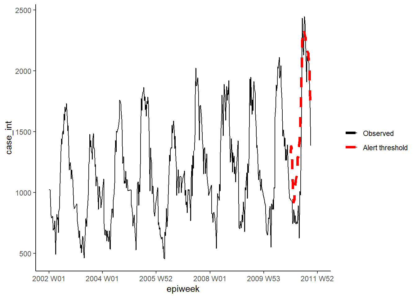
GLRNB method
Similarly for the GLRNB method we define each of our parameters for the in a list,
then fit the algorithm and extract the upper bounds.
CAUTION: This method uses “brute force” (similar to bootstrapping) for calculating thresholds, so can take a long time!
See the GLRNB vignette for details.
## define control options
ctrl <- list(
  ## define what time period that want threshold for (i.e. 2011)
  range = which(counts_sts@epoch > weekrange),
  mu0 = list(S = 1,    ## number of fourier terms (harmonics) to include
  trend = TRUE,   ## whether to include trend or not
  refit = FALSE), ## whether to refit model after each alarm
  ## cARL = threshold for GLR statistic (arbitrary)
     ## 3 ~ middle ground for minimising false positives
     ## 1 fits to the 99%PI of glm.nb - with changes after peaks (threshold lowered for alert)
   c.ARL = 2,
   # theta = log(1.5), ## equates to a 50% increase in cases in an outbreak
   ret = "cases"     ## return threshold upperbound as case counts
  )

## apply the glrnb method
glrnbmethod <- glrnb(counts_sts, control = ctrl, verbose = FALSE)

## create a new variable in the original dataset called threshold
## containing the upper bound from glrnb
## nb. this is only for the weeks in 2011 (so need to subset rows)
counts[which(counts$epiweek >= cut_off &
               !is.na(counts$case_int)),
              "threshold_glrnb"] <- glrnbmethod@upperbound
Visualise the outputs as previously.
ggplot(counts, aes(x = epiweek)) +
  ## add in observed case counts as a line
  geom_line(aes(y = case_int, colour = "Observed")) +
  ## add in upper bound of aberration algorithm
  geom_line(aes(y = threshold_glrnb, colour = "Alert threshold"),
            linetype = "dashed",
            size = 1.5) +
  ## define colours
  scale_colour_manual(values = c("Observed" = "black",
                                 "Alert threshold" = "red")) +
  ## make a traditional plot (with black axes and white background)
  theme_classic() +
  ## remove title of legend
  theme(legend.title = element_blank())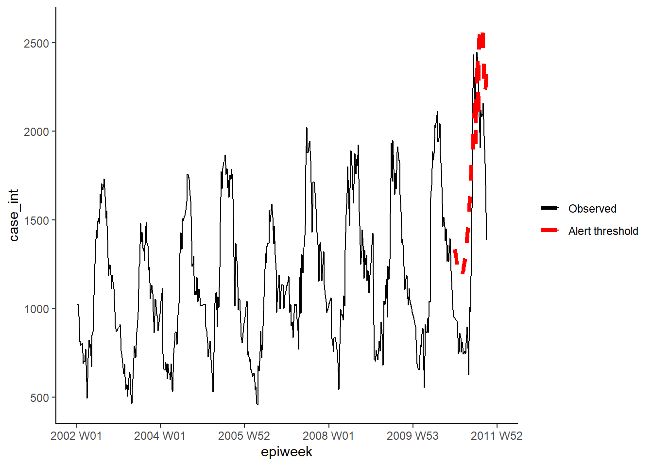
23.8 Interrupted timeseries
Interrupted timeseries (also called segmented regression or intervention analysis), is often used in assessing the impact of vaccines on the incidence of disease. But it can be used for assessing impact of a wide range of interventions or introductions. For example changes in hospital procedures or the introduction of a new disease strain to a population. In this example we will pretend that a new strain of Campylobacter was introduced to Germany at the end of 2008, and see if that affects the number of cases. We will use negative binomial regression again. The regression this time will be split in to two parts, one before the intervention (or introduction of new strain here) and one after (the pre and post-periods). This allows us to calculate an incidence rate ratio comparing the two time periods. Explaining the equation might make this clearer (if not then just ignore!).
The negative binomial regression can be defined as follows:
\[\log(Y_t)= β_0 + β_1 \times t+ β_2 \times δ(t-t_0) + β_3\times(t-t_0 )^+ + log(pop_t) + e_t\]
Where:
\(Y_t\)is the number of cases observed at time \(t\)
\(pop_t\) is the population size in 100,000s at time \(t\) (not used here)
\(t_0\) is the last year of the of the pre-period (including transition time if any)
\(δ(x\) is the indicator function (it is 0 if x≤0 and 1 if x>0)
\((x)^+\) is the cut off operator (it is x if x>0 and 0 otherwise)
\(e_t\) denotes the residual
Additional terms trend and season can be added as needed.
\(β_2 \times δ(t-t_0) + β_3\times(t-t_0 )^+\) is the generalised linear part of the post-period and is zero in the pre-period. This means that the \(β_2\) and \(β_3\) estimates are the effects of the intervention.
We need to re-calculate the fourier terms without forecasting here, as we will use all the data available to us (i.e. retrospectively). Additionally we need to calculate the extra terms needed for the regression.
## add in fourier terms using the epiweek and case_int variabless
counts$fourier <- select(counts, epiweek, case_int) %>%
  as_tsibble(index = epiweek) %>%
  fourier(K = 1)

## define intervention week
intervention_week <- yearweek("2008-12-31")

## define variables for regression
counts <- counts %>%
  mutate(
    ## corresponds to t in the formula
      ## count of weeks (could probably also just use straight epiweeks var)
    # linear = row_number(epiweek),
    ## corresponds to delta(t-t0) in the formula
      ## pre or post intervention period
    intervention = as.numeric(epiweek >= intervention_week),
    ## corresponds to (t-t0)^+ in the formula
      ## count of weeks post intervention
      ## (choose the larger number between 0 and whatever comes from calculation)
    time_post = pmax(0, epiweek - intervention_week + 1))
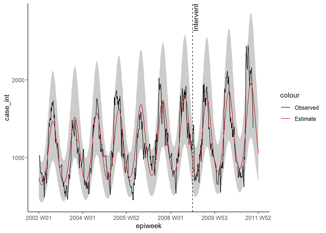
We then use these terms to fit a negative binomial regression, and produce a table with percentage change. What this example shows is that there was no significant change.
CAUTION: Note the use of simulate_pi = FALSE
within the predict() argument. This is because the default behaviour of trending
is to use the ciTools package to estimate a prediction interval. This does not
work if there are NA counts, and also produces more granular intervals.
See ?trending::predict.trending_model_fit for details.
## define the model you want to fit (negative binomial)
model <- glm_nb_model(
  ## set number of cases as outcome of interest
  case_int ~
    ## use epiweek to account for the trend
    epiweek +
    ## use the furier terms to account for seasonality
    fourier +
    ## add in whether in the pre- or post-period
    intervention +
    ## add in the time post intervention
    time_post
    )

## fit your model using the counts dataset
fitted_model <- trending::fit(model, counts)

## calculate confidence intervals and prediction intervals
observed <- predict(fitted_model, simulate_pi = FALSE)


## show estimates and percentage change in a table
fitted_model %>%
  ## extract original negative binomial regression
  get_model() %>%
  ## get a tidy dataframe of results
  tidy(exponentiate = TRUE,
       conf.int = TRUE) %>%
  ## only keep the intervention value
  filter(term == "intervention") %>%
  ## change the IRR to percentage change for estimate and CIs
  mutate(
    ## for each of the columns of interest - create a new column
    across(
      all_of(c("estimate", "conf.low", "conf.high")),
      ## apply the formula to calculate percentage change
            .f = function(i) 100 * (i - 1),
      ## add a suffix to new column names with "_perc"
      .names = "{.col}_perc")
    ) %>%
  ## only keep (and rename) certain columns
  select("IRR" = estimate,
         "95%CI low" = conf.low,
         "95%CI high" = conf.high,
         "Percentage change" = estimate_perc,
         "95%CI low (perc)" = conf.low_perc,
         "95%CI high (perc)" = conf.high_perc,
         "p-value" = p.value)
## # A tibble: 1 x 7
## IRR `95%CI low` `95%CI high` `Percentage change` `95%CI low (perc)` `95%CI high (perc)` `p-value`
## <dbl> <dbl> <dbl> <dbl> <dbl> <dbl> <dbl>
## 1 0.936 0.874 1.00 -6.40 -12.6 0.306 0.0645As previously we can visualise the outputs of the regression.
ggplot(observed, aes(x = epiweek)) +
  ## add in observed case counts as a line
  geom_line(aes(y = case_int, colour = "Observed")) +
  ## add in a line for the model estimate
  geom_line(aes(y = estimate, col = "Estimate")) +
  ## add in a band for the prediction intervals
  geom_ribbon(aes(ymin = lower_pi,
                  ymax = upper_pi),
              alpha = 0.25) +
  ## add vertical line and label to show where forecasting started
  geom_vline(
           xintercept = as.Date(intervention_week),
           linetype = "dashed") +
  annotate(geom = "text",
           label = "Intervention",
           x = intervention_week,
           y = max(observed$upper_pi),
           angle = 90,
           vjust = 1
           ) +
  ## define colours
  scale_colour_manual(values = c("Observed" = "black",
                                 "Estimate" = "red")) +
  ## make a traditional plot (with black axes and white background)
  theme_classic()
## Warning: Removed 13 row(s) containing missing values (geom_path).