39 Interactive plots
Data visualisation is increasingly required to be interrogable by the audience. Consequently, is is becoming common to create interactive plots. There are several ways to include these but the two most common are plotly and shiny.
In this page we will focus on converting an existing ggplot() plot into an interactive plot with plotly. You can read more about shiny in the Dashboards with Shiny page. What is worth mentioning is that interactive plots are only useable in HTML format R markdown documents, not PDF or Word documents.
Below is a basic epicurve that has been transformed to be interactive using the integration of ggplot2 and plotly (hover your mouse over the plot, zoom in, or click items in the legend).
39.1 Preparation
Load packages
This code chunk shows the loading of packages required for the analyses. In this handbook we emphasize p_load() from pacman, which installs the package if necessary and loads it for use. You can also load installed packages with library() from base R. See the page on [R basics] for more information on R packages.
pacman::p_load(
  rio,       # import/export
  here,      # filepaths
  lubridate, # working with dates
  plotly,    # interactive plots
  scales,    # quick percents
  tidyverse  # data management and visualization
  )
Start with a ggplot()
In this page we assume that you are beginning with a ggplot() plot that you want to convert to be interactive. We will build several of these plots in this page, using the case linelist used in many pages of this handbook.
Import data
To begin, we import the cleaned linelist of cases from a simulated Ebola epidemic. If you want to follow along, click to download the “clean” linelist (as .rds file). Import data with the import() function from the rio package (it handles many file types like .xlsx, .csv, .rds - see the [Import and export] page for details).
# import case linelist
linelist <- import("linelist_cleaned.rds")
The first 50 rows of the linelist are displayed below.
39.2 Plot with ggplotly()
The function ggplotly() from the plotly package makes it easy to convert a ggplot() to be interactive. Simply save your ggplot() and then pipe it to the ggplotly() function.
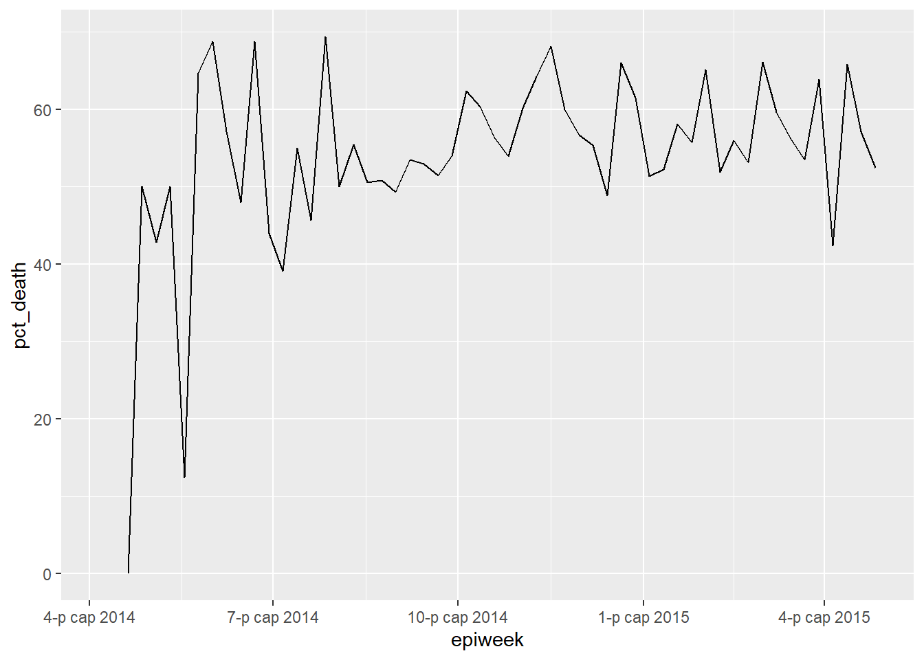
Below, we plot a simple line representing the proportion of cases who died in a given week:
We begin by creating a summary dataset of each epidemiological week, and the percent of cases with a known outcome that died.
weekly_deaths <- linelist %>%
  group_by(epiweek = floor_date(date_onset, "week")) %>%  # create and group data by epiweek column
  summarise(                                              # create new summary data frame:
    n_known_outcome = sum(!is.na(outcome), na.rm=T),      # number of cases per group with known outcome
    n_death  = sum(outcome == "Death", na.rm=T),          # number of cases per group who died
    pct_death = 100*(n_death / n_known_outcome)           # percent of cases with known outcome who died
  )
Here is the first 50 rows of the weekly_deaths dataset.
Then we create the plot with ggplot2, using geom_line().
deaths_plot <- ggplot(data = weekly_deaths)+            # begin with weekly deaths data
  geom_line(mapping = aes(x = epiweek, y = pct_death))  # make line

deaths_plot   # print
We can make this interactive by simply passing this plot to ggplotly(), as below. Hover your mouse over the line to show the x and y values. You can zoom in on the plot, and drag it around. You can also see icons in the upper-right of the plot. In order, they allow you to:
- Download the current view as a PNG image
- Zoom in with a select box
- “Pan”, or move across the plot by clicking and dragging the plot
- Zoom in, zoom out, or return to default zoom
- Reset axes to defaults
- Toggle on/off “spike lines” which are dotted lines from the interactive point extending to the x and y axes
- Adjustments to whether data show when you are not hovering on the line
deaths_plot %>% plotly::ggplotly()Grouped data work with ggplotly() as well. Below, a weekly epicurve is made, grouped by outcome. The stacked bars are interactive. Try clicking on the different items in the legend (they will appear/disappear).
# Make epidemic curve with incidence2 pacakge
p <- incidence2::incidence(
  linelist,
  date_index = date_onset,
  interval = "weeks",
  groups = outcome) %>% plot(fill = outcome)
# Plot interactively
p %>% plotly::ggplotly()
39.3 Modifications
File size
When exporting in an R Markdown generated HTML (like this book!) you want to make the plot as small data size as possible (with no negative side effects in most cases). For this, just pipe the interactive plot to partial_bundle(), also from plotly.
p <- p %>%
  plotly::ggplotly() %>%
plotly::partial_bundle()39.4 Heat tiles
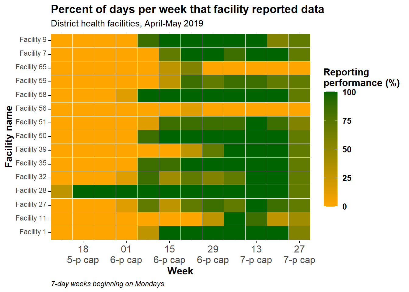
You can make almost any ggplot() plot interactive, including heat tiles. In the page on Heat plots you can read about how to make the below plot, which displays the proportion of days per week that certain facilities reported data to their province.
Here is the code, although we will not describe it in depth here.
# import data
facility_count_data <- rio::import(here::here("data", "malaria_facility_count_data.rds"))

# aggregate data into Weeks for Spring district
agg_weeks <- facility_count_data %>%
  filter(District == "Spring",
         data_date < as.Date("2020-08-01")) %>%
  mutate(week = aweek::date2week(
    data_date,
    start_date = "Monday",
    floor_day = TRUE,
    factor = TRUE)) %>%
  group_by(location_name, week, .drop = F) %>%
  summarise(
    n_days          = 7,
    n_reports       = n(),
    malaria_tot     = sum(malaria_tot, na.rm = T),
    n_days_reported = length(unique(data_date)),
    p_days_reported = round(100*(n_days_reported / n_days))) %>%
  right_join(tidyr::expand(., week, location_name)) %>%
  mutate(week = aweek::week2date(week))

# create plot
metrics_plot <- ggplot(agg_weeks,
       aes(x = week,
           y = location_name,
           fill = p_days_reported))+
  geom_tile(colour="white")+
  scale_fill_gradient(low = "orange", high = "darkgreen", na.value = "grey80")+
  scale_x_date(expand = c(0,0),
               date_breaks = "2 weeks",
               date_labels = "%d\n%b")+
  theme_minimal()+
  theme(
    legend.title = element_text(size=12, face="bold"),
    legend.text  = element_text(size=10, face="bold"),
    legend.key.height = grid::unit(1,"cm"),
    legend.key.width  = grid::unit(0.6,"cm"),
    axis.text.x = element_text(size=12),
    axis.text.y = element_text(vjust=0.2),
    axis.ticks = element_line(size=0.4),
    axis.title = element_text(size=12, face="bold"),
    plot.title = element_text(hjust=0,size=14,face="bold"),
    plot.caption = element_text(hjust = 0, face = "italic")
    )+
  labs(x = "Week",
       y = "Facility name",
       fill = "Reporting\nperformance (%)",
       title = "Percent of days per week that facility reported data",
       subtitle = "District health facilities, April-May 2019",
       caption = "7-day weeks beginning on Mondays.")

metrics_plot # print
Below, we make it interactive and modify it for simple buttons and file size.
metrics_plot %>%
  plotly::ggplotly() %>%
  plotly::partial_bundle() %>%
  plotly::config(displaylogo = FALSE, modeBarButtonsToRemove = plotly_buttons_remove)
–>
39.5 Resources
Plotly is not just for R, but also works well with Python (and really any data science language as it’s built in JavaScript). You can read more about it on the plotly website