43 Dashboards with Shiny
Dashboards are often a great way to share results from analyses with others. Producing a dashboard with shiny requires a relatively advanced knowledge of the R language, but offers incredible customization and possibilities.
It is recommended that someone learning dashboards with shiny has good knowledge of data transformation and visualisation, and is comfortable debugging code, and writing functions. Working with dashboards is not intuitive when you’re starting, and is difficult to understand at times, but is a great skill to learn and gets much easier with practice!
This page will give a short overview of how to make dashboards with shiny and its extensions. For an alternative method of making dashboards that is faster, easier, but perhaps less customizeable, see the page on flextable (Dashboards with R Markdown).
43.1 Preparation
Load packages
In this handbook we emphasize p_load() from pacman, which installs the package if necessary and loads it for use. You can also load installed packages with library() from base R. See the page on [R basics] for more information on R packages.
We begin by installing the shiny R package:
pacman::p_load("shiny")Import data
If you would like to follow-along with this page, see this section of the Download handbook and data. There are links to download the R scripts and data files that produce the final Shiny app.
If you try to re-construct the app using these files, please be aware of the R project folder structure that is created over the course of the demonstration (e.g. folders for “data” and for “funcs”).
43.2 The structure of a shiny app
Basic file structures
To understand shiny, we first need to understand how the file structure of an app works! We should make a brand new directory before we start. This can actually be made easier by choosing New project in Rstudio, and choosing Shiny Web Application. This will create the basic structure of a shiny app for you.
When opening this project, you’ll notice there is a .R file already present called app.R. It is essential that we have one of two basic file structures:
- One file called app.R, or
- Two files, one called ui.R and the other server.R
In this page, we will use the first approach of having one file called app.R. Here is an example script:
# an example of app.R

library(shiny)

ui <- fluidPage(

    # Application title
    titlePanel("My app"),

    # Sidebar with a slider input widget
    sidebarLayout(
        sidebarPanel(
            sliderInput("input_1")
        ),

        # Show a plot
        mainPanel(
           plotOutput("my_plot")
        )
    )
)

# Define server logic required to draw a histogram
server <- function(input, output) {

     plot_1 <- reactive({
          plot_func(param = input_1)
     })

    output$my_plot <- renderPlot({
       plot_1()
    })
}


# Run the application
shinyApp(ui = ui, server = server)
If you open this file, you’ll notice that two objects are defined - one called ui and another called server. These objects must be defined in every shiny app and are central to the structure of the app itself! In fact, the only difference between the two file structures described above is that in structure 1, both ui and server are defined in one file, whereas in structure 2 they are defined in separate files. Note: we can also (and we should if we have a larger app) have other .R files in our structure that we can source() into our app.
The server and the ui
We next need to understand what the server and ui objects actually do. Put simply, these are two objects that are interacting with each other whenever the user interacts with the shiny app.
The UI element of a shiny app is, on a basic level, R code that creates an HTML interface. This means everything that is displayed in the UI of an app. This generally includes:
- “Widgets” - dropdown menus, check boxes, sliders, etc that can be interacted with by the user
- Plots, tables, etc - outputs that are generated with R code
- Navigation aspects of an app - tabs, panes, etc.
- Generic text, hyperlinks, etc
- HTML and CSS elements (addressed later)
The most important thing to understand about the UI is that it receives inputs from the user and displays outputs from the server. There is no active code running in the ui at any time - all changes seen in the UI are passed through the server (more or less). So we have to make our plots, downloads, etc in the server
The server of the shiny app is where all code is being run once the app starts up. The way this works is a little confusing. The server function will effectively react to the user interfacing with the UI, and run chunks of code in response. If things change in the server, these will be passed back up to the ui, where the changes can be seen. Importantly, the code in the server will be executed non-consecutively (or it’s best to think of it this way). Basically, whenever a ui input affects a chunk of code in the server, it will run automatically, and that output will be produced and displayed.
This all probably sounds very abstract for now, so we’ll have to dive into some examples to get a clear idea of how this actually works.
Before you start to build an app
Before you begin to build an app, its immensely helpful to know what you want to build. Since your UI will be written in code, you can’t really visualise what you’re building unless you are aiming for something specific. For this reason, it is immensely helpful to look at lots of examples of shiny apps to get an idea of what you can make - even better if you can look at the source code behind these apps! Some great resources for this are:
Once you get an idea for what is possible, it’s also helpful to map out what you want yours to look like - you can do this on paper or in any drawing software (PowerPoint, MS paint, etc.). It’s helpful to start simple for your first app! There’s also no shame in using code you find online of a nice app as a template for your work - its much easier than building something from scratch!
43.3 Building a UI
When building our app, its easier to work on the UI first so we can see what we’re making, and not risk the app failing because of any server errors. As mentioned previously, its often good to use a template when working on the UI. There are a number of standard layouts that can be used with shiny that are available from the base shiny package, but it’s worth noting that there are also a number of package extensions such as shinydashboard. We’ll use an example from base shiny to start with.
A shiny UI is generally defined as a series of nested functions, in the following order
- A function defining the general layout (the most basic is
fluidPage(), but more are available) - Panels within the layout such as:
- a sidebar (
sidebarPanel()) - a “main” panel (
mainPanel()) - a tab (
tabPanel()) - a generic “column” (
column())
- a sidebar (
- Widgets and outputs - these can confer inputs to the server (widgets) or outputs from the server (outputs)
- Widgets generally are styled as
xxxInput()e.g.selectInput() - Outputs are generally styled as
xxxOutput()e.g.plotOutput()
- Widgets generally are styled as
It’s worth stating again that these can’t be visualised easily in an abstract way, so it’s best to look at an example! Lets consider making a basic app that visualises our malaria facility count data by district. This data has a lot of differnet parameters, so it would be great if the end user could apply some filters to see the data by age group/district as they see fit! We can use a very simple shiny layout to start - the sidebar layout. This is a layout where widgets are placed in a sidebar on the left, and the plot is placed on the right.
Lets plan our app - we can start with a selector that lets us choose the district where we want to visualise data, and another to let us visualise the age group we are interested in. We’ll aim to use these filters to show an epicurve that reflects these parameters. So for this we need:
- Two dropdown menus that let us choose the district we want, and the age group we’re interested in.
- An area where we can show our resulting epicurve.
This might look something like this:
library(shiny)

ui <- fluidPage(

  titlePanel("Malaria facility visualisation app"),

  sidebarLayout(

    sidebarPanel(
         # selector for district
         selectInput(
              inputId = "select_district",
              label = "Select district",
              choices = c(
                   "All",
                   "Spring",
                   "Bolo",
                   "Dingo",
                   "Barnard"
              ),
              selected = "All",
              multiple = TRUE
         ),
         # selector for age group
         selectInput(
              inputId = "select_agegroup",
              label = "Select age group",
              choices = c(
                   "All ages" = "malaria_tot",
                   "0-4 yrs" = "malaria_rdt_0-4",
                   "5-14 yrs" = "malaria_rdt_5-14",
                   "15+ yrs" = "malaria_rdt_15"
              ),
              selected = "All",
              multiple = FALSE
         )

    ),

    mainPanel(
      # epicurve goes here
      plotOutput("malaria_epicurve")
    )

  )
)
When app.R is run with the above UI code (with no active code in the server portion of app.R) the layout appears looking like this - note that there will be no plot if there is no server to render it, but our inputs are working!
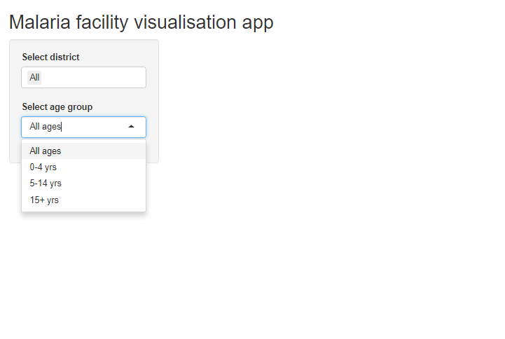
This is a good opportunity to discuss how widgets work - note that each widget is accepting an inputId, a label, and a series of other options that are specific to the widget type. This inputId is extremely important - these are the IDs that are used to pass information from the UI to the server. For this reason, they must be unique. You should make an effort to name them something sensible, and specific to what they are interacting with in cases of larger apps.
You should read documentation carefully for full details on what each of these widgets do. Widgets will pass specific types of data to the server depending on the widget type, and this needs to be fully understood. For example, selectInput() will pass a character type to the server:
- If we select Spring for the first widget here, it will pass the character object
"Spring"to the server. - If we select two items from the dropdown menu, they will come through as a character vector (e.g.
c("Spring", "Bolo")).
Other widgets will pass different types of object to the server! For example:
-
numericInput()will pass a numeric type object to the server -
checkboxInput()will pass a logical type object to the server (TRUEorFALSE)
It’s also worth noting the named vector we used for the age data here. For many widgets, using a named vector as the choices will display the names of the vector as the display choices, but pass the selected value from the vector to the server. I.e. here someone can select “15+” from the drop-down menu, and the UI will pass "malaria_rdt_15" to the server - which happens to be the name of the column we’re interested in!
There are loads of widgets that you can use to do lots of things with your app. Widgets also allow you to upload files into your app, and download outputs. There are also some excellent shiny extensions that give you access to more widgets than base shiny - the shinyWidgets package is a great example of this. To look at some examples you can look at the following links:
43.4 Loading data into our app
The next step in our app development is getting the server up and running. To do this however, we need to get some data into our app, and figure out all the calculations we’re going to do. A shiny app is not straightforward to debug, as it’s often not clear where errors are coming from, so it’s ideal to get all our data processing and visualisation code working before we start making the server itself.
So given we want to make an app that shows epi curves that change based on user input, we should think about what code we would need to run this in a normal R script. We’ll need to:
- Load our packages
- Load our data
- Transform our data
- Develop a function to visualise our data based on user inputs
This list is pretty straightforward, and shouldn’t be too hard to do. It’s now important to think about which parts of this process need to be done only once and which parts need to run in response to user inputs. This is because shiny apps generally run some code before running, which is only performed once. It will help our app’s performance if as much of our code can be moved to this section. For this example, we only need to load our data/packages and do basic transformations once, so we can put that code outside the server. This means the only thing we’ll need in the server is the code to visualise our data. Lets develop all of these componenets in a script first. However, since we’re visualising our data with a function, we can also put the code for the function outside the server so our function is in the environment when the app runs!
First lets load our data. Since we’re working with a new project, and we want to make it clean, we can create a new directory called data, and add our malaria data in there. We can run this code below in a testing script we will eventually delete when we clean up the structure of our app.
pacman::p_load("tidyverse", "lubridate")

# read data
malaria_data <- rio::import(here::here("data", "malaria_facility_count_data.rds")) %>%
  as_tibble()

print(malaria_data)
## # A tibble: 3,038 x 10
## location_name data_date submitted_date Province District `malaria_rdt_0-4` `malaria_rdt_5-1~ malaria_rdt_15 malaria_tot newid
## <chr> <date> <date> <chr> <chr> <int> <int> <int> <int> <int>
## 1 Facility 1 2020-08-11 2020-08-12 North Spring 11 12 23 46 1
## 2 Facility 2 2020-08-11 2020-08-12 North Bolo 11 10 5 26 2
## 3 Facility 3 2020-08-11 2020-08-12 North Dingo 8 5 5 18 3
## 4 Facility 4 2020-08-11 2020-08-12 North Bolo 16 16 17 49 4
## 5 Facility 5 2020-08-11 2020-08-12 North Bolo 9 2 6 17 5
## 6 Facility 6 2020-08-11 2020-08-12 North Dingo 3 1 4 8 6
## 7 Facility 6 2020-08-10 2020-08-12 North Dingo 4 0 3 7 6
## 8 Facility 5 2020-08-10 2020-08-12 North Bolo 15 14 13 42 5
## 9 Facility 5 2020-08-09 2020-08-12 North Bolo 11 11 13 35 5
## 10 Facility 5 2020-08-08 2020-08-12 North Bolo 19 15 15 49 5
## # ... with 3,028 more rowsIt will be easier to work with this data if we use tidy data standards, so we should also transform into a longer data format, where age group is a column, and cases is another column. We can do this easily using what we’ve learned in the Pivoting data page.
malaria_data <- malaria_data %>%
  select(-newid) %>%
  pivot_longer(cols = starts_with("malaria_"), names_to = "age_group", values_to = "cases_reported")

print(malaria_data)
## # A tibble: 12,152 x 7
## location_name data_date submitted_date Province District age_group cases_reported
## <chr> <date> <date> <chr> <chr> <chr> <int>
## 1 Facility 1 2020-08-11 2020-08-12 North Spring malaria_rdt_0-4 11
## 2 Facility 1 2020-08-11 2020-08-12 North Spring malaria_rdt_5-14 12
## 3 Facility 1 2020-08-11 2020-08-12 North Spring malaria_rdt_15 23
## 4 Facility 1 2020-08-11 2020-08-12 North Spring malaria_tot 46
## 5 Facility 2 2020-08-11 2020-08-12 North Bolo malaria_rdt_0-4 11
## 6 Facility 2 2020-08-11 2020-08-12 North Bolo malaria_rdt_5-14 10
## 7 Facility 2 2020-08-11 2020-08-12 North Bolo malaria_rdt_15 5
## 8 Facility 2 2020-08-11 2020-08-12 North Bolo malaria_tot 26
## 9 Facility 3 2020-08-11 2020-08-12 North Dingo malaria_rdt_0-4 8
## 10 Facility 3 2020-08-11 2020-08-12 North Dingo malaria_rdt_5-14 5
## # ... with 12,142 more rowsAnd with that we’ve finished preparing our data! This crosses items 1, 2, and 3 off our list of things to develop for our “testing R script”. The last, and most difficult task will be building a function to produce an epicurve based on user defined parameters. As mentioned previously, it’s highly recommended that anyone learning shiny first look at the section on functional programming (Writing functions) to understand how this works!
When defining our function, it might be hard to think about what parameters we want to include. For functional programming with shiny, every relevent parameter will generally have a widget associated with it, so thinking about this is usually quite easy! For example in our current app, we want to be able to filter by district, and have a widget for this, so we can add a district parameter to reflect this. We don’t have any app functionality to filter by facility (for now), so we don’t need to add this as a parameter. Lets start by making a function with three parameters:
- The core dataset
- The district of choice
- The age group of choice
plot_epicurve <- function(data, district = "All", agegroup = "malaria_tot") {

  if (!("All" %in% district)) {
    data <- data %>%
      filter(District %in% district)

    plot_title_district <- stringr::str_glue("{paste0(district, collapse = ', ')} districts")

  } else {

    plot_title_district <- "all districts"

  }

  # if no remaining data, return NULL
  if (nrow(data) == 0) {

    return(NULL)
  }

  data <- data %>%
    filter(age_group == agegroup)


  # if no remaining data, return NULL
  if (nrow(data) == 0) {

    return(NULL)
  }

  if (agegroup == "malaria_tot") {
      agegroup_title <- "All ages"
  } else {
    agegroup_title <- stringr::str_glue("{str_remove(agegroup, 'malaria_rdt')} years")
  }


  ggplot(data, aes(x = data_date, y = cases_reported)) +
    geom_col(width = 1, fill = "darkred") +
    theme_minimal() +
    labs(
      x = "date",
      y = "number of cases",
      title = stringr::str_glue("Malaria cases - {plot_title_district}"),
      subtitle = agegroup_title
    )


}
We won’t go into great detail about this function, as it’s relatively simple in how it works. One thing to note however, is we handle errors by returning NULL when it would otherwise give an error. This is because when a shiny server produces a NULL object instead of a plot object, nothing will be shown in the ui! This is important, as otherwise errors will often cause your app to stop working.
Another thing to note is the use of the %in% operator when evaluating the district input. As mentioned above, this could arrive as a character vector with multiple values, so using %in% is more flexible than say, ==.
Let’s test our function!
plot_epicurve(malaria_data, district = "Bolo", agegroup = "malaria_rdt_0-4")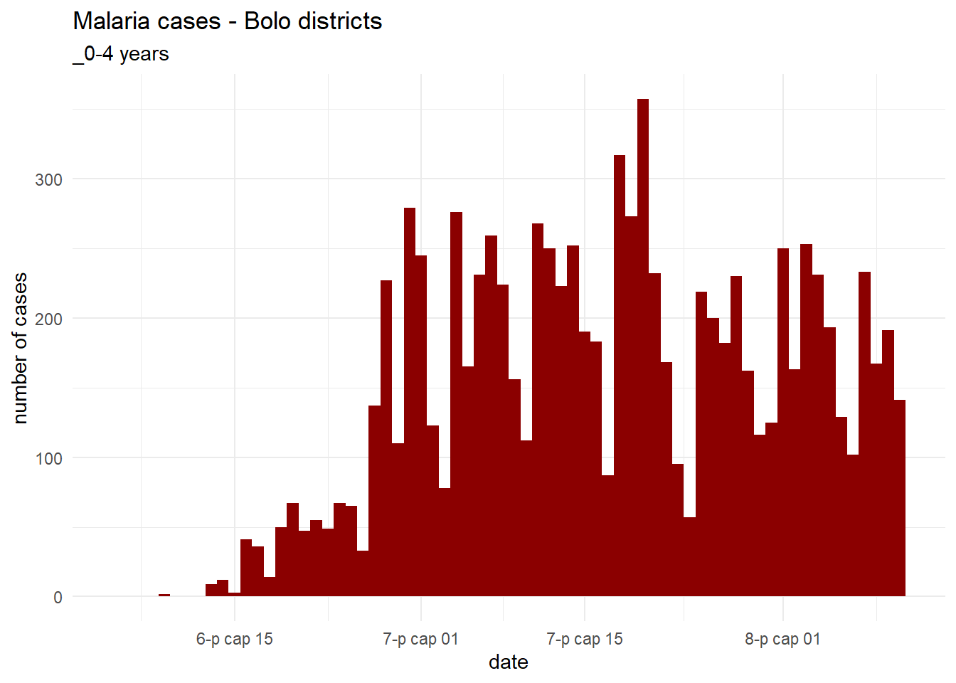
With our function working, we now have to understand how this all is going to fit into our shiny app. We mentioned the concept of startup code before, but lets look at how we can actually incorporate this into the structure of our app. There are two ways we can do this!
- Put this code in your app.R file at the start of the script (above the UI), or
- Create a new file in your app’s directory called global.R, and put the startup code in this file.
It’s worth noting at this point that it’s generally easier, especially with bigger apps, to use the second file structure, as it lets you separate your file structure in a simple way. Lets fully develop a this global.R script now. Here is what it could look like:
# global.R script

pacman::p_load("tidyverse", "lubridate", "shiny")

# read data
malaria_data <- rio::import(here::here("data", "malaria_facility_count_data.rds")) %>%
  as_tibble()

# clean data and pivot longer
malaria_data <- malaria_data %>%
  select(-newid) %>%
  pivot_longer(cols = starts_with("malaria_"), names_to = "age_group", values_to = "cases_reported")


# define plotting function
plot_epicurve <- function(data, district = "All", agegroup = "malaria_tot") {

  # create plot title
  if (!("All" %in% district)) {
    data <- data %>%
      filter(District %in% district)

    plot_title_district <- stringr::str_glue("{paste0(district, collapse = ', ')} districts")

  } else {

    plot_title_district <- "all districts"

  }

  # if no remaining data, return NULL
  if (nrow(data) == 0) {

    return(NULL)
  }

  # filter to age group
  data <- data %>%
    filter(age_group == agegroup)


  # if no remaining data, return NULL
  if (nrow(data) == 0) {

    return(NULL)
  }

  if (agegroup == "malaria_tot") {
      agegroup_title <- "All ages"
  } else {
    agegroup_title <- stringr::str_glue("{str_remove(agegroup, 'malaria_rdt')} years")
  }


  ggplot(data, aes(x = data_date, y = cases_reported)) +
    geom_col(width = 1, fill = "darkred") +
    theme_minimal() +
    labs(
      x = "date",
      y = "number of cases",
      title = stringr::str_glue("Malaria cases - {plot_title_district}"),
      subtitle = agegroup_title
    )


}
Easy! One great feature of shiny is that it will understand what files named app.R, server.R, ui.R, and global.R are for, so there is no need to connect them to each other via any code. So just by having this code in global.R in the directory it will run before we start our app!.
We should also note that it would improve our app’s organisation if we moved the plotting function to its own file - this will be especially helpful as apps become larger. To do this, we could make another directory called funcs, and put this function in as a file called plot_epicurve.R. We could then read this function in via the following command in global.R
Note that you should always specify local = TRUE in shiny apps, since it will affect sourcing when/if the app is published on a server.
43.5 Developing an app server
Now that we have most of our code, we just have to develop our server. This is the final piece of our app, and is probably the hardest to understand. The server is a large R function, but its helpful to think of it as a series of smaller functions, or tasks that the app can perform. It’s important to understand that these functions are not executed in a linear order. There is an order to them, but it’s not fully necessary to understand when starting out with shiny. At a very basic level, these tasks or functions will activate when there is a change in user inputs that affects them, unless the developer has set them up so they behave differently. Again, this is all quite abstract, but lets first go through the three basic types of shiny objects
Reactive sources - this is another term for user inputs. The shiny server has access to the outputs from the UI through the widgets we’ve programmed. Every time the values for these are changed, this is passed down to the server.
Reactive conductors - these are objects that exist only inside the shiny server. We don’t actually need these for simple apps, but they produce objects that can only be seen inside the server, and used in other operations. They generally depend on reactive sources.
Endpoints - these are outputs that are passed from the server to the UI. In our example, this would be the epi curve we are producing.
With this in mind lets construct our server step-by-step. We’ll show our UI code again here just for reference:
ui <- fluidPage(

  titlePanel("Malaria facility visualisation app"),

  sidebarLayout(

    sidebarPanel(
         # selector for district
         selectInput(
              inputId = "select_district",
              label = "Select district",
              choices = c(
                   "All",
                   "Spring",
                   "Bolo",
                   "Dingo",
                   "Barnard"
              ),
              selected = "All",
              multiple = TRUE
         ),
         # selector for age group
         selectInput(
              inputId = "select_agegroup",
              label = "Select age group",
              choices = c(
                   "All ages" = "malaria_tot",
                   "0-4 yrs" = "malaria_rdt_0-4",
                   "5-14 yrs" = "malaria_rdt_5-14",
                   "15+ yrs" = "malaria_rdt_15"
              ),
              selected = "All",
              multiple = FALSE
         )

    ),

    mainPanel(
      # epicurve goes here
      plotOutput("malaria_epicurve")
    )

  )
)
From this code UI we have:
- Two inputs:
- District selector (with an inputId of
select_district) - Age group selector (with an inputId of
select_agegroup)
- District selector (with an inputId of
- One output:
- The epicurve (with an outputId of
malaria_epicurve)
- The epicurve (with an outputId of
As stated previously, these unique names we have assigned to our inputs and outputs are crucial. They must be unique and are used to pass information between the ui and server. In our server, we access our inputs via the syntax input$inputID and outputs and passed to the ui through the syntax output$output_name Lets have a look at an example, because again this is hard to understand otherwise!
server <- function(input, output, session) {

  output$malaria_epicurve <- renderPlot(
    plot_epicurve(malaria_data, district = input$select_district, agegroup = input$select_agegroup)
  )

}
The server for a simple app like this is actually quite straightforward! You’ll notice that the server is a function with three parameters - input, output, and session - this isn’t that important to understand for now, but its important to stick to this setup! In our server we only have one task - this renders a plot based on our function we made earlier, and the inputs from the server. Notice how the names of the input and output objects correspond exactly to those in the ui.
To understand the basics of how the server reacts to user inputs, you should note that the output will know (through the underlying package) when inputs change, and rerun this function to create a plot every time they change. Note that we also use the renderPlot() function here - this is one of a family of class-specific functions that pass those objects to a ui output. There are a number of functions that behave similarly, but you need to ensure the function used matches the class of object you’re passing to the ui! For example:
-
renderText()- send text to the ui -
renderDataTable- send an interactive table to the ui.
Remember that these also need to match the output function used in the ui - so renderPlot() is paired with plotOutput(), and renderText() is matched with textOutput().
So we’ve finally made a functioning app! We can run this by pressing the Run App button on the top right of the script window in Rstudio. You should note that you can choose to run your app in your default browser (rather than Rstudio) which will more accurately reflect what the app will look like for other users.
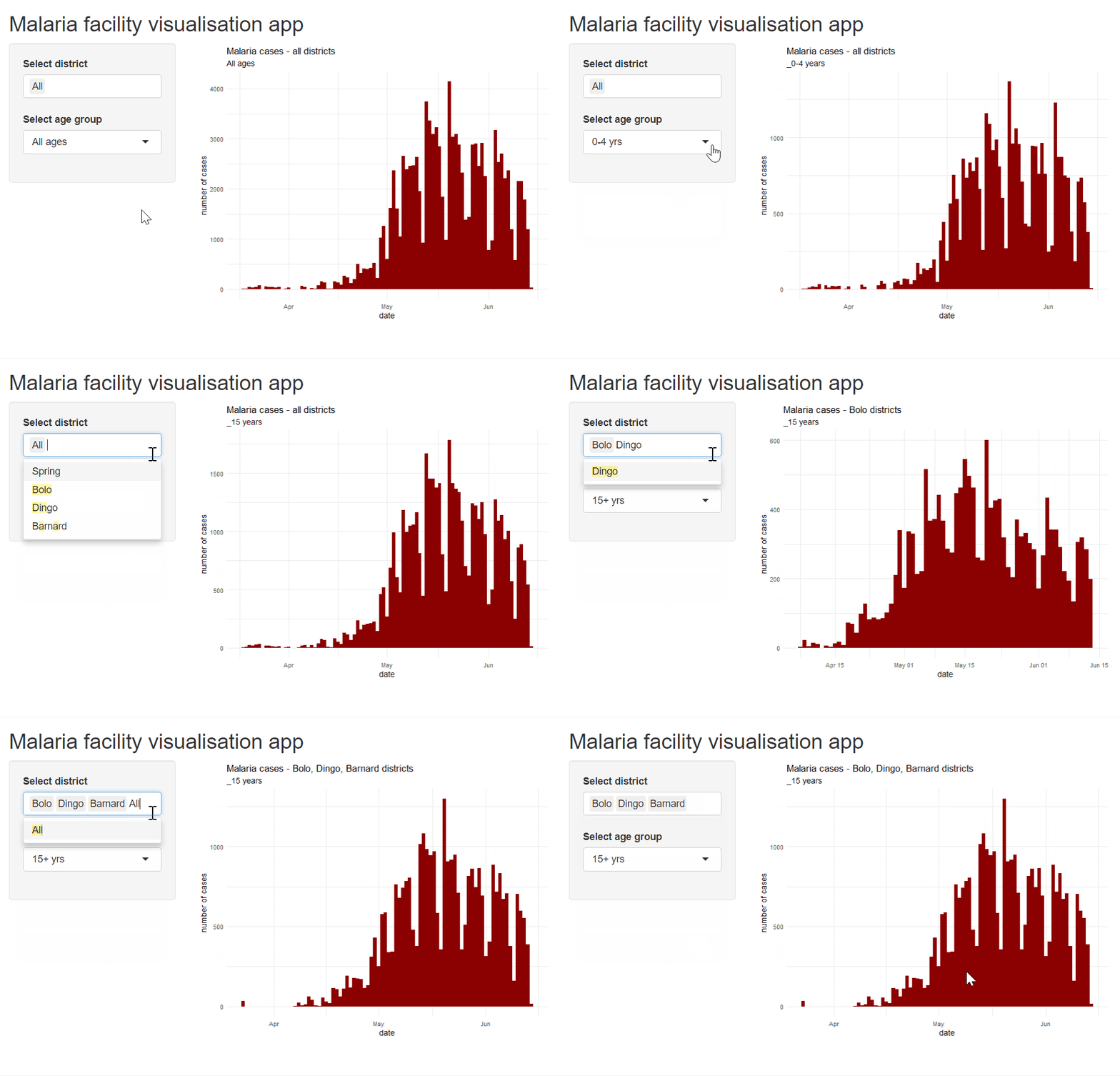
It is fun to note that in the R console, the app is “listening”! Talk about reactivity!

43.6 Adding more functionality
At this point we’ve finally got a running app, but we have very little functionality. We also haven’t really scratched the surface of what shiny can do, so there’s a lot more to learn about! Lets continue to build our existing app by adding some extra features. Some things that could be nice to add could be:
- Some explanatory text
- A download button for our plot - this would provide the user with a high quality version of the image that they’re generating in the app
- A selector for specific facilities
- Another dashboard page - this could show a table of our data.
This is a lot to add, but we can use it to learn about a bunch of different shiny featues on the way. There is so much to learn about shiny (it can get very advanced, but its hopefully the case that once users have a better idea of how to use it they can become more comfortable using external learning sources as well).
Adding static text
Lets first discuss adding static text to our shiny app. Adding text to our app is extremely easy, once you have a basic grasp of it. Since static text doesn’t change in the shiny app (If you’d like it to change, you can use text rendering functions in the server!), all of shiny’s static text is generally added in the ui of the app. We wont go through this in great detail, but you can add a number of different elements to your ui (and even custom ones) by interfacing R with HTML and css.
HTML and css are languages that are explicitly involved in user interface design. We don’t need to understand these too well, but HTML creates objects in UI (like a text box, or a table), and css is generally used to change the style and aesthetics of those objects. Shiny has access to a large array of HTML tags - these are present for objects that behave in a specific way, such as headers, paragraphs of text, line breaks, tables, etc. We can use some of these examples like this:
-
h1()- this a a header tag, which will make enclosed text automatically larger, and change defaults as they pertain to the font face, colour etc (depending on the overall theme of your app). You can access smaller and smaller sub-heading withh2()down toh6()as well. Usage looks like: -
p()- this is a paragraph tag, which will make enclosed text similar to text in a body of text. This text will automatically wrap, and be of a relatively small size (footers could be smaller for example.) Think of it as the text body of a word document. Usage looks like: tags$b()andtags$i()- these are used to create boldtags$b()and italicisedtags$i()with whichever text is enclosed!tags$ul(),tags$ol()andtags$li()- these are tags used in creating lists. These are all used within the syntax below, and allow the user to create either an ordered list (tags$ol(); i.e. numbered) or unordered list (tags$ul(), i.e. bullet points).tags$li()is used to denote items in the list, regardless of which type of list is used. e.g.:
tags$ol(

  tags$li("Item 1"),

  tags$li("Item 2"),

  tags$li("Item 3")

)br()andhr()- these tags create linebreaks and horizontal lines (with a linebreak) respectively. Use them to separate out the sections of your app and text! There is no need to pass any items to these tags (parentheses can remain empty).div()- this is a generic tag that can contain anything, and can be named anything. Once you progress with ui design, you can use these to compartmentalize your ui, give specific sections specific styles, and create interactions between the server and UI elements. We won’t go into these in detail, but they’re worth being aware of!
Note that every one of these objects can be accessed through tags$... or for some, just the function. These are effectively synonymous, but it may help to use the tags$... style if you’d rather be more explicit and not overwrite the functions accidentally. This is also by no means an exhaustive list of tags available. There is a full list of all tags available in shiny here and even more can be used by inserting HTML directly into your ui!
If you’re feeling confident, you can also add any css styling elements to your HTML tags with the style argument in any of them. We won’t go into how this works in detail, but one tip for testing aesthetic changes to a UI is using the HTML inspector mode in chrome (of your shiny app you are running in browser), and editing the style of objects yourself!
Lets add some text to our app
ui <- fluidPage(

  titlePanel("Malaria facility visualisation app"),

  sidebarLayout(

    sidebarPanel(
         h4("Options"),
         # selector for district
         selectInput(
              inputId = "select_district",
              label = "Select district",
              choices = c(
                   "All",
                   "Spring",
                   "Bolo",
                   "Dingo",
                   "Barnard"
              ),
              selected = "All",
              multiple = TRUE
         ),
         # selector for age group
         selectInput(
              inputId = "select_agegroup",
              label = "Select age group",
              choices = c(
                   "All ages" = "malaria_tot",
                   "0-4 yrs" = "malaria_rdt_0-4",
                   "5-14 yrs" = "malaria_rdt_5-14",
                   "15+ yrs" = "malaria_rdt_15"
              ),
              selected = "All",
              multiple = FALSE
         ),
    ),

    mainPanel(
      # epicurve goes here
      plotOutput("malaria_epicurve"),
      br(),
      hr(),
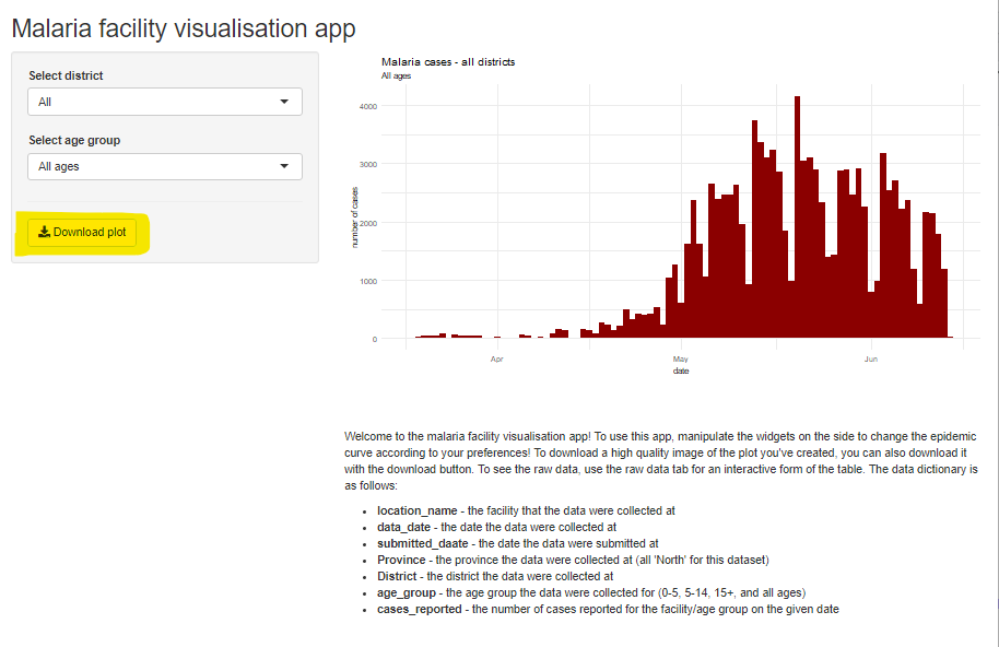
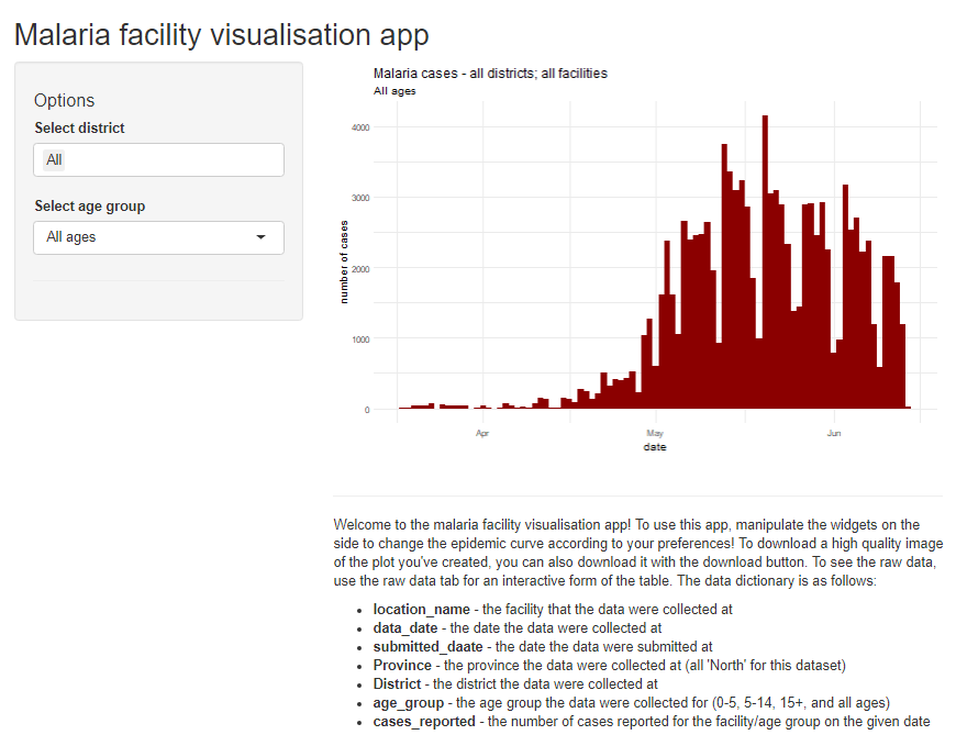
      p("Welcome to the malaria facility visualisation app! To use this app, manipulate the widgets on the side to change the epidemic curve according to your preferences! To download a high quality image of the plot you've created, you can also download it with the download button. To see the raw data, use the raw data tab for an interactive form of the table. The data dictionary is as follows:"),
    tags$ul(
      tags$li(tags$b("location_name"), " - the facility that the data were collected at"),
      tags$li(tags$b("data_date"), " - the date the data were collected at"),
      tags$li(tags$b("submitted_daate"), " - the date the data were submitted at"),
      tags$li(tags$b("Province"), " - the province the data were collected at (all 'North' for this dataset)"),
      tags$li(tags$b("District"), " - the district the data were collected at"),
      tags$li(tags$b("age_group"), " - the age group the data were collected for (0-5, 5-14, 15+, and all ages)"),
      tags$li(tags$b("cases_reported"), " - the number of cases reported for the facility/age group on the given date")
    )

  )
)
)
Adding a link
To add a link to a website, use tags$a() with the link and display text as shown below. To have as a standalone paragraph, put it within p(). To have only a few words of a sentence linked, break the sentence into parts and use tags$a() for the hyperlinked part. To ensure the link opens in a new browser window, add target = "_blank" as an argument.
tags$a(href = "www.epiRhandbook.com", "Visit our website!")Adding a facility selector
Lets move on to our next feature - a selector for specific facilities. We’ll implement another parameter into our function so we can pass this as an argument from our code. Lets look at doing this first - it just operates off the same principles as the other parameters we’ve set up. Lets update and test our function.
plot_epicurve <- function(data, district = "All", agegroup = "malaria_tot", facility = "All") {

  if (!("All" %in% district)) {
    data <- data %>%
      filter(District %in% district)

    plot_title_district <- stringr::str_glue("{paste0(district, collapse = ', ')} districts")

  } else {

    plot_title_district <- "all districts"

  }

  # if no remaining data, return NULL
  if (nrow(data) == 0) {

    return(NULL)
  }

  data <- data %>%
    filter(age_group == agegroup)


  # if no remaining data, return NULL
  if (nrow(data) == 0) {

    return(NULL)
  }

  if (agegroup == "malaria_tot") {
      agegroup_title <- "All ages"
  } else {
    agegroup_title <- stringr::str_glue("{str_remove(agegroup, 'malaria_rdt')} years")
  }

    if (!("All" %in% facility)) {
    data <- data %>%
      filter(location_name == facility)

    plot_title_facility <- facility

  } else {

    plot_title_facility <- "all facilities"

  }

  # if no remaining data, return NULL
  if (nrow(data) == 0) {

    return(NULL)
  }


  ggplot(data, aes(x = data_date, y = cases_reported)) +
    geom_col(width = 1, fill = "darkred") +
    theme_minimal() +
    labs(
      x = "date",
      y = "number of cases",
      title = stringr::str_glue("Malaria cases - {plot_title_district}; {plot_title_facility}"),
      subtitle = agegroup_title
    )


}
Let’s test it:
plot_epicurve(malaria_data, district = "Spring", agegroup = "malaria_rdt_0-4", facility = "Facility 1")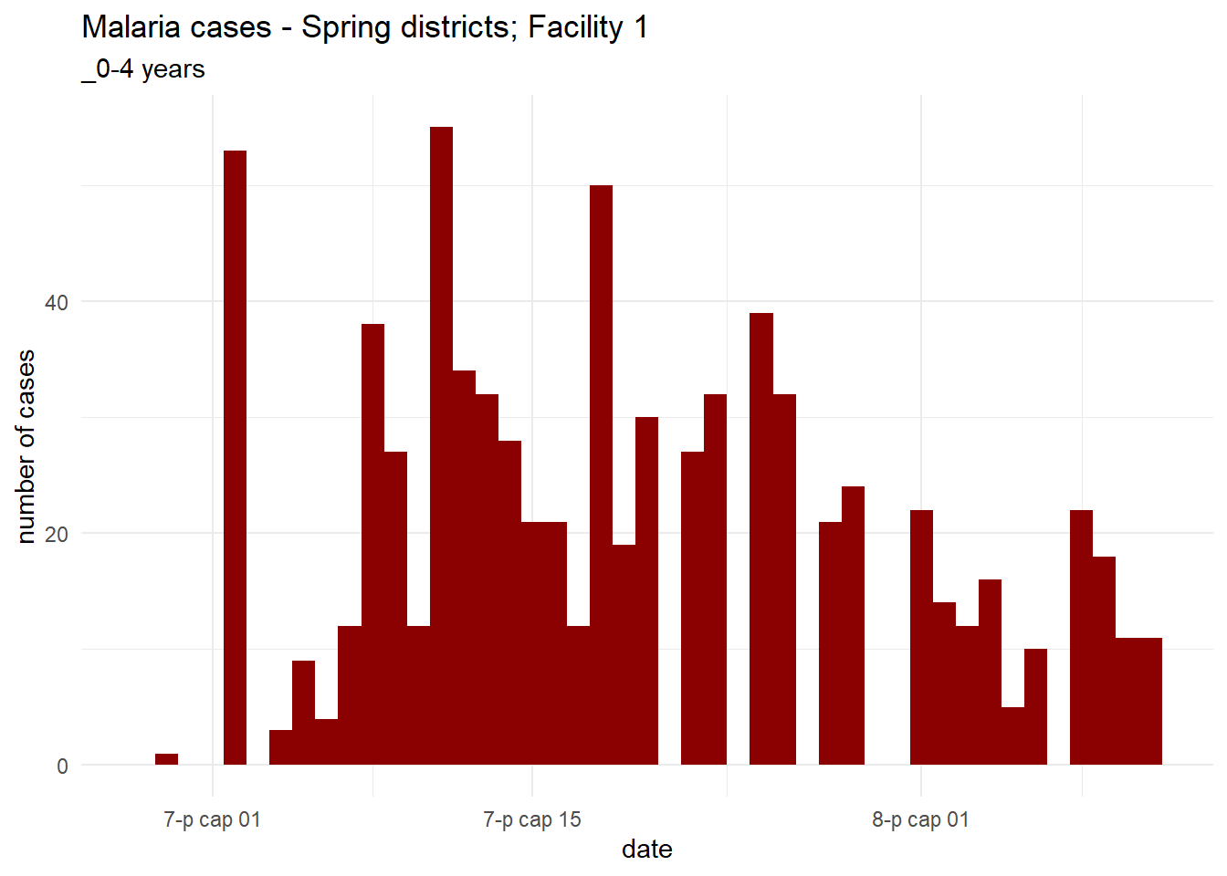
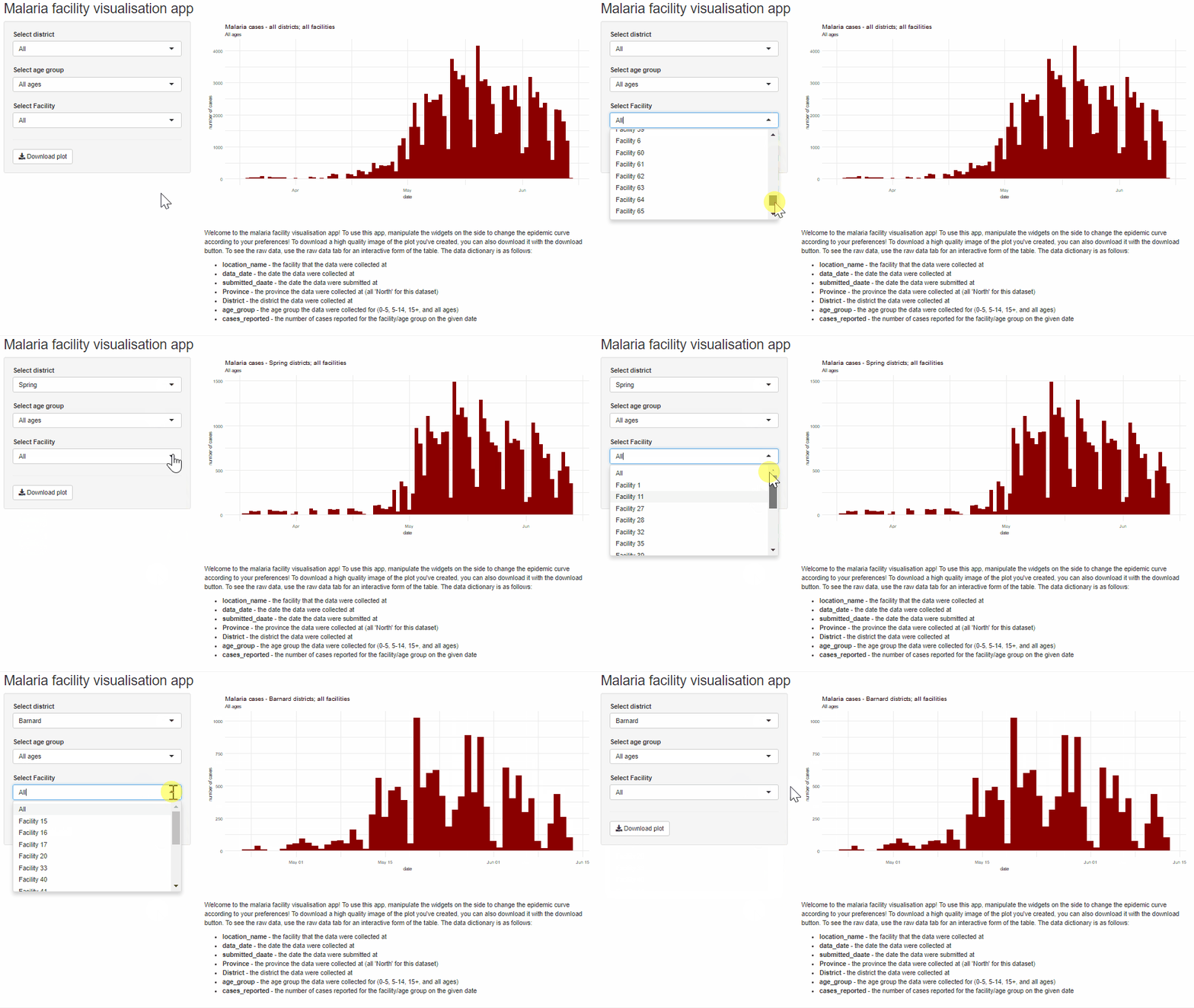
With all the facilites in our data, it isn’t very clear which facilities correspond to which districts - and the end user won’t know either. This might make using the app quite unintuitive. For this reason, we should make the facility options in the UI change dynamically as the user changes the district - so one filters the other! Since we have so many variables that we’re using in the options, we might also want to generate some of our options for the ui in our global.R file from the data. For example, we can add this code chunk to global.R after we’ve read our data in:
all_districts <- c("All", unique(malaria_data$District))

# data frame of location names by district
facility_list <- malaria_data %>%
  group_by(location_name, District) %>%
  summarise() %>%
  ungroup()
Let’s look at them:
all_districts## [1] "All" "Spring" "Bolo" "Dingo" "Barnard"
facility_list## # A tibble: 65 x 2
## location_name District
## <chr> <chr>
## 1 Facility 1 Spring
## 2 Facility 10 Bolo
## 3 Facility 11 Spring
## 4 Facility 12 Dingo
## 5 Facility 13 Bolo
## 6 Facility 14 Dingo
## 7 Facility 15 Barnard
## 8 Facility 16 Barnard
## 9 Facility 17 Barnard
## 10 Facility 18 Bolo
## # ... with 55 more rowsWe can pass these new variables to the ui without any issue, since they are globally visible by both the server and the ui! Lets update our UI:
ui <- fluidPage(

  titlePanel("Malaria facility visualisation app"),

  sidebarLayout(

    sidebarPanel(
         # selector for district
         selectInput(
              inputId = "select_district",
              label = "Select district",
              choices = all_districts,
              selected = "All",
              multiple = FALSE
         ),
         # selector for age group
         selectInput(
              inputId = "select_agegroup",
              label = "Select age group",
              choices = c(
                   "All ages" = "malaria_tot",
                   "0-4 yrs" = "malaria_rdt_0-4",
                   "5-14 yrs" = "malaria_rdt_5-14",
                   "15+ yrs" = "malaria_rdt_15"
              ),
              selected = "All",
              multiple = FALSE
         ),
         # selector for facility
         selectInput(
           inputId = "select_facility",
           label = "Select Facility",
           choices = c("All", facility_list$location_name),
           selected = "All"
         ),

         # horizontal line
         hr(),
         downloadButton(
           outputId = "download_epicurve",
           label = "Download plot"
         )

    ),

    mainPanel(
      # epicurve goes here
      plotOutput("malaria_epicurve"),
      br(),
      hr(),
      p("Welcome to the malaria facility visualisation app! To use this app, manipulate the widgets on the side to change the epidemic curve according to your preferences! To download a high quality image of the plot you've created, you can also download it with the download button. To see the raw data, use the raw data tab for an interactive form of the table. The data dictionary is as follows:"),
      tags$ul(
        tags$li(tags$b("location_name"), " - the facility that the data were collected at"),
        tags$li(tags$b("data_date"), " - the date the data were collected at"),
        tags$li(tags$b("submitted_daate"), " - the date the data were submitted at"),
        tags$li(tags$b("Province"), " - the province the data were collected at (all 'North' for this dataset)"),
        tags$li(tags$b("District"), " - the district the data were collected at"),
        tags$li(tags$b("age_group"), " - the age group the data were collected for (0-5, 5-14, 15+, and all ages)"),
        tags$li(tags$b("cases_reported"), " - the number of cases reported for the facility/age group on the given date")
      )

    )

  )
)
Notice how we’re now passing variables for our choices instead of hard coding them in the ui! This might make our code more compact as well! Lastly, we’ll have to update the server. It will be easy to update our function to incorporate our new input (we just have to pass it as an argument to our new parameter), but we should remember we also want the ui to update dynamically when the user changes the selected district. It is important to understand here that we can change the parameters and behaviour of widgets while the app is running, but this needs to be done in the server. We need to understand a new way to output to the server to learn how to do this.
The functions we need to understand how to do this are known as observer functions, and are similar to reactive functions in how they behave. They have one key difference though:
- Reactive functions do not directly affect outputs, and produce objects that can be seen in other locations in the server
- Observer functions can affect server outputs, but do so via side effects of other functions. (They can also do other things, but this is their main function in practice)
Similar to reactive functions, there are two flavours of observer functions, and they are divided by the same logic that divides reactive functions:
-
observe()- this function runs whenever any inputs used inside of it change -
observeEvent()- this function runs when a user-specified input changes
We also need to understand the shiny-provided functions that update widgets. These are fairly straightforward to run - they first take the session object from the server function (this doesn’t need to be understood for now), and then the inputId of the function to be changed. We then pass new versions of all parameters that are already taken by selectInput() - these will be automatically updated in the widget.
Lets look at an isolated example of how we could use this in our server. When the user changes the district, we want to filter our tibble of facilities by district, and update the choices to only reflect those that are available in that district (and an option for all facilities)
observe({

  if (input$select_district == "All") {
    new_choices <- facility_list$location_name
  } else {
    new_choices <- facility_list %>%
      filter(District == input$select_district) %>%
      pull(location_name)
  }

  new_choices <- c("All", new_choices)

  updateSelectInput(session, inputId = "select_facility",
                    choices = new_choices)

})
And that’s it! we can add it into our server, and that behaviour will now work. Here’s what our new server should look like:
server <- function(input, output, session) {

  malaria_plot <- reactive({
    plot_epicurve(malaria_data, district = input$select_district, agegroup = input$select_agegroup, facility = input$select_facility)
  })


  observe({

    if (input$select_district == "All") {
      new_choices <- facility_list$location_name
    } else {
      new_choices <- facility_list %>%
        filter(District == input$select_district) %>%
        pull(location_name)
    }

    new_choices <- c("All", new_choices)

    updateSelectInput(session, inputId = "select_facility",
                      choices = new_choices)

  })


  output$malaria_epicurve <- renderPlot(
    malaria_plot()
  )

  output$download_epicurve <- downloadHandler(

    filename = function() {
      stringr::str_glue("malaria_epicurve_{input$select_district}.png")
    },

    content = function(file) {
      ggsave(file,
             malaria_plot(),
             width = 8, height = 5, dpi = 300)
    }

  )


}
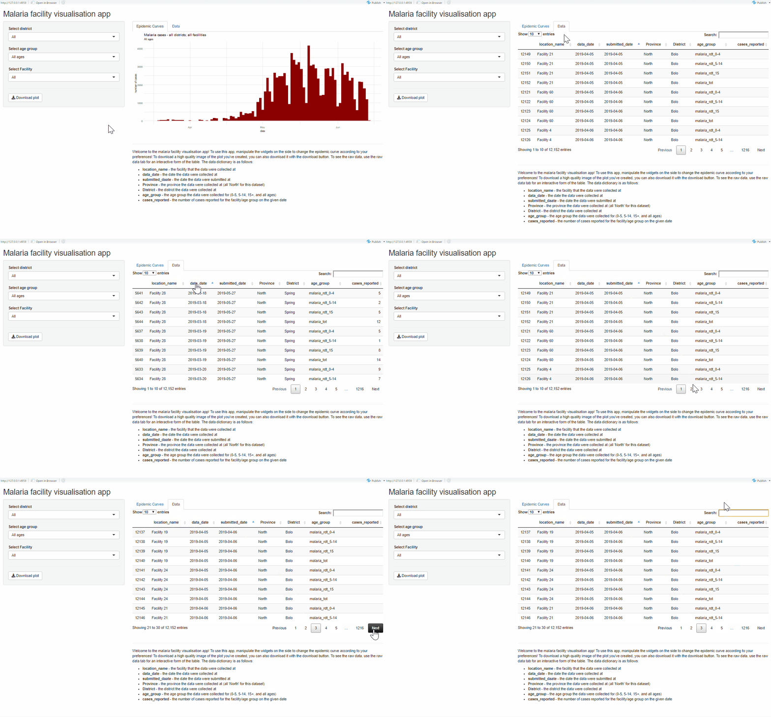
Adding another tab with a table
Now we’ll move on to the last component we want to add to our app. We’ll want to separate our ui into two tabs, one of which will have an interactive table where the user can see the data they are making the epidemic curve with. To do this, we can use the packaged ui elements that come with shiny relevant to tabs. On a basic level, we can enclose most of our main panel in this general structure:
# ... the rest of ui

mainPanel(

  tabsetPanel(
    type = "tabs",
    tabPanel(
      "Epidemic Curves",
      ...
    ),
    tabPanel(
      "Data",
      ...
    )
  )
)
Lets apply this to our ui. We also will want to use the DT package here - this is a great package for making interactive tables from pre-existing data. We can see it being used for DT::datatableOutput() in this example.
ui <- fluidPage(

     titlePanel("Malaria facility visualisation app"),

     sidebarLayout(

          sidebarPanel(
               # selector for district
               selectInput(
                    inputId = "select_district",
                    label = "Select district",
                    choices = all_districts,
                    selected = "All",
                    multiple = FALSE
               ),
               # selector for age group
               selectInput(
                    inputId = "select_agegroup",
                    label = "Select age group",
                    choices = c(
                         "All ages" = "malaria_tot",
                         "0-4 yrs" = "malaria_rdt_0-4",
                         "5-14 yrs" = "malaria_rdt_5-14",
                         "15+ yrs" = "malaria_rdt_15"
                    ),
                    selected = "All",
                    multiple = FALSE
               ),
               # selector for facility
               selectInput(
                    inputId = "select_facility",
                    label = "Select Facility",
                    choices = c("All", facility_list$location_name),
                    selected = "All"
               ),

               # horizontal line
               hr(),
               downloadButton(
                    outputId = "download_epicurve",
                    label = "Download plot"
               )

          ),

          mainPanel(
               tabsetPanel(
                    type = "tabs",
                    tabPanel(
                         "Epidemic Curves",
                         plotOutput("malaria_epicurve")
                    ),
                    tabPanel(
                         "Data",
                         DT::dataTableOutput("raw_data")
                    )
               ),
               br(),
               hr(),
               p("Welcome to the malaria facility visualisation app! To use this app, manipulate the widgets on the side to change the epidemic curve according to your preferences! To download a high quality image of the plot you've created, you can also download it with the download button. To see the raw data, use the raw data tab for an interactive form of the table. The data dictionary is as follows:"),
               tags$ul(
                    tags$li(tags$b("location_name"), " - the facility that the data were collected at"),
                    tags$li(tags$b("data_date"), " - the date the data were collected at"),
                    tags$li(tags$b("submitted_daate"), " - the date the data were submitted at"),
                    tags$li(tags$b("Province"), " - the province the data were collected at (all 'North' for this dataset)"),
                    tags$li(tags$b("District"), " - the district the data were collected at"),
                    tags$li(tags$b("age_group"), " - the age group the data were collected for (0-5, 5-14, 15+, and all ages)"),
                    tags$li(tags$b("cases_reported"), " - the number of cases reported for the facility/age group on the given date")
               )


          )
     )
)
Now our app is arranged into tabs! Lets make the necessary edits to the server as well. Since we dont need to manipulate our dataset at all before we render it this is actually very simple - we just render the malaria_data dataset via DT::renderDT() to the ui!
server <- function(input, output, session) {

  malaria_plot <- reactive({
    plot_epicurve(malaria_data, district = input$select_district, agegroup = input$select_agegroup, facility = input$select_facility)
  })


  observe({

    if (input$select_district == "All") {
      new_choices <- facility_list$location_name
    } else {
      new_choices <- facility_list %>%
        filter(District == input$select_district) %>%
        pull(location_name)
    }

    new_choices <- c("All", new_choices)

    updateSelectInput(session, inputId = "select_facility",
                      choices = new_choices)

  })


  output$malaria_epicurve <- renderPlot(
    malaria_plot()
  )

  output$download_epicurve <- downloadHandler(

    filename = function() {
      stringr::str_glue("malaria_epicurve_{input$select_district}.png")
    },

    content = function(file) {
      ggsave(file,
             malaria_plot(),
             width = 8, height = 5, dpi = 300)
    }

  )

  # render data table to ui
  output$raw_data <- DT::renderDT(
    malaria_data
  )


}
43.8 Further reading
So far, we’ve covered a lot of aspects of shiny, and have barely scratched the surface of what is on offer for shiny. While this guide serves as an introduction, there is loads more to learn to fully understand shiny. You should start making apps and gradually add more and more functionality
43.9 Recommended extension packages
The following represents a selection of high quality shiny extensions that can help you get a lot more out of shiny. In no particular order:
shinyWidgets - this package gives you many many more widgets that can be used in your app. Run
shinyWidgets::shinyWidgetsGallery()to see a selection of available widgets with this package. See examples hereshinyjs - this is an excellent package that gives the user the ability to greatly extend shiny’s utility via a series of javascript. The applications of this package range from very simple to highly advanced, but you might want to first use it to manipulate the ui in simple ways, like hiding/showing elements, or enabling/disabling buttons. Find out more here
shinydashboard - this package massively expands the available ui that can be used in shiny, specifically letting the user create a complex dashboard with a variety of complex layouts. See more here
shinydashboardPlus - get even more features out of the shinydashboard framework! See more here
shinythemes - change the default css theme for your shiny app with a wide range of preset templates! See more here
There are also a number of packages that can be used to create interactive outputs that are shiny compatible.
DT is semi-incorporated into base-shiny, but provides a great set of functions to create interactive tables.
plotly is a package for creating interactive plots that the user can manipulate in app. You can also convert your plot to interactive versions via
plotly::ggplotly()! As alternatives, dygraphs and highcharter are also excellent.
