36 Combinations analysis

This analysis plots the frequency of different combinations of values/responses. In this example, we plot the frequency at which cases exhibited various combinations of symptoms.
This analysis is also often called:
-
“Multiple response analysis”
-
“Sets analysis”
- “Combinations analysis”
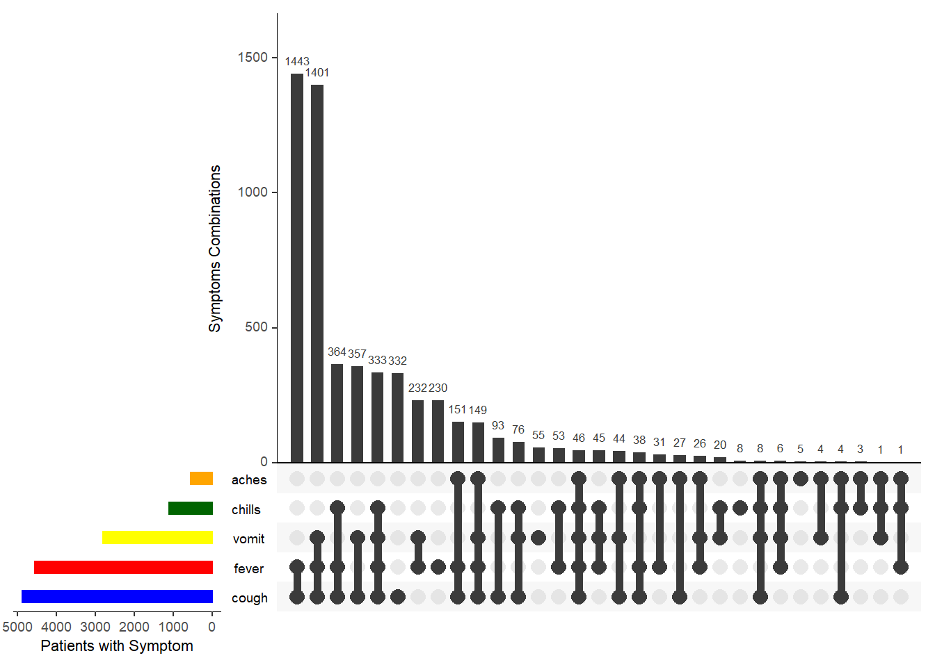
In the example plot above, five symptoms are shown. Below each vertical bar is a line and dots indicating the combination of symptoms reflected by the bar above. To the right, horizontal bars reflect the frequency of each individual symptom.
The first method we show uses the package ggupset, and the second uses the package UpSetR.
36.1 Preparation
Load packages
This code chunk shows the loading of packages required for the analyses. In this handbook we emphasize p_load() from pacman, which installs the package if necessary and loads it for use. You can also load installed packages with library() from base R. See the page on [R basics] for more information on R packages.
pacman::p_load(
  tidyverse,     # data management and visualization
  UpSetR,        # special package for combination plots
  ggupset)       # special package for combination plots
Import data
To begin, we import the cleaned linelist of cases from a simulated Ebola epidemic. If you want to follow along, click to download the “clean” linelist (as .rds file). Import data with the import() function from the rio package (it handles many file types like .xlsx, .csv, .rds - see the [Import and export] page for details).
# import case linelist
linelist_sym <- import("linelist_cleaned.rds")
This linelist includes five “yes/no” variables on reported symptoms. We will need to transform these variables a bit to use the ggupset package to make our plot. View the data (scroll to the right to see the symptoms variables).
Re-format values
To align with the format expected by ggupset we convert the “yes” and “no” the the actual symptom name, using case_when() from dplyr. If “no”, we set the value as blank, so the values are eiter NA or the symptom.
# create column with the symptoms named, separated by semicolons
linelist_sym_1 <- linelist_sym %>%

  # convert the "yes" and "no" values into the symptom name itself
  mutate(
    fever = case_when(
      fever == "yes" ~ "fever",          # if old value is "yes", new value is "fever"
      TRUE           ~ NA_character_),   # if old value is anything other than "yes", the new value is NA

    chills = case_when(
       chills == "yes" ~ "chills",
       TRUE           ~ NA_character_),

    cough = case_when(
      cough == "yes" ~ "cough",
      TRUE           ~ NA_character_),

    aches = case_when(
      aches == "yes" ~ "aches",
      TRUE           ~ NA_character_),

    vomit = case_when(
      vomit == "yes" ~ "vomit",
      TRUE           ~ NA_character_)
    )
Now we make two final columns:
- Concatenating (gluing together) all the symptoms of the patient (a character column)
- Convert the above column to class list, so it can be accepted by ggupset to make the plot
See the page on Characters and strings to learn more about the unite() function from stringr
linelist_sym_1 <- linelist_sym_1 %>%
  unite(col = "all_symptoms",
        c(fever, chills, cough, aches, vomit),
        sep = "; ",
        remove = TRUE,
        na.rm = TRUE) %>%
  mutate(
    # make a copy of all_symptoms column, but of class "list" (which is required to use ggupset() in next step)
    all_symptoms_list = as.list(strsplit(all_symptoms, "; "))
    )
View the new data. Note the two columns towards the right end - the pasted combined values, and the list
36.2 ggupset
Load the package
pacman::p_load(ggupset)Create the plot. We begin with a ggplot() and geom_bar(), but then we add the special function scale_x_upset() from the ggupset.
ggplot(
  data = linelist_sym_1,
  mapping = aes(x = all_symptoms_list)) +
geom_bar() +
scale_x_upset(
  reverse = FALSE,
  n_intersections = 10,
  sets = c("fever", "chills", "cough", "aches", "vomit"))+
labs(
  title = "Signs & symptoms",
  subtitle = "10 most frequent combinations of signs and symptoms",
  caption = "Caption here.",
  x = "Symptom combination",
  y = "Frequency in dataset")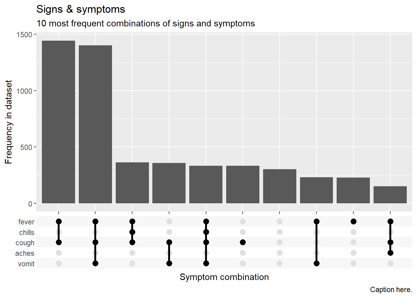
More information on ggupset can be found online or offline in the package documentation in your RStudio Help tab ?ggupset.
36.3 UpSetR
The UpSetR package allows more customization of the plot, but it can be more difficult to execute:
Load package
pacman::p_load(UpSetR)Data cleaning
We must convert the linelist symptoms values to 1 / 0.
# Make using upSetR

linelist_sym_2 <- linelist_sym %>%

  # convert the "yes" and "no" values into the symptom name itself
  mutate(
    fever = case_when(
      fever == "yes" ~ 1,    # if old value is "yes", new value is 1
      TRUE           ~ 0),   # if old value is anything other than "yes", the new value is 0

    chills = case_when(
      chills == "yes" ~ 1,
      TRUE           ~ 0),

    cough = case_when(
      cough == "yes" ~ 1,
      TRUE           ~ 0),

    aches = case_when(
      aches == "yes" ~ 1,
      TRUE           ~ 0),

    vomit = case_when(
      vomit == "yes" ~ 1,
      TRUE           ~ 0)
    )
Now make the plot using the custom function upset() - using only the symptoms columns. You must designate which “sets” to compare (the names of the symptom columns). Alternatively, use nsets = and order.by = "freq" to only show the top X combinations.
# Make the plot
UpSetR::upset(
  select(linelist_sym_2, fever, chills, cough, aches, vomit),
  sets = c("fever", "chills", "cough", "aches", "vomit"),
  order.by = "freq",
  sets.bar.color = c("blue", "red", "yellow", "darkgreen", "orange"), # optional colors
  empty.intersections = "on",
  # nsets = 3,
  number.angles = 0,
  point.size = 3.5,
  line.size = 2,
  mainbar.y.label = "Symptoms Combinations",
  sets.x.label = "Patients with Symptom")