42 Dashboards with R Markdown
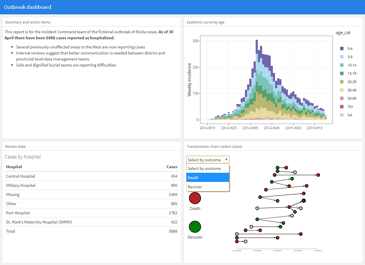
This page will cover the basic use of the flexdashboard package. This package allows you to easily format R Markdown output as a dashboard with panels and pages. The dashboard content can be text, static figures/tables or interactive graphics.
Advantages of flexdashboard:
- It requires minimal non-standard R coding - with very little practice you can quickly create a dashboard
- The dashboard can usually be emailed to colleagues as a self-contained HTML file - no server required
- You can combine flexdashboard with shiny, ggplotly, and other “html widgets” to add interactivity
Disadvantages of flexdashboard:
- Less customization as compared to using shiny alone to create a dashboard
Very comprehensive tutorials on using flexdashboard that informed this page can be found in the Resources section. Below we describe the core features and give an example of building a dashboard to explore an outbreak, using the case linelist data.
42.1 Preparation
Load packages
In this handbook we emphasize p_load() from pacman, which installs the package if necessary and loads it for use. You can also load installed packages with library() from base R. See the page on [R basics] for more information on R packages.
pacman::p_load(
  rio,             # data import/export
  here,            # locate files
  tidyverse,       # data management and visualization
  flexdashboard,   # dashboard versions of R Markdown reports
  shiny,           # interactive figures
  plotly           # interactive figures
)
## Installing package into 'C:/Users/Temuulen/Documents/R/win-library/4.1'
## (as 'lib' is unspecified)## Warning: unable to access index for repository http://www.stats.ox.ac.uk/pub/RWin/bin/windows/contrib/4.1:
## cannot open URL 'http://www.stats.ox.ac.uk/pub/RWin/bin/windows/contrib/4.1/PACKAGES'## package 'flexdashboard' successfully unpacked and MD5 sums checked
##
## The downloaded binary packages are in
## C:\Users\Temuulen\AppData\Local\Temp\Rtmp4kiPpA\downloaded_packages##
## flexdashboard installedImport data
We import the dataset of cases from a simulated Ebola epidemic. If you want to follow along, click to download the “clean” linelist (as .rds file). Import data with the import() function from the rio package (it handles many file types like .xlsx, .csv, .rds - see the [Import and export] page for details).
# import the linelist
linelist <- import("linelist_cleaned.rds")
The first 50 rows of the linelist are displayed below.
42.2 Create new R Markdown
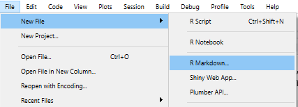
After you have installed the package, create a new R Markdown file by clicking through to File > New file > R Markdown.
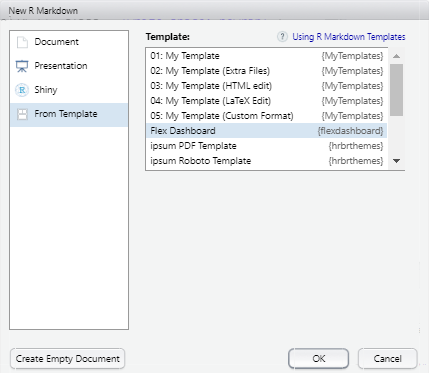
In the window that opens, select “From Template” and select the “Flex Dashboard” template. You will then be prompted to name the document. In this page’s example, we will name our R Markdown as “outbreak_dashboard.Rmd”.
42.3 The script
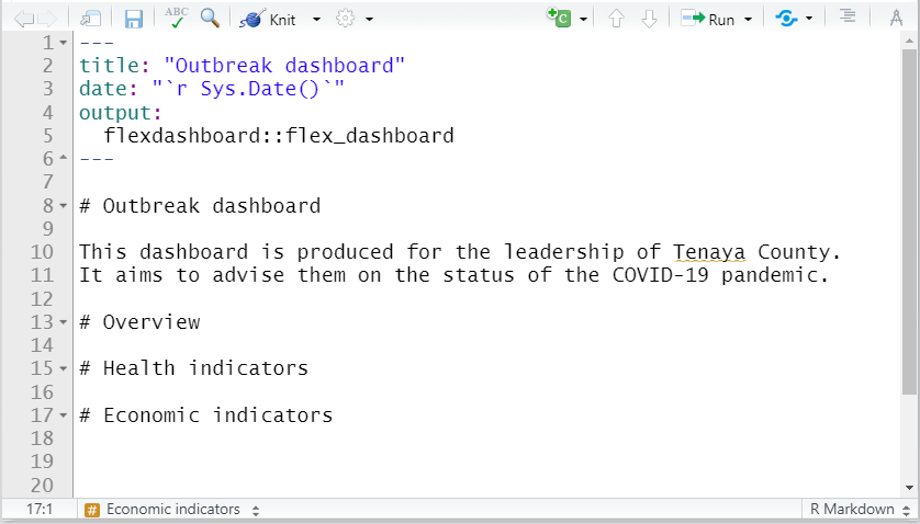
The script is an R Markdown script, and so has the same components and organization as described in the page on Reports with R Markdown. We briefly re-visit these and highlight differences from other R Markdown output formats.
YAML
At the top of the script is the “YAML” header. This must begin with three dashes --- and must close with three dashes ---. YAML parameters comes in key:value pairs. The indentation and placement of colons in YAML is important - the key:value pairs are separated by colons (not equals signs!).
The YAML should begin with metadata for the document. The order of these primary YAML parameters (not indented) does not matter. For example:
title: "My document"
author: "Me"
date: "`r Sys.Date()`"
You can use R code in YAML values by putting it like in-line code (preceeded by r within backticks) but also within quotes (see above for Date).
A required YAML parameter is output:, which specifies the type of file to be produced (e.g. html_document, pdf_document, word_document, or powerpoint_presentation). For flexdashboard this parameter value is a bit confusing - it must be set as output:flexdashboard::flex_dashboard. Note the single and double colons, and the underscore. This YAML output parameter is often followed by an additional colon and indented sub-parameters (see orientation: and vertical_layout: parameters below).
title: "My dashboard"
author: "Me"
date: "`r Sys.Date()`"
output:
  flexdashboard::flex_dashboard:
    orientation: rows
    vertical_layout: scroll
As shown above, indentations (2 spaces) are used for sub-parameters. In this case, do not forget to put an additional colon after the primary, like key:value:.
If appropriate, logical values should be given in YAML in lowercase (true, false, null). If a colon is part of your value (e.g. in the title) put the value in quotes. See the examples in sections below.
Code chunks
An R Markdown script can contain multiple code “chunks” - these are areas of the script where you can write multiple-line R code and they function just like mini R scripts.
Code chunks are created with three back-ticks and curly brackets with a lowercase “r” within. The chunk is closed with three backticks. You can create a new chunk by typing it out yourself, by using the keyboard shortcut “Ctrl + Alt + i” (or Cmd + Shift + r in Mac), or by clicking the green ‘insert a new code chunk’ icon at the top of your script editor. Many examples are given below.
Narrative text
Outside of an R code “chunk”, you can write narrative text. As described in the page on Reports with R Markdown, you can italicize text by surrounding it with one asterisk (*), or bold by surrounding it with two asterisks (**). Recall that bullets and numbering schemes are sensitive to newlines, indentation, and finishing a line with two spaces.
You can also insert in-line R code into text as described in the Reports with R Markdown page, by surrounding the code with backticks and starting the command with “r”: ` 1+1`(see example with date above).
Headings
Different heading levels are established with different numbers of hash symbols, as described in the Reports with R Markdown page.
In flexdashboard, a primary heading (#) creates a “page” of the dashboard. Second-level headings (##) create a column or a row depending on your orientation: parameter (see details below). Third-level headings (###) create panels for plots, charts, tables, text, etc.
# First-level heading (page)

## Second level heading (row or column)

### Third-level heading (pane for plot, chart, etc.)
42.4 Section attributes
As in a normal R markdown, you can specify attributes to apply to parts of your dashboard by including key=value options after a heading, within curly brackets { }. For example, in a typical HTML R Markdown report you might organize sub-headings into tabs with ## My heading {.tabset}.
Note that these attributes are written after a heading in a text portion of the script. These are different than the knitr options inserted within at the top of R code chunks, such as out.height =.
Section attributes specific to flexdashboard include:
-
{data-orientation=}Set to eitherrowsorcolumns. If your dashboard has multiple pages, add this attribute to each page to indicate orientation (further explained in layout section).
-
{data-width=}and{data-height=}set relative size of charts, columns, rows laid out in the same dimension (horizontal or vertical). Absolute sizes are adjusted to best fill the space on any display device thanks to the flexbox engine.- Height of charts also depends on whether you set the YAML parameter
vertical_layout: fillorvertical_layout: scroll. If set to scroll, figure height will reflect the traditionalfig.height =option in the R code chunk.
- See complete size documentation at the flexdashboard website
- Height of charts also depends on whether you set the YAML parameter
-
{.hidden}Use this to exclude a specific page from the navigation bar
-
{data-navbar=}Use this in a page-level heading to nest it within a navigation bar drop-down menu. Provide the name (in quotes) of the drop-down menu. See example below.
42.5 Layout
Adjust the layout of your dashboard in the following ways:
- Add pages, columns/rows, and charts with R Markdown headings (e.g. #, ##, or ###)
- Adjust the YAML parameter
orientation:to eitherrowsorcolumns
- Specify whether the layout fills the browser or allows scrolling
- Add tabs to a particular section heading
Pages
First-level headings (#) in the R Markdown will represent “pages” of the dashboard. By default, pages will appear in a navigation bar along the top of the dashboard.

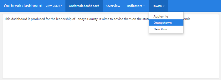
You can group pages into a “menu” within the top navigation bar by adding the attribute {data-navmenu=} to the page heading. Be careful - do not include spaces around the equals sign otherwise it will not work!
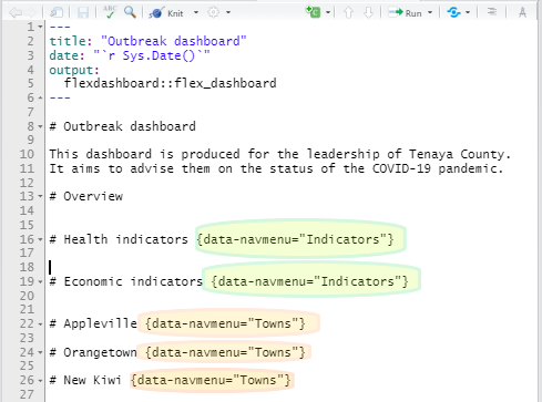
Here is what the script produces:
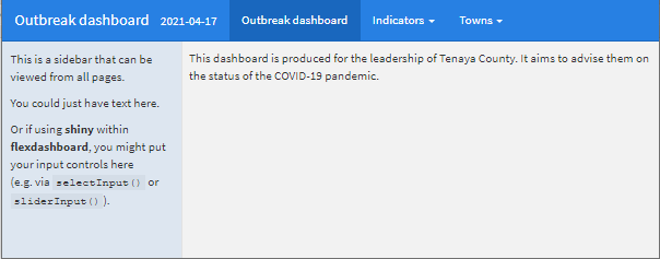
You can also convert a page or a column into a “sidebar” on the left side of the dashboard by adding the {.sidebar} attribute. It can hold text (viewable from any page), or if you have integrated shiny interactivity it can be useful to hold user-input controls such as sliders or drop-down menus.
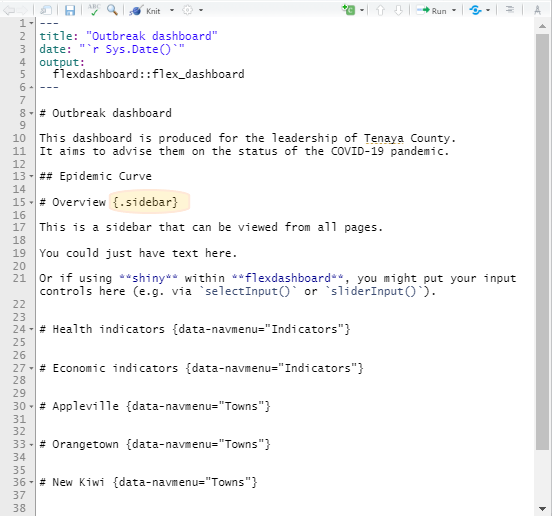
Here is what the script produces:
Orientation
Set the orientation: yaml parameter to indicate how your second-level (##) R Markdown headings should be interpreted - as either orientation: columns or orientation: rows.
Second-level headings (##) will be interpreted as new columns or rows based on this orientation setting.
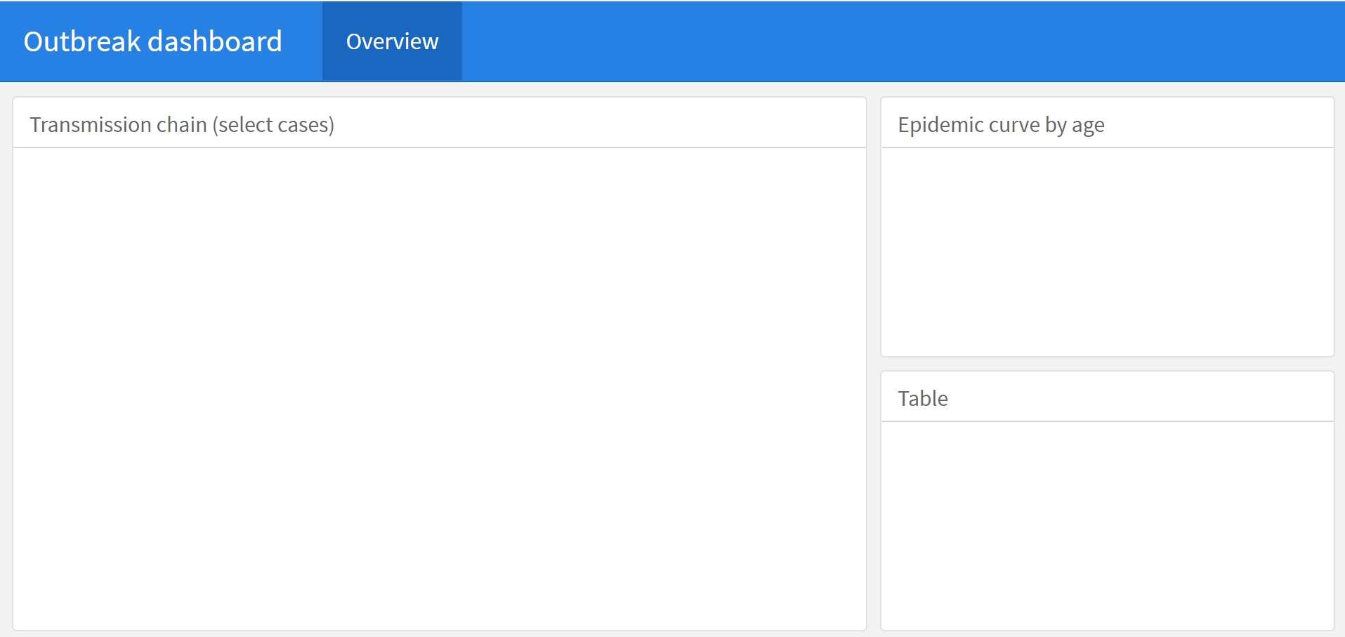
If you set orientation: columns, second-level headers will create new columns in the dashboard. The below dashboard has one page, containing two columns, with a total of three panels. You can adjust the relative width of the columns with {data-width=} as shown below.
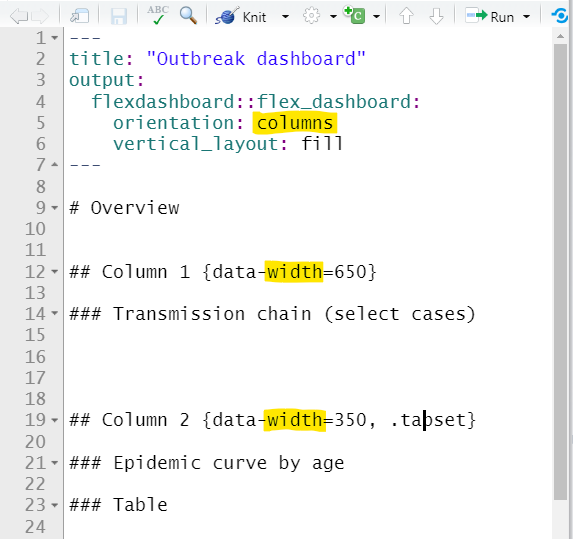
Here is what the script produces:
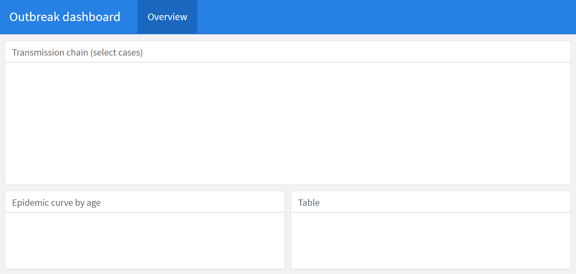
If you set orientation: rows, second-level headers will create new rows instead of columns. Below is the same script as above, but orientation: rows so that second-level headings produce rows instead of columns. You can adjust the relative height of the rows with {data-height=} as shown below.
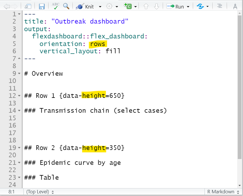
Here is what the script produces:
If your dashboard has multiple pages, you can designate the orientation for each specific page by adding the {data-orientation=} attribute the header of each page (specify either rows or columns without quotes).
Tabs
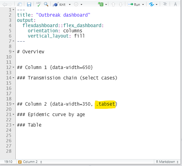
You can divide content into tabs with the {.tabset} attribute, as in other HTML R Markdown outputs.
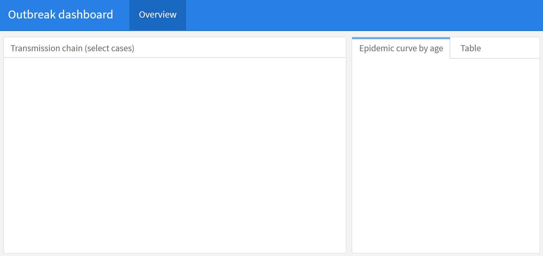
Simply add this attribute after the desired heading. Sub-headings under that heading will be displayed as tabs. For example, in the example script below column 2 on the right (##) is modified so that the epidemic curve and table panes (###) are displayed in tabs.
You can do the same with rows if your orientation is rows.
Here is what the script produces:
42.6 Adding content
Let’s begin to build a dashboard. Our simple dashboard will have 1 page, 2 columns, and 4 panels. We will build the panels piece-by-piece for demonstration.
You can easily include standard R outputs such as text, ggplots, and tables (see Tables for presentation page). Simply code them within an R code chunk as you would for any other R Markdown script.
Note: you can download the finished Rmd script and HTML dashboard output - see the [Download handbook and data] page.
Text
You can type in Markdown text and include in-line code as for any other R Markdown output. See the Reports with R Markdown page for details.
In this dashboard we include a summary text panel that includes dynamic text showing the latest hospitalisation date and number of cases reported in the outbreak.
Tables
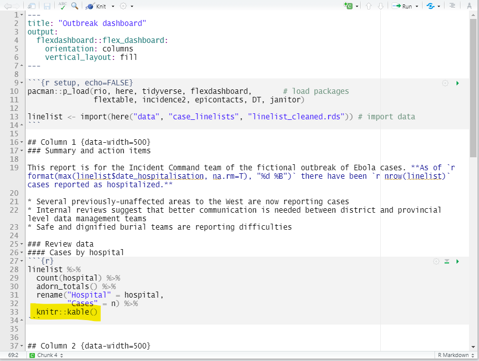
You can include R code chunks that print outputs such as tables. But the output will look best and respond to the window size if you use the kable() function from knitr to display your tables. The flextable functions may produce tables that are shortened / cut-off.
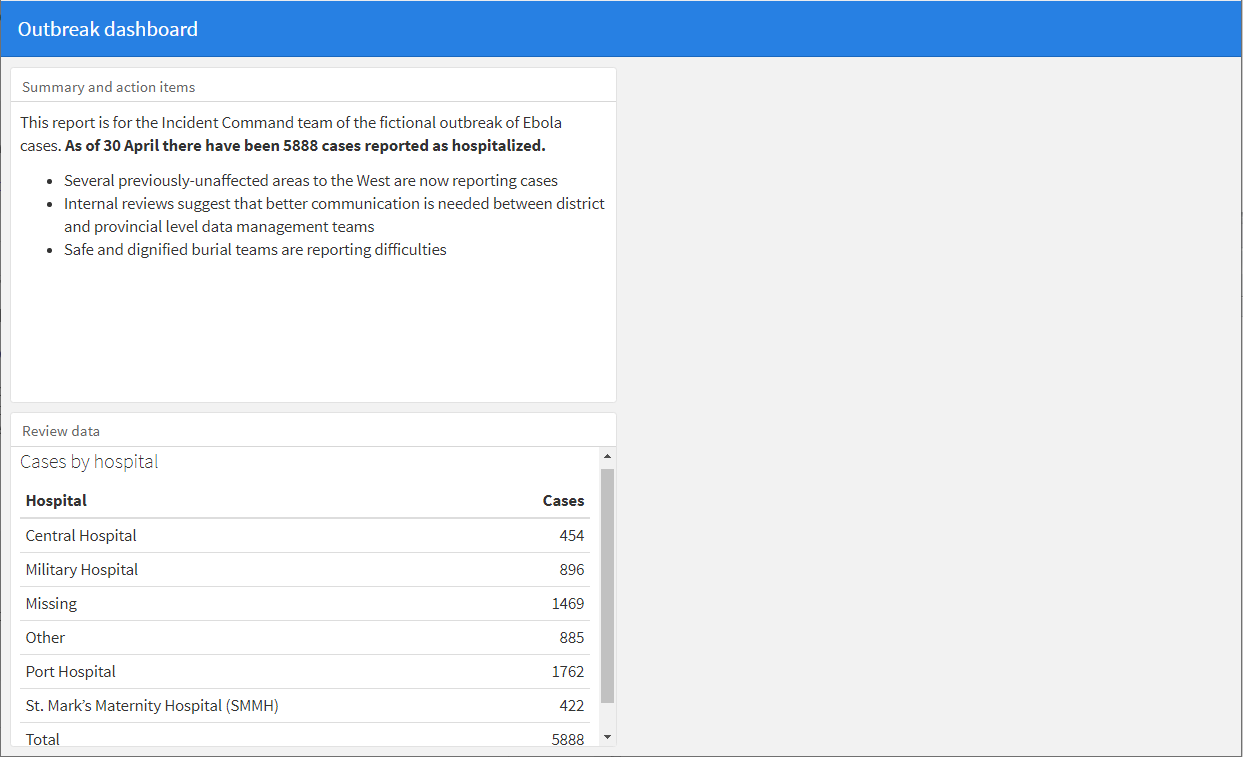
For example, below we feed the linelist() through a count() command to produce a summary table of cases by hospital. Ultimately, the table is piped to knitr::kable() and the result has a scroll bar on the right. You can read more about customizing your table with kable() and kableExtra here.
Here is what the script produces:
If you want to show a dynamic table that allows the user to filter, sort, and/or click through “pages” of the data frame, use the package DT and it’s function datatable(), as in the code below.
The example code below, the data frame linelist is printed. You can set rownames = FALSE to conserve horizontal space, and filter = "top" to have filters on top of every column. A list of other specifications can be provided to options =. Below, we set pageLength = so that 5 rows appear and scrollX = so the user can use a scroll bar on the bottom to scroll horizontally. The argument class = 'white-space: nowrap' ensures that each row is only one line (not multiple lines). You can read about other possible arguments and values here or by entering ?datatable
Plots
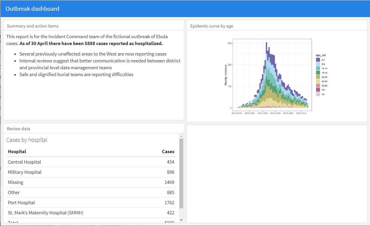
You can print plots to a dashboard pane as you would in an R script. In our example, we use the incidence2 package to create an “epicurve” by age group with two simple commands (see Epidemic curves page). However, you could use ggplot() and print a plot in the same manner.
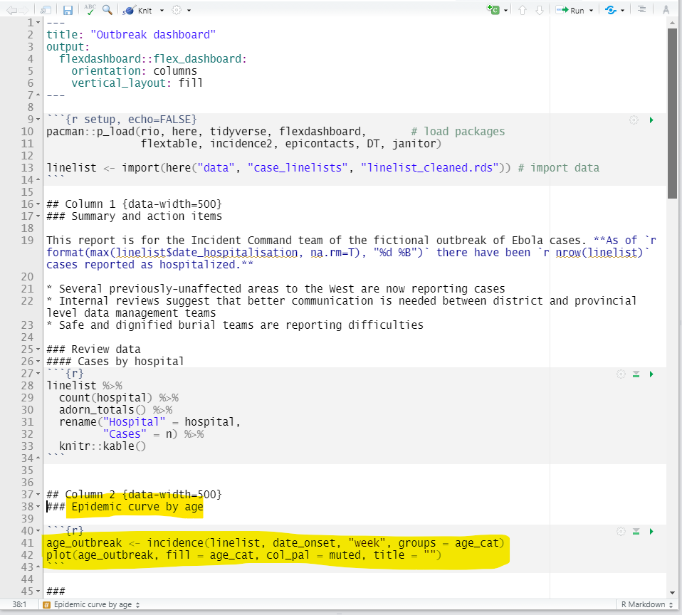
Here is what the script produces:
Interactive plots
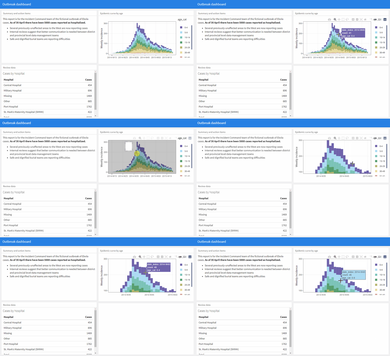
You can also pass a standard ggplot or other plot object to ggplotly() from the plotly package (see the Interactive plots page). This will make your plot interactive, allow the reader to “zoom in”, and show-on-hover the value of every data point (in this scenario the number of cases per week and age group in the curve).
age_outbreak <- incidence(linelist, date_onset, "week", groups = age_cat)
plot(age_outbreak, fill = age_cat, col_pal = muted, title = "") %>%
  plotly::ggplotly()
Here is what this looks like in the dashboard (gif). This interactive functionality will still work even if you email the dashboard as a static file (not online on a server).
HTML widgets
HTML widgets for R are a special class of R packages that increases interactivity by utilizing JavaScript libraries. You can embed them in R Markdown outputs (such as a flexdashboard) and in Shiny dashboards.
Some common examples of these widgets include:
- Plotly (used in this handbook page and in the [Interative plots] page)
- visNetwork (used in the Transmission Chains page of this handbook)
- Leaflet (used in the GIS Basics page of this handbook)
- dygraphs (useful for interactively showing time series data)
- DT (
datatable()) (used to show dynamic tables with filter, sort, etc.)
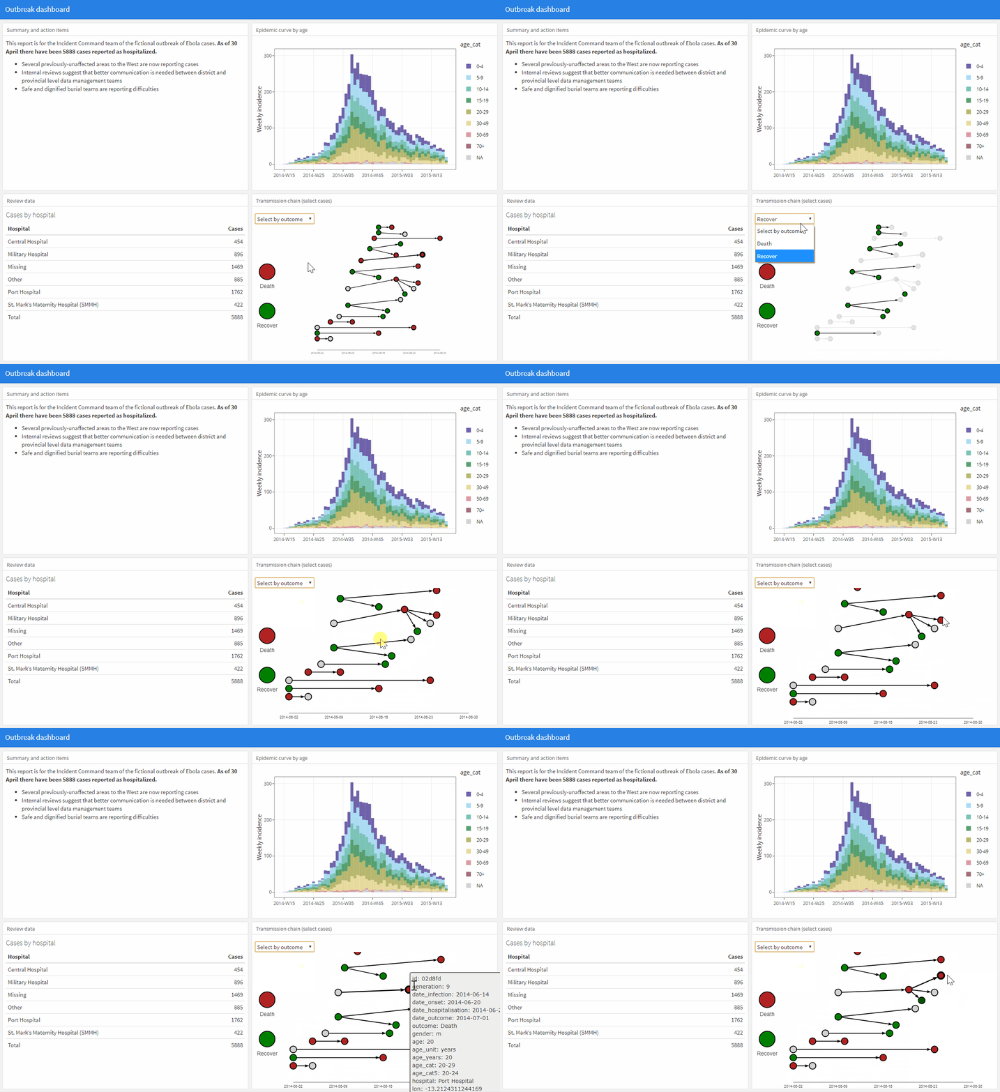
Below we demonstrate adding an epidemic transmission chain which uses visNetwork to the dashboard. The script shows only the new code added to the “Column 2” section of the R Markdown script. You can find the code in the Transmission chains page of this handbook.
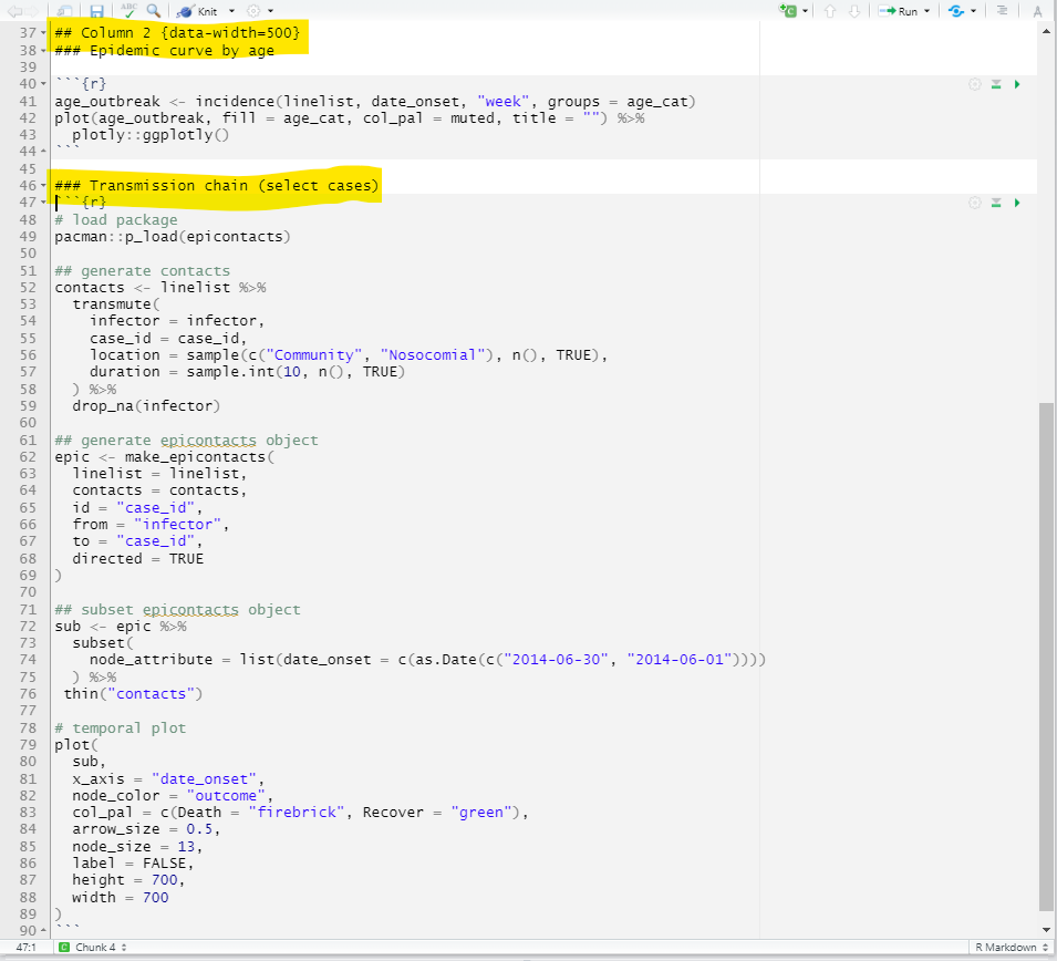
Here is what the script produces:
42.7 Code organization
You may elect to have all code within the R Markdown flexdashboard script. Alternatively, to have a more clean and concise dashboard script you may choose to call upon code/figures that are hosted or created in external R scripts. This is described in greater detail in the Reports with R Markdown page.
42.8 Shiny
Integrating the R package shiny can make your dashboards even more reactive to user input. For example, you could have the user select a jurisdiction, or a date range, and have panels react to their choice (e.g. filter the data displayed). To embed shiny reactivity into flexdashboard, you need only make a few changes to your flexdashboard R Markdown script.
You can use shiny to produce apps/dashboards without flexdashboard too. The handbook page on Dashboards with Shiny gives an overview of this approach, including primers on shiny syntax, app file structure, and options for sharing/publishing (including free server options). These syntax and general tips translate into the flexdashboard context as well.
Embedding shiny in flexdashboard is however, a fundamental change to your flexdashboard. It will no longer produce an HTML output that you can send by email and anyone could open and view. Instead, it will be an “app”. The “Knit” button at the top of the script will be replaced by a “Run document” icon, which will open an instance of the interactive the dashboard locally on your computer.
Sharing your dashboard will now require that you either:
- Send the Rmd script to the viewer, they open it in R on their computer, and run the app, or
- The app/dashboard is hosted on a server accessible to the viewer
Thus, there are benefits to integrating shiny, but also complications. If easy sharing by email is a priority and you don’t need shiny reactive capabilities, consider the reduced interactivity offered by ggplotly() as demonstrated above.
Below we give a very simple example using the same “outbreak_dashboard.Rmd” as above. Extensive documentation on integrating Shiny into flexdashboard is available online here.
Settings
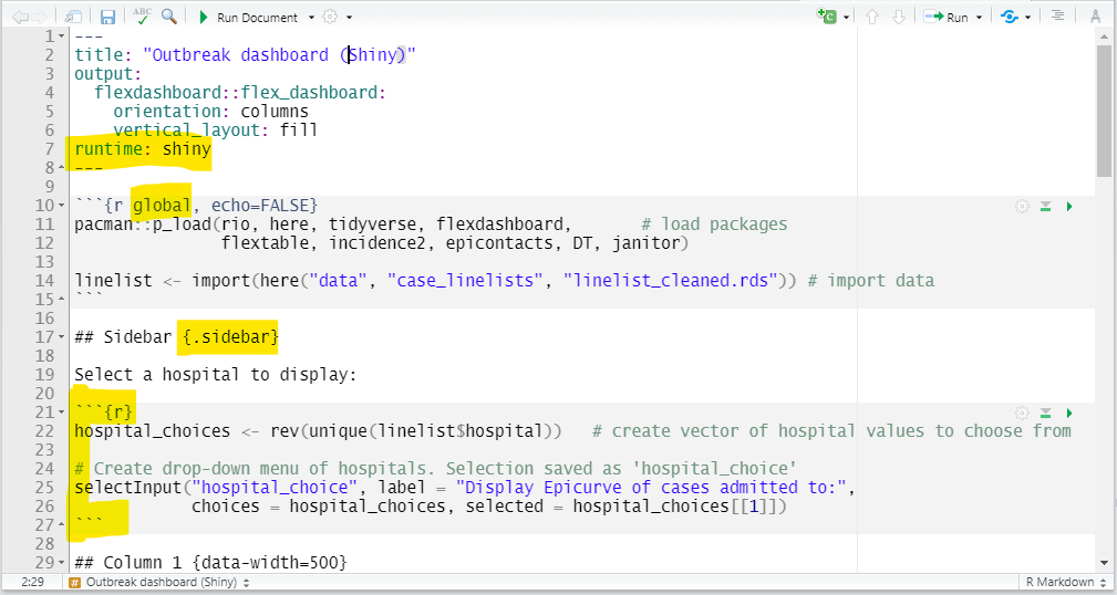
Enable shiny in a flexdashboard by adding the YAML parameter runtime: shiny at the same indentation level as output:, as below:
---
title: "Outbreak dashboard (Shiny demo)"
output:
  flexdashboard::flex_dashboard:
    orientation: columns
    vertical_layout: fill
runtime: shiny
---
It is also convenient to enable a “side bar” to hold the shiny input widgets that will collect information from the user. As explained above, create a column and indicate the {.sidebar} option to create a side bar on the left side. You can add text and R chunks containing the shiny input commands within this column.
If your app/dashboard is hosted on a server and may have multiple simultaneous users, name the first R code chunk as global. Include the commands to import/load your data in this chunk. This special named chunk is treated differently, and the data imported within it are only imported once (not continuously) and are available for all users. This improves the start-up speed of the app.
Worked example
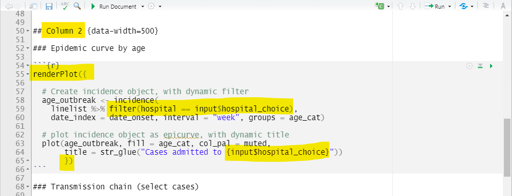
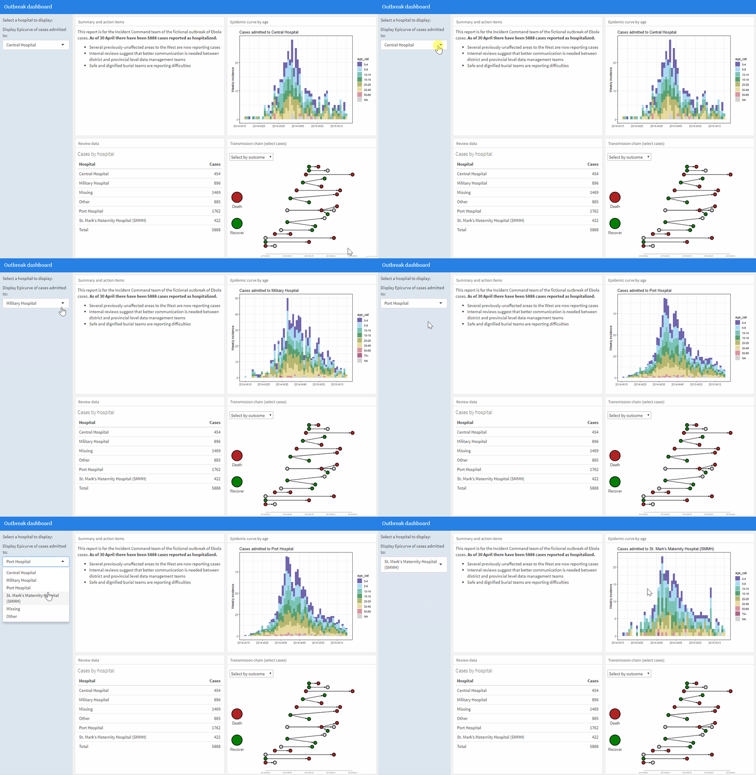
Here we adapt the flexdashboard script “outbreak_dashboard.Rmd” to include shiny. We will add the capability for the user to select a hospital from a drop-down menu, and have the epidemic curve reflect only cases from that hospital, with a dynamic plot title. We do the following:
- Add
runtime: shinyto the YAML
- Re-name the setup chunk as
global
- Create a sidebar containing:
- Code to create a vector of unique hospital names
- A
selectInput()command (shiny drop-down menu) with the choice of hospital names. The selection is saved ashospital_choice, which can be referenced in later code asinput$hospital_choice
- Code to create a vector of unique hospital names
- The epidemic curve code (column 2) is wrapped within
renderPlot({ }), including:- A filter on the dataset restricting the column
hospitalto the current value ofinput$hospital_choice
- A dynamic plot title that incorporates
input$hospital_choice
- A filter on the dataset restricting the column
Note that any code referencing an input$ value must be within a render({}) function (to be reactive).
Here is the top of the script, including YAML, global chunk, and sidebar:
Here is the Column 2, with the reactive epicurve plot:
And here is the dashboard:
Other examples
To read a health-related example of a Shiny-flexdashboard using the shiny interactivity and the leaflet mapping widget, see this chapter of the online book Geospatial Health Data: Modeling and Visualization with R-INLA and Shiny.
42.10 Resources
Excellent tutorials that informed this page can be found below. If you review these, most likely within an hour you can have your own dashboard.
https://bookdown.org/yihui/rmarkdown/dashboards.html
https://rmarkdown.rstudio.com/flexdashboard/