31 ggplot tips
In this page we will cover tips and tricks to make your ggplots sharp and fancy. See the page on ggplot basics for the fundamentals.
There a several extensive ggplot2 tutorials linked in the Resources section. You can also download this data visualization with ggplot cheatsheet from the RStudio website. We strongly recommend that you peruse for inspiration at the R graph gallery and Data-to-viz.
31.1 Preparation
Load packages
This code chunk shows the loading of packages required for the analyses. In this handbook we emphasize p_load() from pacman, which installs the package if necessary and loads it for use. You can also load installed packages with library() from base R. See the page on [R basics] for more information on R packages.
pacman::p_load(
  tidyverse,      # includes ggplot2 and other
  rio,            # import/export
  here,           # file locator
  stringr,        # working with characters
  scales,         # transform numbers
  ggrepel,        # smartly-placed labels
  gghighlight,    # highlight one part of plot
  RColorBrewer    # color scales
)
Import data
For this page, we import the dataset of cases from a simulated Ebola epidemic. If you want to follow along, click to download the “clean” linelist (as .rds file). Import data with the import() function from the rio package (it handles many file types like .xlsx, .csv, .rds - see the [Import and export] page for details).
linelist <- rio::import("linelist_cleaned.rds")The first 50 rows of the linelist are displayed below.
31.2 Scales for color, fill, axes, etc.
In ggplot2, when aesthetics of plotted data (e.g. size, color, shape, fill, plot axis) are mapped to columns in the data, the exact display can be adjusted with the corresponding “scale” command. In this section we explain some common scale adjustments.
31.2.1 Color schemes
One thing that can initially be difficult to understand with ggplot2 is control of color schemes. Note that this section discusses the color of plot objects (geoms/shapes) such as points, bars, lines, tiles, etc. To adjust color of accessory text, titles, or background color see the Themes section of the ggplot basics page.
To control “color” of plot objects you will be adjusting either the color = aesthetic (the exterior color) or the fill = aesthetic (the interior color). One exception to this pattern is geom_point(), where you really only get to control color =, which controls the color of the point (interior and exterior).
When setting colour or fill you can use colour names recognized by R like "red" (see complete list or enter ?colors), or a specific hex colour such as "#ff0505".
# histogram -
ggplot(data = linelist, mapping = aes(x = age))+       # set data and axes
  geom_histogram(              # display histogram
    binwidth = 7,                # width of bins
    color = "red",               # bin line color
fill = "lightblue") # bin interior color (fill) 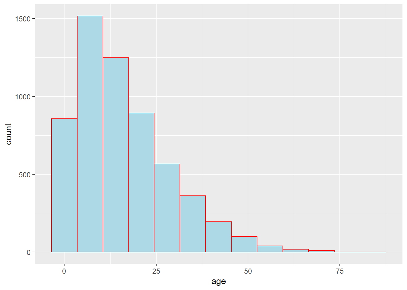
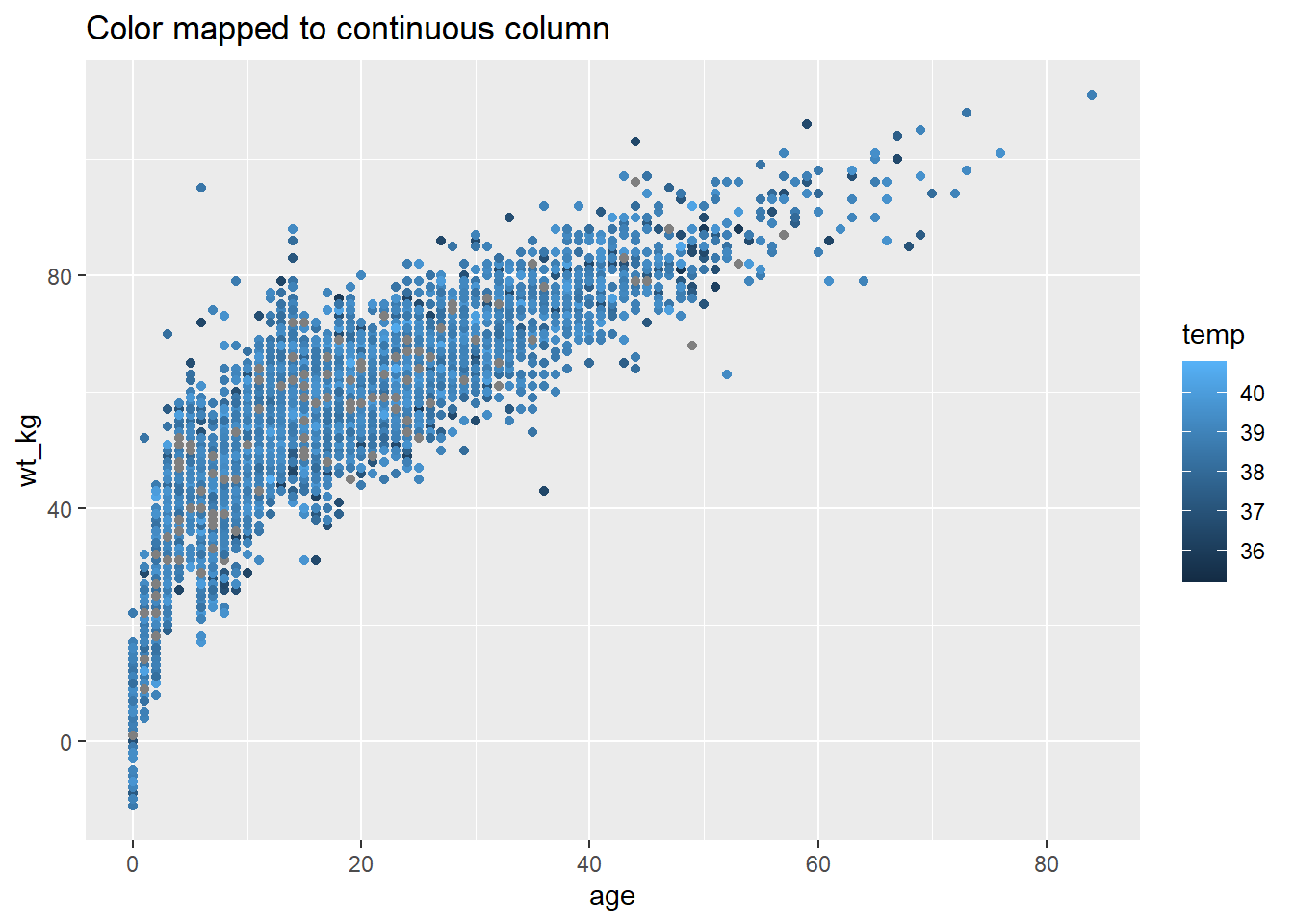
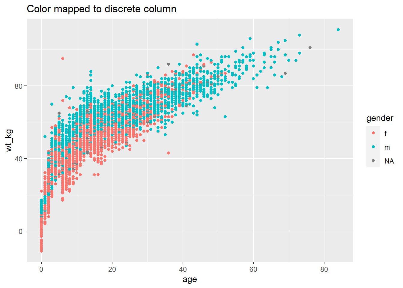
As explained the ggplot basics section on mapping data to the plot, aesthetics such as fill = and color = can be defined either outside of a mapping = aes() statement or inside of one. If outside the aes(), the assigned value should be static (e.g. color = "blue") and will apply for all data plotted by the geom. If inside, the aesthetic should be mapped to a column, like color = hospital, and the expression will vary by the value for that row in the data. A few examples:
# Static color for points and for line
ggplot(data = linelist, mapping = aes(x = age, y = wt_kg))+
  geom_point(color = "purple")+
  geom_vline(xintercept = 50, color = "orange")+
  labs(title = "Static color for points and line")

# Color mapped to continuous column
ggplot(data = linelist, mapping = aes(x = age, y = wt_kg))+
  geom_point(mapping = aes(color = temp))+
  labs(title = "Color mapped to continuous column")

# Color mapped to discrete column
ggplot(data = linelist, mapping = aes(x = age, y = wt_kg))+
  geom_point(mapping = aes(color = gender))+
  labs(title = "Color mapped to discrete column")

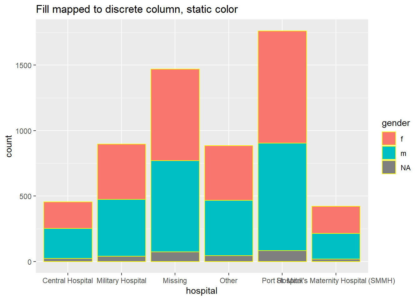
# bar plot, fill to discrete column, color to static value
ggplot(data = linelist, mapping = aes(x = hospital))+
  geom_bar(mapping = aes(fill = gender), color = "yellow")+
  labs(title = "Fill mapped to discrete column, static color")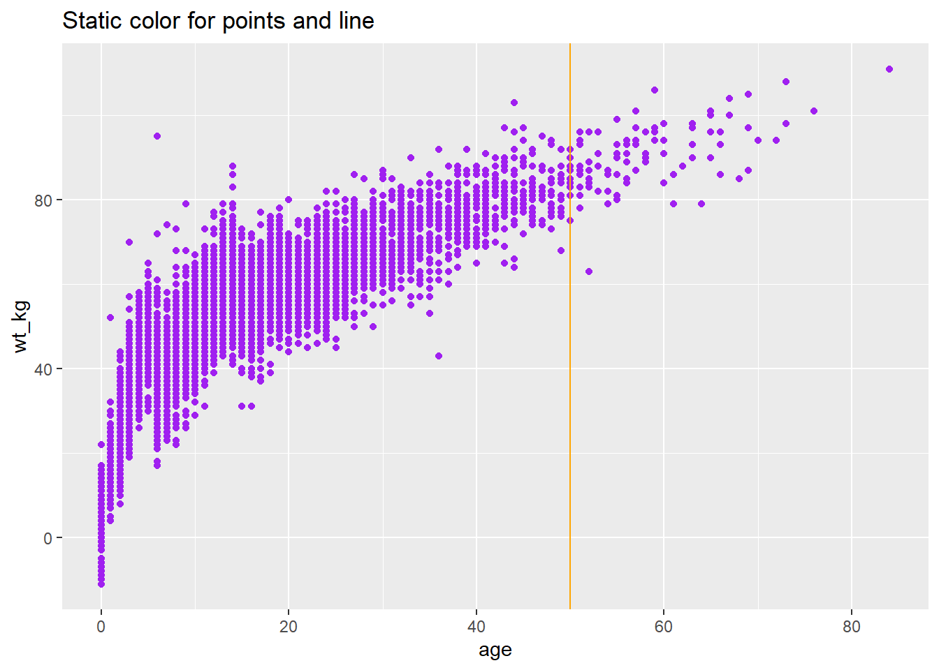
Scales
Once you map a column to a plot aesthetic (e.g. x =, y =, fill =, color =…), your plot will gain a scale/legend. See above how the scale can be continuous, discrete, date, etc. values depending on the class of the assigned column. If you have multiple aesthetics mapped to columns, your plot will have multiple scales.
You can control the scales with the appropriate scales_() function. The scale functions of ggplot() have 3 parts that are written like this: scale_AESTHETIC_METHOD().
- The first part,
scale_(), is fixed.
- The second part, the AESTHETIC, should be the aesthetic that you want to adjust the scale for (
_fill_,_shape_,_color_,_size_,_alpha_…) - the options here also include_x_and_y_.
- The third part, the METHOD, will be either
_discrete(),continuous(),_date(),_gradient(), or_manual()depending on the class of the column and how you want to control it. There are others, but these are the most-often used.
Be sure that you use the correct function for the scale! Otherwise your scale command will not appear to change anything. If you have multiple scales, you may use multiple scale functions to adjust them! For example:
Scale arguments
Each kind of scale has its own arguments, though there is some overlap. Query the function like ?scale_color_discrete in the R console to see the function argument documentation.
For continuous scales, use breaks = to provide a sequence of values with seq() (take to =, from =, and by = as shown in the example below. Set expand = c(0,0) to eliminate padding space around the axes (this can be used on any _x_ or _y_ scale.
For discrete scales, you can adjust the order of level appearance with breaks =, and how the values display with the labels = argument. Provide a character vector to each of those (see example below). You can also drop NA easily by setting na.translate = FALSE.
The nuances of date scales are covered more extensively in the Epidemic curves page.
Manual adjustments
One of the most useful tricks is using “manual” scaling functions to explicitly assign colors as you desire. These are functions with the syntax scale_xxx_manual() (e.g. scale_colour_manual() or scale_fill_manual()). Each of the below arguments are demonstrated in the code example below.
- Assign colors to data values with the
values =argument
- Specify a color for
NAwithna.value =
- Change how the values are written in the legend with the
labels =argument
- Change the legend title with
name =
Below, we create a bar plot and show how it appears by default, and then with three scales adjusted - the continuous y-axis scale, the discrete x-axis scale, and manual adjustment of the fill (interior bar color).
# BASELINE - no scale adjustment
ggplot(data = linelist)+
  geom_bar(mapping = aes(x = outcome, fill = gender))+
  labs(title = "Baseline - no scale adjustments")
# SCALES ADJUSTED
ggplot(data = linelist)+

  geom_bar(mapping = aes(x = outcome, fill = gender), color = "black")+

  theme_minimal()+                   # simplify background

  scale_y_continuous(                # continuous scale for y-axis (counts)
    expand = c(0,0),                 # no padding
    breaks = seq(from = 0,
                 to = 3000,
                 by = 500))+

  scale_x_discrete(                   # discrete scale for x-axis (gender)
    expand = c(0,0),                  # no padding
    drop = FALSE,                     # show all factor levels (even if not in data)
    na.translate = FALSE,             # remove NA outcomes from plot
    labels = c("Died", "Recovered"))+ # Change display of values


  scale_fill_manual(                  # Manually specify fill (bar interior color)
    values = c("m" = "violetred",     # reference values in data to assign colors
               "f" = "aquamarine"),
    labels = c("m" = "Male",          # re-label the legend (use "=" assignment to avoid mistakes)
              "f" = "Female",
              "Missing"),
    name = "Gender",                  # title of legend
    na.value = "grey"                 # assign a color for missing values
  )+
  labs(title = "Adjustment of scales") # Adjust the title of the fill legend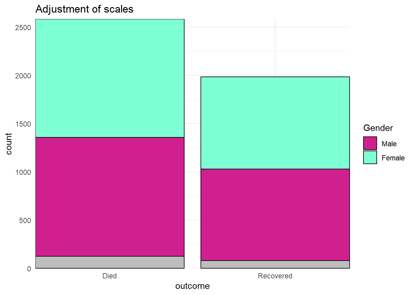
Continuous axes scales
When data are mapping to the plot axes, these too can be adjusted with scales commands. A common example is adjusting the display of an axis (e.g. y-axis) that is mapped to a column with continuous data.
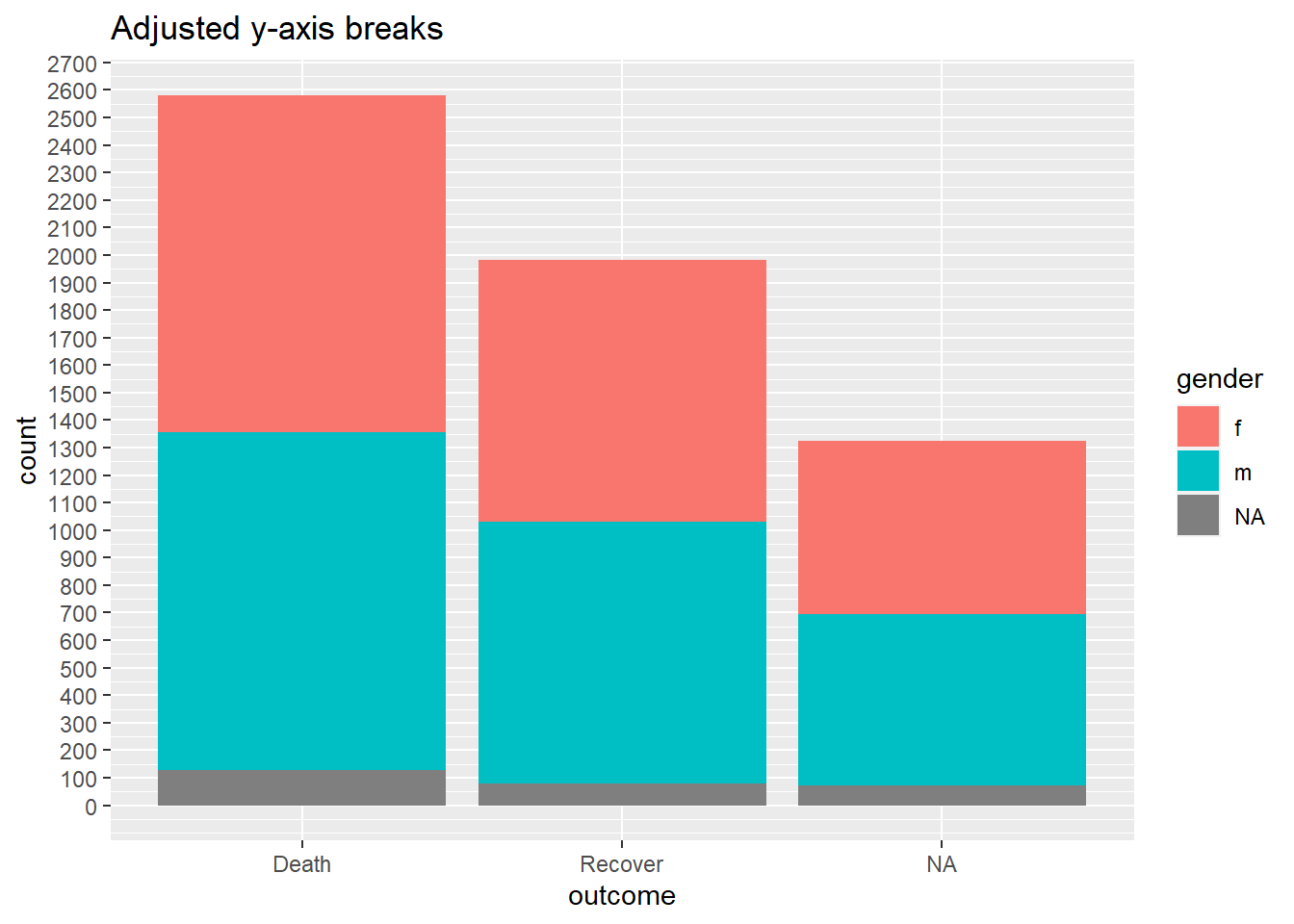
We may want to adjust the breaks or display of the values in the ggplot using scale_y_continuous(). As noted above, use the argument breaks = to provide a sequence of values that will serve as “breaks” along the scale. These are the values at which numbers will display. To this argument, you can provide a c() vector containing the desired break values, or you can provide a regular sequence of numbers using the base R function seq(). This seq() function accepts to =, from =, and by =.
# BASELINE - no scale adjustment
ggplot(data = linelist)+
  geom_bar(mapping = aes(x = outcome, fill = gender))+
  labs(title = "Baseline - no scale adjustments")

#
ggplot(data = linelist)+
  geom_bar(mapping = aes(x = outcome, fill = gender))+
  scale_y_continuous(
    breaks = seq(
      from = 0,
      to = 3000,
      by = 100)
  )+
  labs(title = "Adjusted y-axis breaks")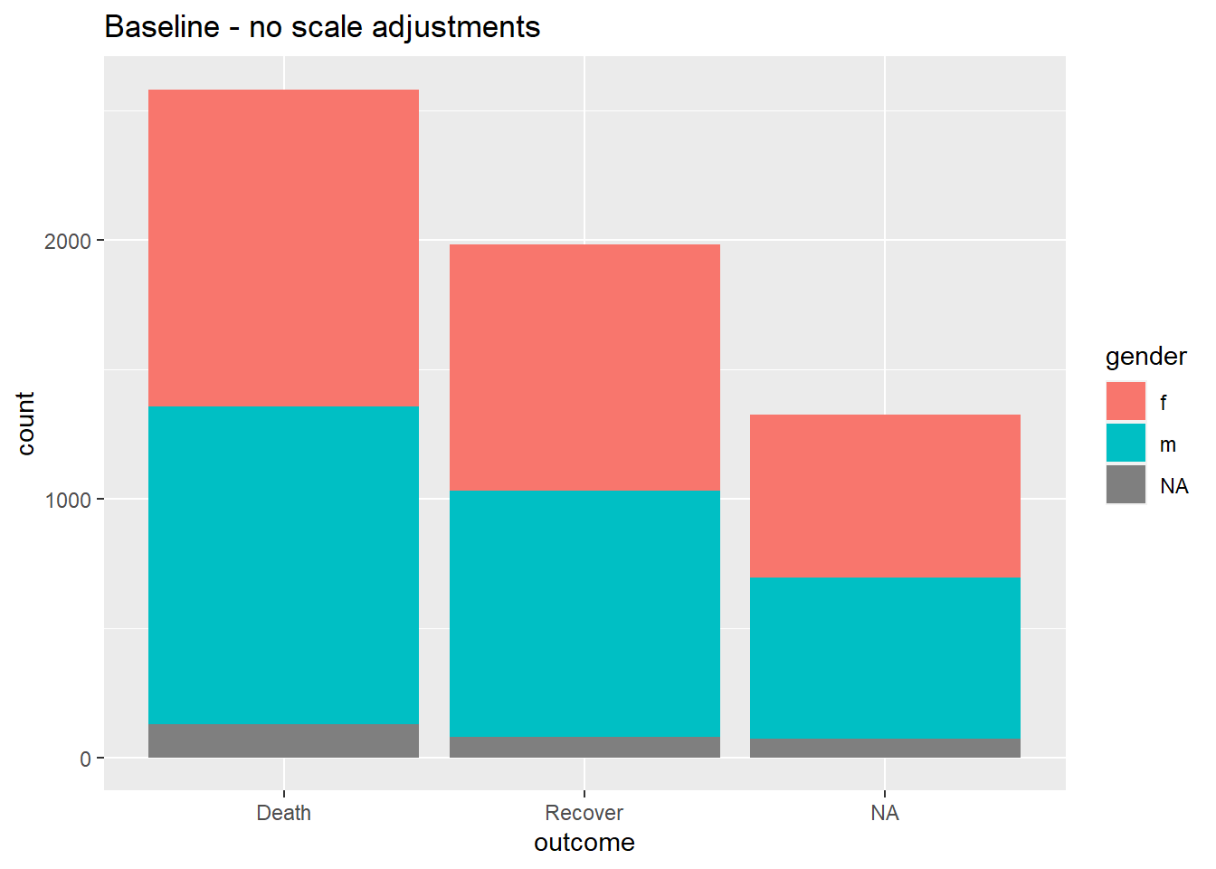
Display percents
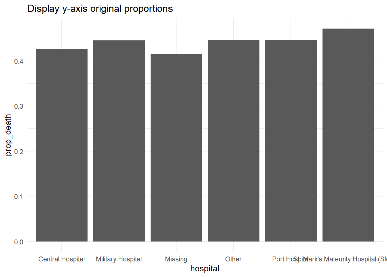
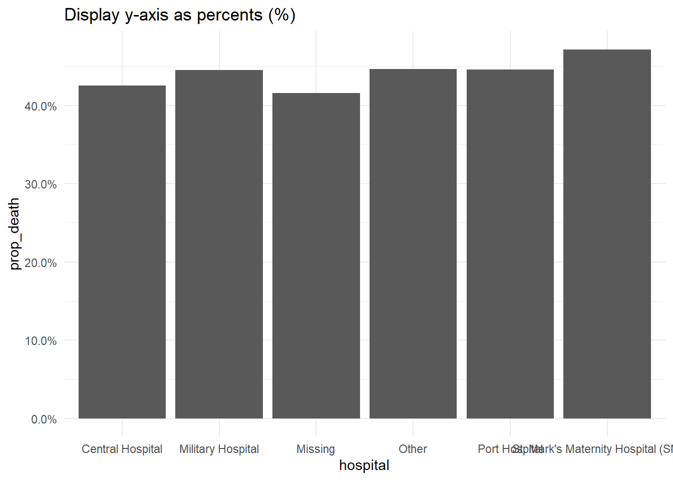
If your original data values are proportions, you can easily display them as percents with “%” by providing labels = scales::percent in your scales command, as shown below.
While an alternative would be to convert the values to character and add a “%” character to the end, this approach will cause complications because your data will no longer be continuous numeric values.
# Original y-axis proportions
#############################
linelist %>%                                   # start with linelist
  group_by(hospital) %>%                       # group data by hospital
  summarise(                                   # create summary columns
    n = n(),                                     # total number of rows in group
    deaths = sum(outcome == "Death", na.rm=T),   # number of deaths in group
    prop_death = deaths/n) %>%                   # proportion deaths in group
  ggplot(                                      # begin plotting
    mapping = aes(
      x = hospital,
      y = prop_death))+
  geom_col()+
  theme_minimal()+
  labs(title = "Display y-axis original proportions")


# Display y-axis proportions as percents
########################################
linelist %>%
  group_by(hospital) %>%
  summarise(
    n = n(),
    deaths = sum(outcome == "Death", na.rm=T),
    prop_death = deaths/n) %>%
  ggplot(
    mapping = aes(
      x = hospital,
      y = prop_death))+
  geom_col()+
  theme_minimal()+
  labs(title = "Display y-axis as percents (%)")+
  scale_y_continuous(
    labels = scales::percent                    # display proportions as percents
  )
Log scale
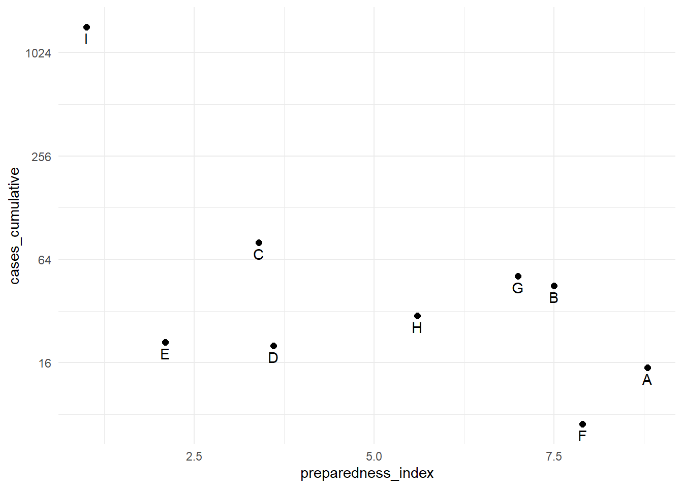
To transform a continuous axis to log scale, add trans = "log2" to the scale command. For purposes of example, we create a data frame of regions with their respective preparedness_index and cumulative cases values.
plot_data <- data.frame(
  region = c("A", "B", "C", "D", "E", "F", "G", "H", "I"),
  preparedness_index = c(8.8, 7.5, 3.4, 3.6, 2.1, 7.9, 7.0, 5.6, 1.0),
  cases_cumulative = c(15, 45, 80, 20, 21, 7, 51, 30, 1442)
)

plot_data
## region preparedness_index cases_cumulative
## 1 A 8.8 15
## 2 B 7.5 45
## 3 C 3.4 80
## 4 D 3.6 20
## 5 E 2.1 21
## 6 F 7.9 7
## 7 G 7.0 51
## 8 H 5.6 30
## 9 I 1.0 1442The cumulative cases for region “I” are dramatically greater than all the other regions. In circumstances like this, you may elect to display the y-axis using a log scale so the reader can see differences between the regions with fewer cumulative cases.
# Original y-axis
preparedness_plot <- ggplot(data = plot_data,
       mapping = aes(
         x = preparedness_index,
         y = cases_cumulative))+
  geom_point(size = 2)+            # points for each region
  geom_text(
    mapping = aes(label = region),
    vjust = 1.5)+                  # add text labels
  theme_minimal()

preparedness_plot                  # print original plot


# print with y-axis transformed
preparedness_plot+                   # begin with plot saved above
  scale_y_continuous(trans = "log2") # add transformation for y-axis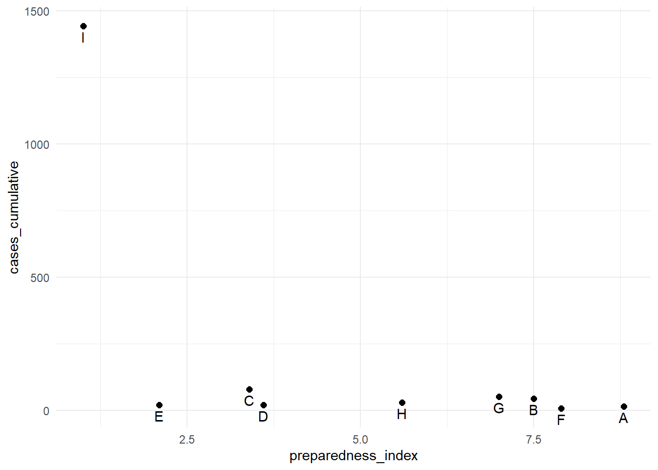
Gradient scales
Fill gradient scales can involve additional nuance. The defaults are usually quite pleasing, but you may want to adjust the values, cutoffs, etc.
To demonstrate how to adjust a continuous color scale, we’ll use a data set from the Contact tracing page that contains the ages of cases and of their source cases.
case_source_relationships <- rio::import(here::here("data", "godata", "relationships_clean.rds")) %>%
  select(source_age, target_age)
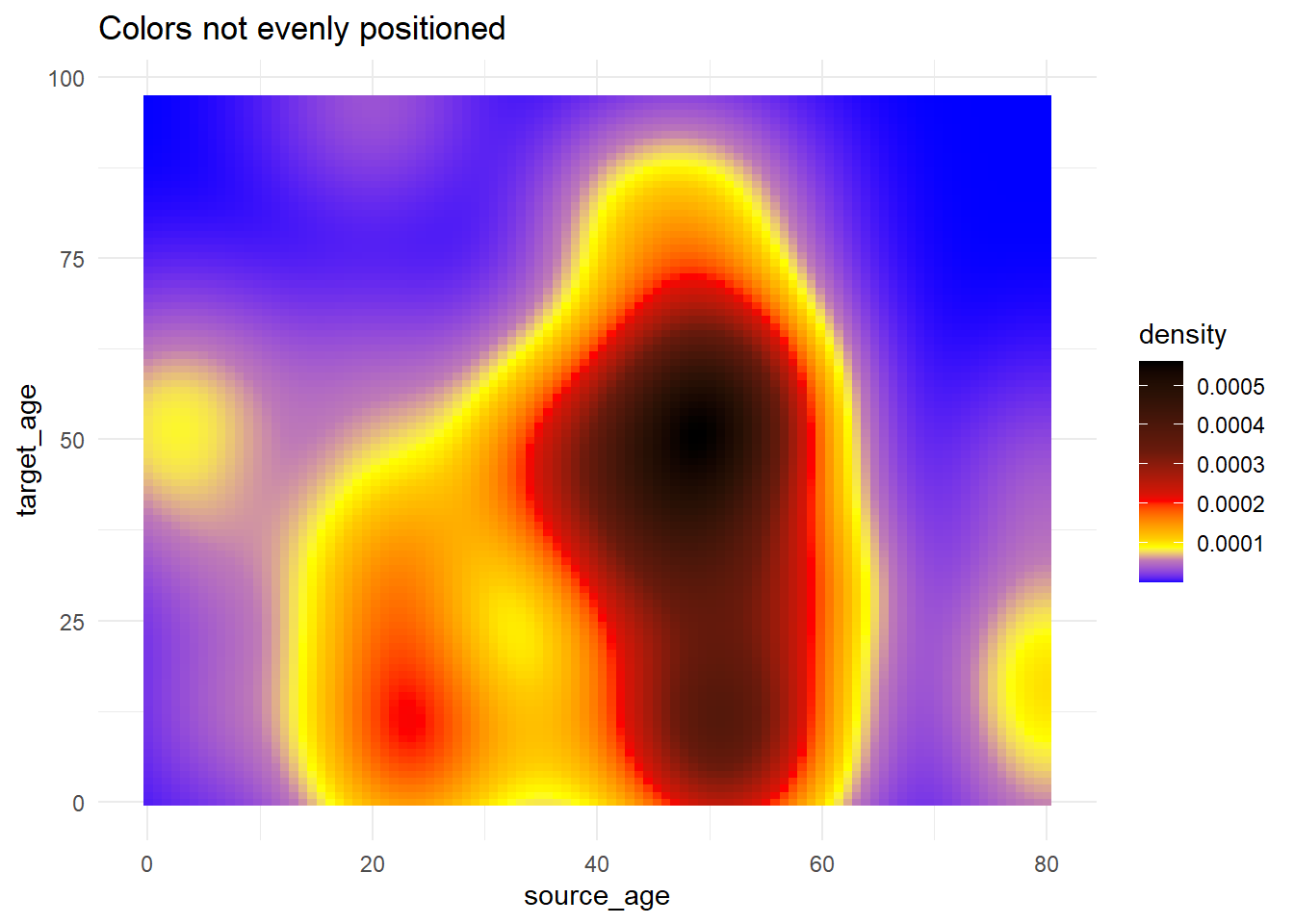
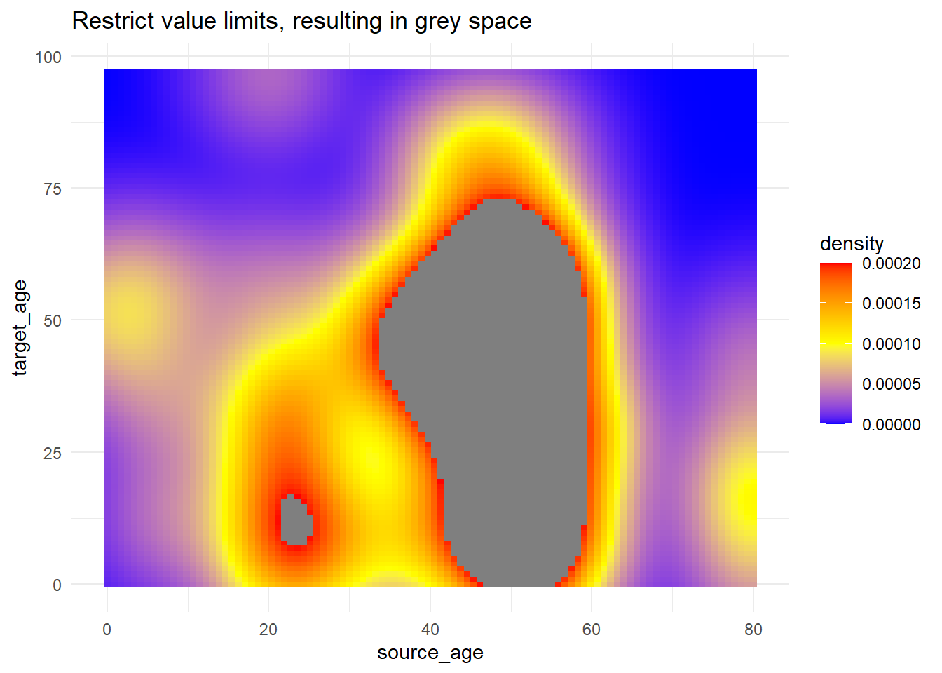
Below, we produce a “raster” heat tile density plot. We won’t elaborate how (see the link in paragraph above) but we will focus on how we can adjust the color scale. Read more about the stat_density2d() ggplot2 function here. Note how the fill scale is continuous.
trans_matrix <- ggplot(
    data = case_source_relationships,
    mapping = aes(x = source_age, y = target_age))+
  stat_density2d(
    geom = "raster",
    mapping = aes(fill = after_stat(density)),
    contour = FALSE)+
  theme_minimal()
Now we show some variations on the fill scale:
trans_matrix
trans_matrix + scale_fill_viridis_c(option = "plasma")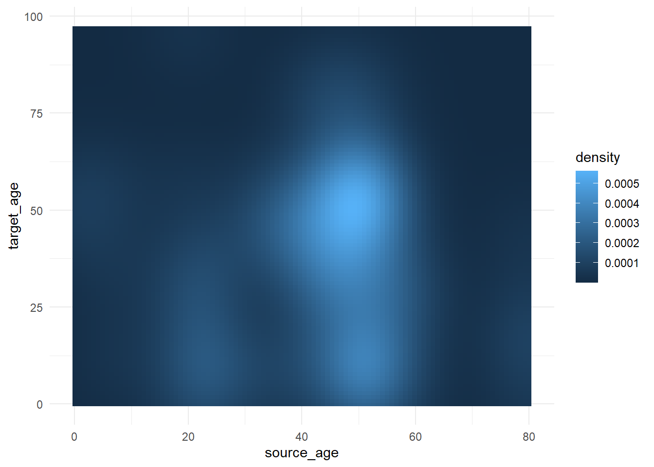
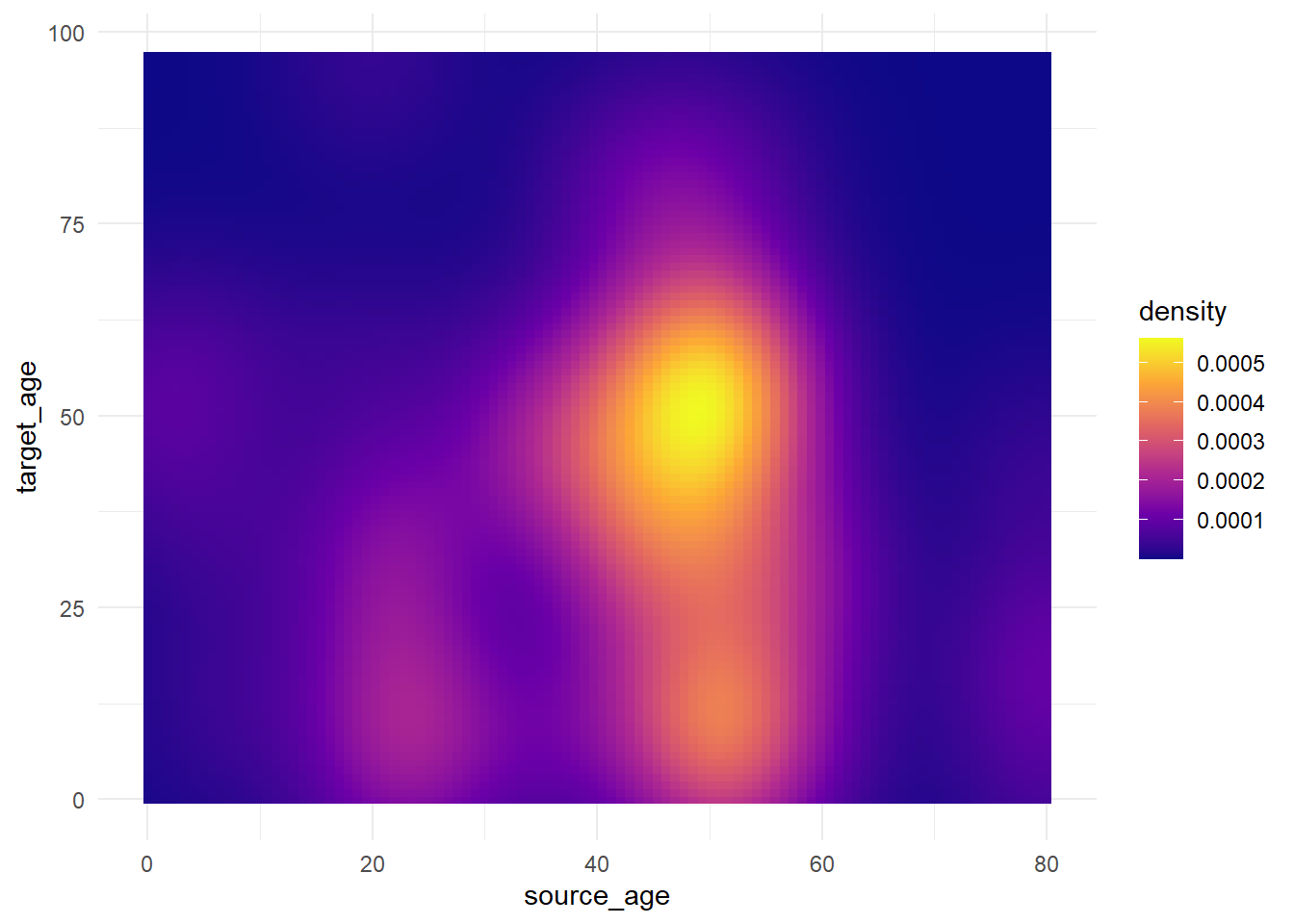
Now we show some examples of actually adjusting the break points of the scale:
-
scale_fill_gradient()accepts two colors (high/low)
-
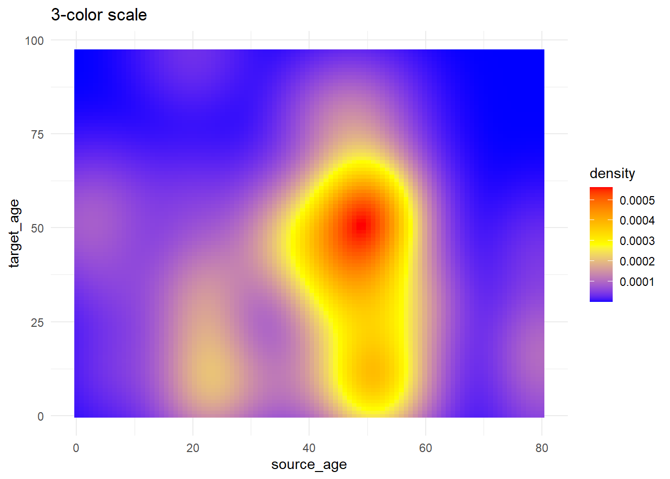
scale_fill_gradientn()accepts a vector of any length of colors tovalues =(intermediate values will be interpolated)
- Use
scales::rescale()to adjust how colors are positioned along the gradient; it rescales your vector of positions to be between 0 and 1.
trans_matrix +
  scale_fill_gradient(     # 2-sided gradient scale
    low = "aquamarine",    # low value
    high = "purple",       # high value
    na.value = "grey",     # value for NA
    name = "Density")+     # Legend title
  labs(title = "Manually specify high/low colors")

# 3+ colors to scale
trans_matrix +
  scale_fill_gradientn(    # 3-color scale (low/mid/high)
    colors = c("blue", "yellow","red") # provide colors in vector
  )+
  labs(title = "3-color scale")

# Use of rescale() to adjust placement of colors along scale
trans_matrix +
  scale_fill_gradientn(    # provide any number of colors
    colors = c("blue", "yellow","red", "black"),
    values = scales::rescale(c(0, 0.05, 0.07, 0.10, 0.15, 0.20, 0.3, 0.5)) # positions for colors are rescaled between 0 and 1
    )+
  labs(title = "Colors not evenly positioned")

# use of limits to cut-off values that get fill color
trans_matrix +
  scale_fill_gradientn(
    colors = c("blue", "yellow","red"),
    limits = c(0, 0.0002))+
  labs(title = "Restrict value limits, resulting in grey space")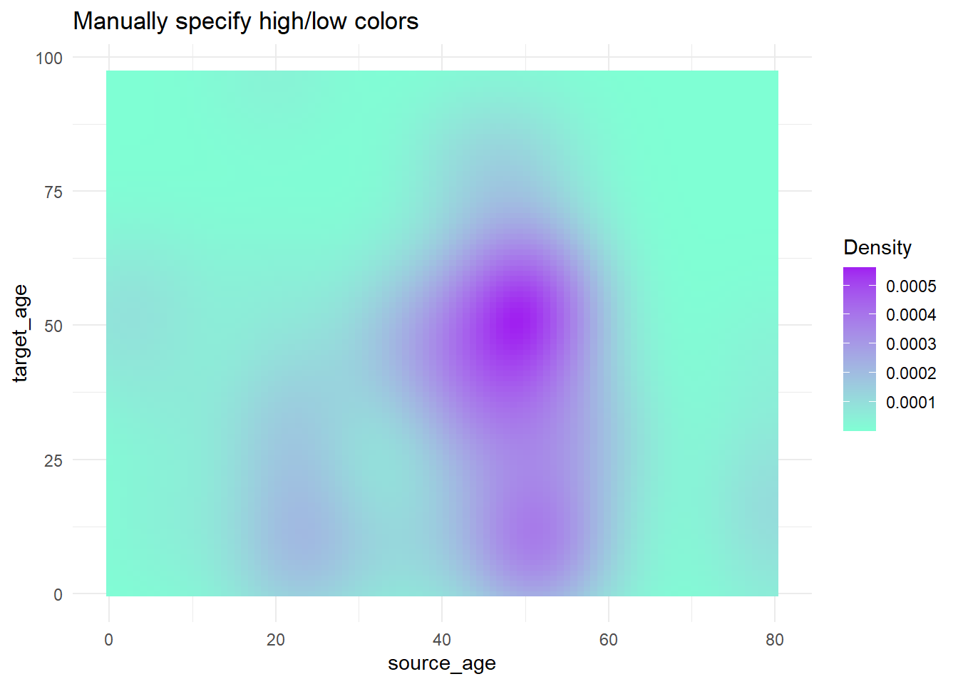
Palettes
Colorbrewer and Viridis
More generally, if you want predefined palettes, you can use the scale_xxx_brewer or scale_xxx_viridis_y functions.
The ‘brewer’ functions can draw from colorbrewer.org palettes.
The ‘viridis’ functions draw from viridis (colourblind friendly!) palettes, which “provide colour maps that are perceptually uniform in both colour and black-and-white. They are also designed to be perceived by viewers with common forms of colour blindness.” (read more here and here). Define if the palette is discrete, continuous, or binned by specifying this at the end of the function (e.g. discrete is scale_xxx_viridis_d).
It is advised that you test your plot in this color blindness simulator. If you have a red/green color scheme, try a “hot-cold” (red-blue) scheme instead as described here
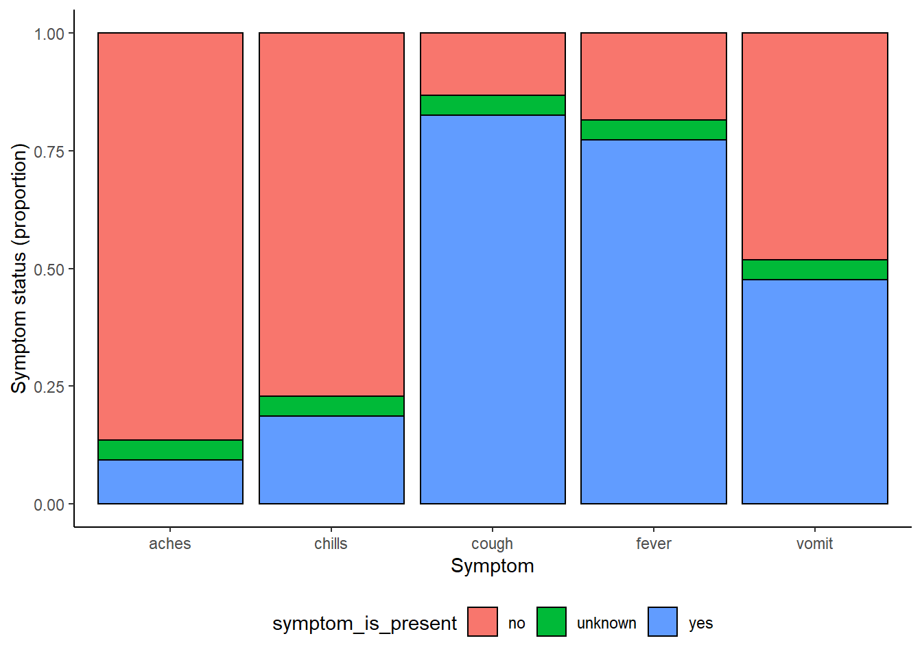
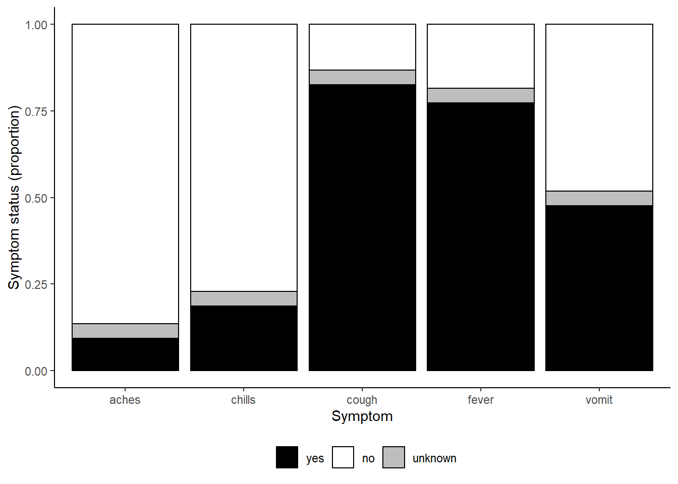
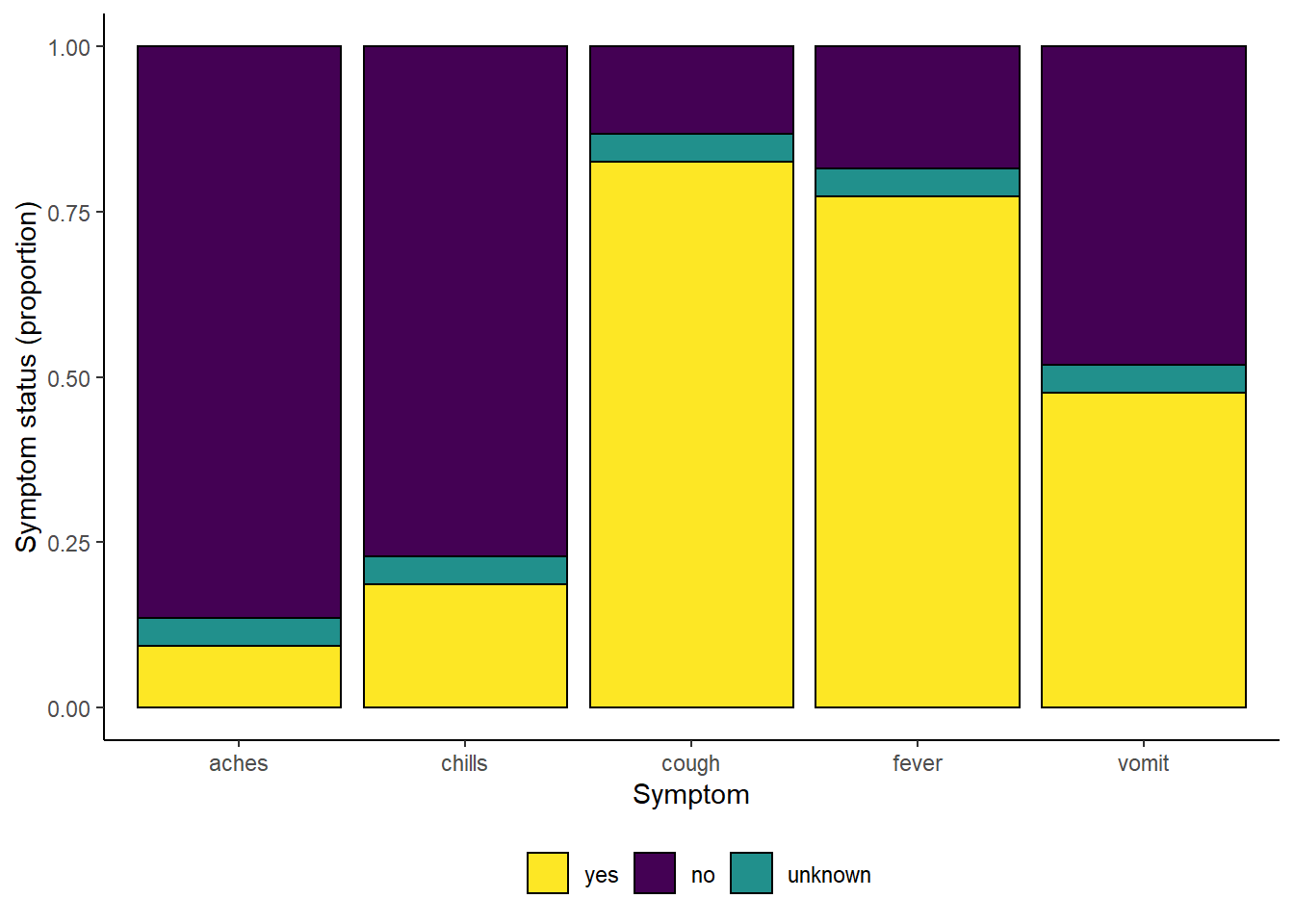
Here is an example from the ggplot basics page, using various color schemes.
symp_plot <- linelist %>%                                         # begin with linelist
  select(c(case_id, fever, chills, cough, aches, vomit)) %>%     # select columns
  pivot_longer(                                                  # pivot longer
    cols = -case_id,
    names_to = "symptom_name",
    values_to = "symptom_is_present") %>%
  mutate(                                                        # replace missing values
    symptom_is_present = replace_na(symptom_is_present, "unknown")) %>%
  ggplot(                                                        # begin ggplot!
    mapping = aes(x = symptom_name, fill = symptom_is_present))+
  geom_bar(position = "fill", col = "black") +
  theme_classic() +
  theme(legend.position = "bottom")+
  labs(
    x = "Symptom",
    y = "Symptom status (proportion)"
  )

symp_plot  # print with default colors

#################################
# print with manually-specified colors
symp_plot +
  scale_fill_manual(
    values = c("yes" = "black",         # explicitly define colours
               "no" = "white",
               "unknown" = "grey"),
    breaks = c("yes", "no", "unknown"), # order the factors correctly
    name = ""                           # set legend to no title

  )

#################################
# print with viridis discrete colors
symp_plot +
  scale_fill_viridis_d(
    breaks = c("yes", "no", "unknown"),
    name = ""
  )
31.3 Change order of discrete variables
Changing the order that discrete variables appear in is often difficult to understand for people who are new to ggplot2 graphs. It’s easy to understand how to do this however once you understand how ggplot2 handles discrete variables under the hood. Generally speaking, if a discrete varaible is used, it is automatically converted to a factor type - which orders factors by alphabetical order by default. To handle this, you simply have to reorder the factor levels to reflect the order you would like them to appear in the chart. For more detailed information on how to reorder factor objects, see the factor section of the guide.
We can look at a common example using age groups - by default the 5-9 age group will be placed in the middle of the age groups (given alphanumeric order), but we can move it behind the 0-4 age group of the chart by releveling the factors.
ggplot(
  data = linelist %>% drop_na(age_cat5),                         # remove rows where age_cat5 is missing
  mapping = aes(x = fct_relevel(age_cat5, "5-9", after = 1))) +  # relevel factor

  geom_bar() +

  labs(x = "Age group", y = "Number of hospitalisations",
       title = "Total hospitalisations by age group") +

  theme_minimal()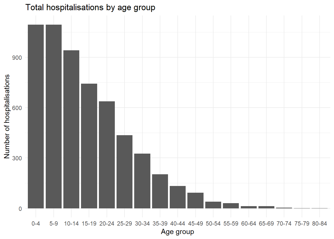
31.3.0.1 ggthemr
Also consider using the ggthemr package. You can download this package from Github using the instructions here. It offers palettes that are very aesthetically pleasing, but be aware that these typically have a maximum number of values that can be limiting if you want more than 7 or 8 colors.
31.4 Contour lines
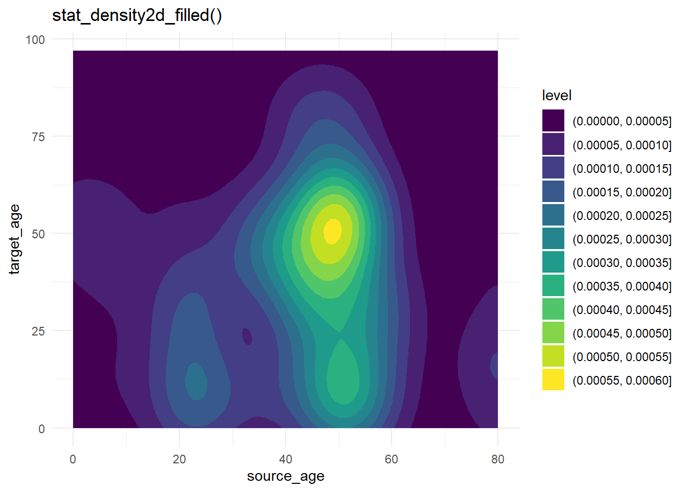
Contour plots are helpful when you have many points that might cover each other (“overplotting”). The case-source data used above are again plotted, but more simply using stat_density2d() and stat_density2d_filled() to produce discrete contour levels - like a topographical map. Read more about the statistics here.
case_source_relationships %>%
  ggplot(aes(x = source_age, y = target_age))+
  stat_density2d()+
  geom_point()+
  theme_minimal()+
  labs(title = "stat_density2d() + geom_point()")


case_source_relationships %>%
  ggplot(aes(x = source_age, y = target_age))+
  stat_density2d_filled()+
  theme_minimal()+
  labs(title = "stat_density2d_filled()")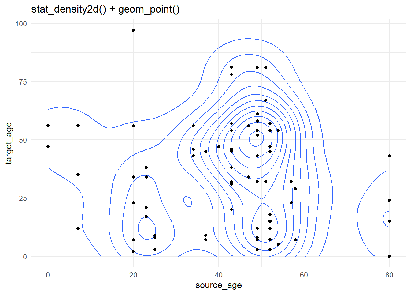
31.5 Marginal distributions
To show the distributions on the edges of a geom_point() scatterplot, you can use the ggExtra package and its function ggMarginal(). Save your original ggplot as an object, then pass it to ggMarginal() as shown below. Here are the key arguments:
- You must specify the
type =as either “histogram”, “density” “boxplot”, “violin”, or “densigram”.
- By default, marginal plots will appear for both axes. You can set
margins =to “x” or “y” if you only want one.
- Other optional arguments include
fill =(bar color),color =(line color),size =(plot size relative to margin size, so larger number makes the marginal plot smaller).
- You can provide other axis-specific arguments to
xparams =andyparams =. For example, to have different histogram bin sizes, as shown below.
You can have the marginal plots reflect groups (columns that have been assigned to color = in your ggplot() mapped aesthetics). If this is the case, set the ggMarginal() argument groupColour = or groupFill = to TRUE, as shown below.
Read more at this vignette, in the R Graph Gallery or the function R documentation ?ggMarginal.
# Install/load ggExtra
pacman::p_load(ggExtra)

# Basic scatter plot of weight and age
scatter_plot <- ggplot(data = linelist)+
  geom_point(mapping = aes(y = wt_kg, x = age)) +
  labs(title = "Scatter plot of weight and age")
To add marginal histograms use type = "histogram". You can optionally set groupFill = TRUE to get stacked histograms.
# with histograms
ggMarginal(
  scatter_plot,                     # add marginal histograms
  type = "histogram",               # specify histograms
  fill = "lightblue",               # bar fill
  xparams = list(binwidth = 10),    # other parameters for x-axis marginal
  yparams = list(binwidth = 5))     # other parameters for y-axis marginal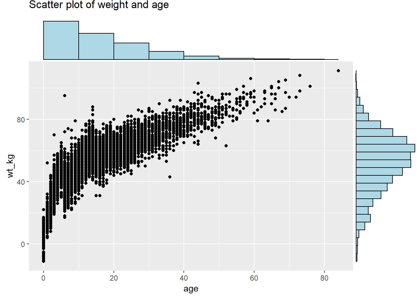
Marginal density plot with grouped/colored values:
# Scatter plot, colored by outcome
# Outcome column is assigned as color in ggplot. groupFill in ggMarginal set to TRUE
scatter_plot_color <- ggplot(data = linelist %>% drop_na(gender))+
  geom_point(mapping = aes(y = wt_kg, x = age, color = gender)) +
  labs(title = "Scatter plot of weight and age")+
  theme(legend.position = "bottom")

ggMarginal(scatter_plot_color, type = "density", groupFill = TRUE)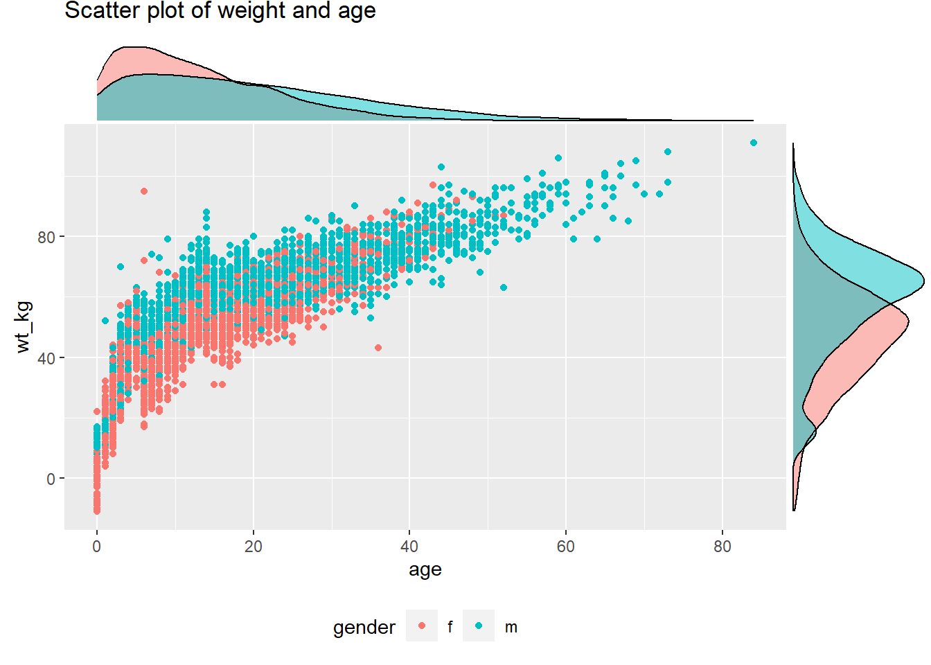
Set the size = arguemnt to adjust the relative size of the marginal plot. Smaller number makes a larger marginal plot. You also set color =. Below are is a marginal boxplot, with demonstration of the margins = argument so it appears on only one axis:
# with boxplot
ggMarginal(
  scatter_plot,
  margins = "x",      # only show x-axis marginal plot
type = "boxplot") 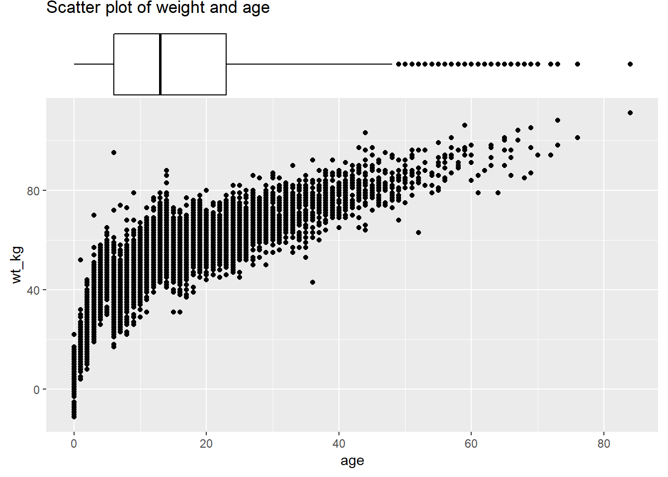
31.6 Smart Labeling
In ggplot2, it is also possible to add text to plots. However, this comes with the notable limitation where text labels often clash with data points in a plot, making them look messy or hard to read. There is no ideal way to deal with this in the base package, but there is a ggplot2 add-on, known as ggrepel that makes dealing with this very simple!
The ggrepel package provides two new functions, geom_label_repel() and geom_text_repel(), which replace geom_label() and geom_text(). Simply use these functions instead of the base functions to produce neat labels. Within the function, map the aesthetics aes() as always, but include the argument label = to which you provide a column name containing the values you want to display (e.g. patient id, or name, etc.). You can make more complex labels by combining columns and newlines (\n) within str_glue() as shown below.
A few tips:
- Use
min.segment.length = 0to always draw line segments, ormin.segment.length = Infto never draw them
- Use
size =outside ofaes()to set text size
- Use
force =to change the degree of repulsion between labels and their respective points (default is 1)
- Include
fill =withinaes()to have label colored by value- A letter “a” may appear in the legend - add
guides(fill = guide_legend(override.aes = aes(color = NA)))+to remove it
- A letter “a” may appear in the legend - add
See this is very in-depth tutorial for more.
pacman::p_load(ggrepel)

linelist %>%                                               # start with linelist
  group_by(hospital) %>%                                   # group by hospital
  summarise(                                               # create new dataset with summary values per hospital
    n_cases = n(),                                           # number of cases per hospital
    delay_mean = round(mean(days_onset_hosp, na.rm=T),1),    # mean delay per hospital
  ) %>%
  ggplot(mapping = aes(x = n_cases, y = delay_mean))+      # send data frame to ggplot
  geom_point(size = 2)+                                    # add points
  geom_label_repel(                                        # add point labels
    mapping = aes(
      label = stringr::str_glue(
        "{hospital}\n{n_cases} cases, {delay_mean} days")  # how label displays
      ),
    size = 3,                                              # text size in labels
    min.segment.length = 0)+                               # show all line segments
  labs(                                                    # add axes labels
    title = "Mean delay to admission, by hospital",
    x = "Number of cases",
    y = "Mean delay (days)")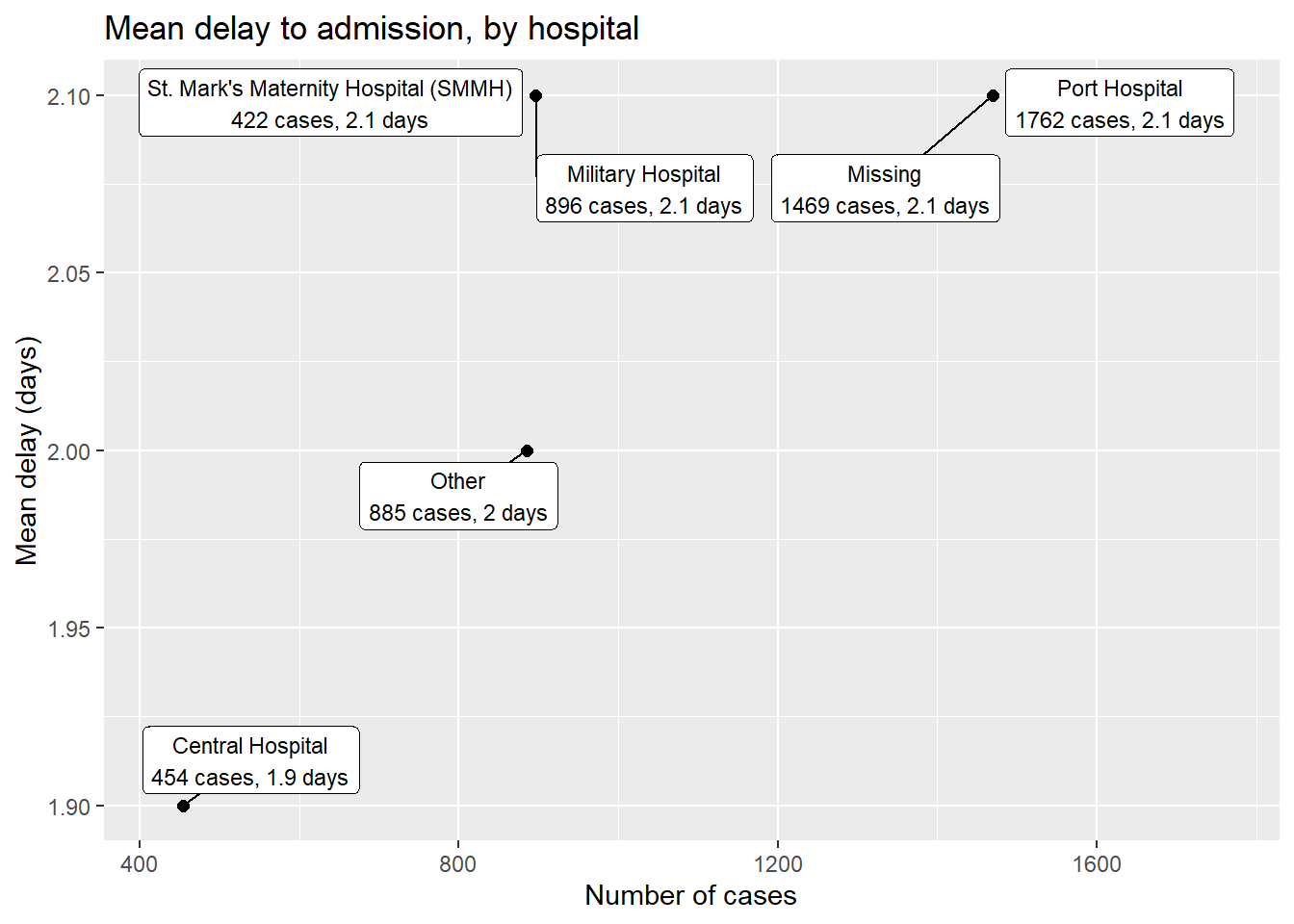
You can label only a subset of the data points - by using standard ggplot() syntax to provide different data = for each geom layer of the plot. Below, All cases are plotted, but only a few are labeled.
ggplot()+
  # All points in grey
  geom_point(
    data = linelist,                                   # all data provided to this layer
    mapping = aes(x = ht_cm, y = wt_kg),
    color = "grey",
    alpha = 0.5)+                                              # grey and semi-transparent

  # Few points in black
  geom_point(
    data = linelist %>% filter(days_onset_hosp > 15),  # filtered data provided to this layer
    mapping = aes(x = ht_cm, y = wt_kg),
    alpha = 1)+                                                # default black and not transparent

  # point labels for few points
  geom_label_repel(
    data = linelist %>% filter(days_onset_hosp > 15),  # filter the data for the labels
    mapping = aes(
      x = ht_cm,
      y = wt_kg,
      fill = outcome,                                          # label color by outcome
      label = stringr::str_glue("Delay: {days_onset_hosp}d")), # label created with str_glue()
    min.segment.length = 0) +                                  # show line segments for all

  # remove letter "a" from inside legend boxes
  guides(fill = guide_legend(override.aes = aes(color = NA)))+

  # axis labels
  labs(
    title = "Cases with long delay to admission",
    y = "weight (kg)",
    x = "height(cm)")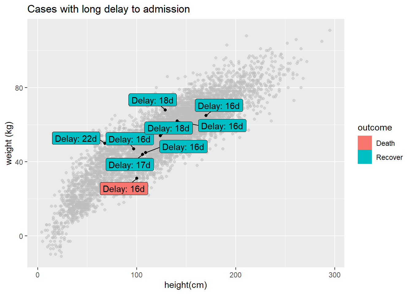
31.7 Time axes
Working with time axes in ggplot can seem daunting, but is made very easy with a few key functions. Remember that when working with time or date that you should ensure that the correct variables are formatted as date or datetime class - see the Working with dates page for more information on this, or Epidemic curves page (ggplot section) for examples.
The single most useful set of functions for working with dates in ggplot2 are the scale functions (scale_x_date(), scale_x_datetime(), and their cognate y-axis functions). These functions let you define how often you have axis labels, and how to format axis labels. To find out how to format dates, see the working with dates section again! You can use the date_breaks and date_labels arguments to specify how dates should look:
date_breaksallows you to specify how often axis breaks occur - you can pass a string here (e.g."3 months", or "2 days")date_labelsallows you to define the format dates are shown in. You can pass a date format string to these arguments (e.g."%b-%d-%Y"):
# make epi curve by date of onset when available
ggplot(linelist, aes(x = date_onset)) +
  geom_histogram(binwidth = 7) +
  scale_x_date(
    # 1 break every 1 month
    date_breaks = "1 months",
    # labels should show month then date
    date_labels = "%b %d"
  ) +
  theme_classic()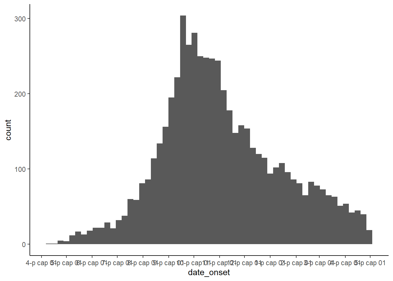
31.8 Highlighting
Highlighting specific elements in a chart is a useful way to draw attention to a specific instance of a variable while also providing information on the dispersion of the full dataset. While this is not easily done in base ggplot2, there is an external package that can help to do this known as gghighlight. This is easy to use within the ggplot syntax.
The gghighlight package uses the gghighlight() function to achieve this effect. To use this function, supply a logical statement to the function - this can have quite flexible outcomes, but here we’ll show an example of the age distribution of cases in our linelist, highlighting them by outcome.
# load gghighlight
library(gghighlight)

# replace NA values with unknown in the outcome variable
linelist <- linelist %>%
  mutate(outcome = replace_na(outcome, "Unknown"))

# produce a histogram of all cases by age
ggplot(
  data = linelist,
  mapping = aes(x = age_years, fill = outcome)) +
  geom_histogram() +
  gghighlight::gghighlight(outcome == "Death")     # highlight instances where the patient has died.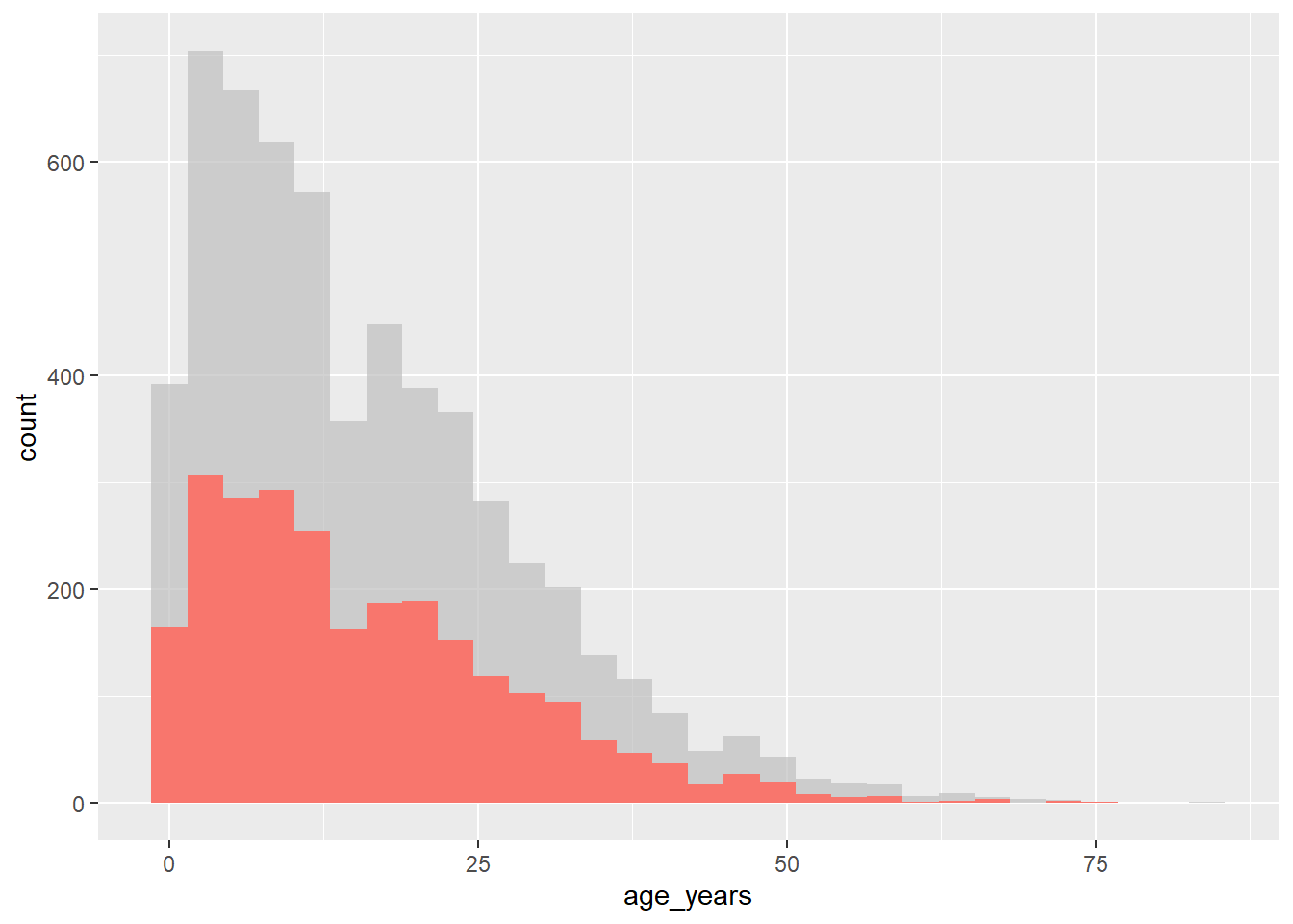
This also works well with faceting functions - it allows the user to produce facet plots with the background data highlighted that doesn’t apply to the facet! Below we count cases by week and plot the epidemic curves by hospital (color = and facet_wrap() set to hospital column).
# produce a histogram of all cases by age
linelist %>%
  count(week = lubridate::floor_date(date_hospitalisation, "week"),
        hospital) %>%
  ggplot()+
  geom_line(aes(x = week, y = n, color = hospital))+
  theme_minimal()+
  gghighlight::gghighlight() +                      # highlight instances where the patient has died
  facet_wrap(~hospital)                              # make facets by outcome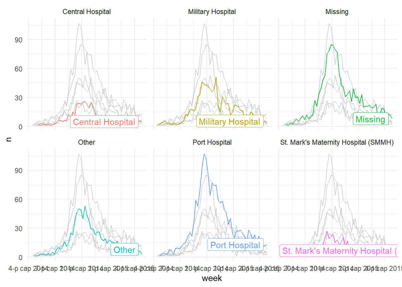
31.9 Plotting multiple datasets
Note that properly aligning axes to plot from multiple datasets in the same plot can be difficult. Consider one of the following strategies:
- Merge the data prior to plotting, and convert to “long” format with a column reflecting the dataset
- Use cowplot or a similar package to combine two plots (see below)
31.10 Combine plots
Two packages that are very useful for combining plots are cowplot and patchwork. In this page we will mostly focus on cowplot, with occassional use of patchwork.
Here is the online introduction to cowplot. You can read the more extensive documentation for each function online here. We will cover a few of the most common use cases and functions below.
The cowplot package works in tandem with ggplot2 - essentially, you use it to arrange and combine ggplots and their legends into compound figures. It can also accept base R graphics.
pacman::p_load(
  tidyverse,      # data manipulation and visualisation
  cowplot,        # combine plots
  patchwork       # combine plots
)
While faceting (described in the ggplot basics page) is a convenient approach to plotting, sometimes its not possible to get the results you want from its relatively restrictive approach. Here, you may choose to combine plots by sticking them together into a larger plot. There are three well known packages that are great for this - cowplot, gridExtra, and patchwork. However, these packages largely do the same things, so we’ll focus on cowplot for this section.
plot_grid()
The cowplot package has a fairly wide range of functions, but the easiest use of it can be achieved through the use of plot_grid(). This is effectively a way to arrange predefined plots in a grid formation. We can work through another example with the malaria dataset - here we can plot the total cases by district, and also show the epidemic curve over time.
malaria_data <- rio::import(here::here("data", "malaria_facility_count_data.rds"))

# bar chart of total cases by district
p1 <- ggplot(malaria_data, aes(x = District, y = malaria_tot)) +
  geom_bar(stat = "identity") +
  labs(
    x = "District",
    y = "Total number of cases",
    title = "Total malaria cases by district"
  ) +
  theme_minimal()

# epidemic curve over time
p2 <- ggplot(malaria_data, aes(x = data_date, y = malaria_tot)) +
  geom_col(width = 1) +
  labs(
    x = "Date of data submission",
    y =  "number of cases"
  ) +
  theme_minimal()

cowplot::plot_grid(p1, p2,
                  # 1 column and two rows - stacked on top of each other
                   ncol = 1,
                   nrow = 2,
                   # top plot is 2/3 as tall as second
                   rel_heights = c(2, 3))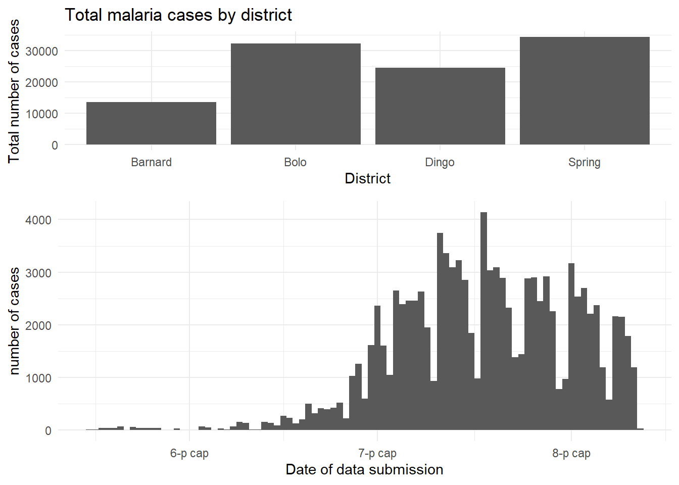
Combine legends
If your plots have the same legend, combining them is relatively straight-forward. Simple use the cowplot approach above to combine the plots, but remove the legend from one of them (de-duplicate).
If your plots have different legends, you must use an alternative approach:
- Create and save your plots without legends using
theme(legend.position = "none")
- Extract the legends from each plot using
get_legend()as shown below - but extract legends from the plots modified to actually show the legend
- Combine the legends into a legends panel
- Combine the plots and legends panel
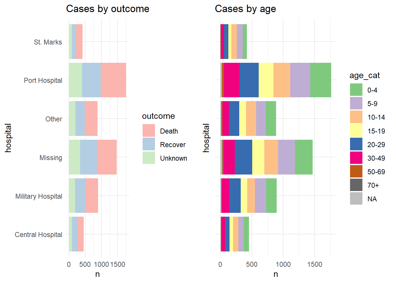
For demonstration we show the two plots separately, and then arranged in a grid with their own legends showing (ugly and inefficient use of space):
p1 <- linelist %>%
  mutate(hospital = recode(hospital, "St. Mark's Maternity Hospital (SMMH)" = "St. Marks")) %>%
  count(hospital, outcome) %>%
  ggplot()+
  geom_col(mapping = aes(x = hospital, y = n, fill = outcome))+
  scale_fill_brewer(type = "qual", palette = 4, na.value = "grey")+
  coord_flip()+
  theme_minimal()+
  labs(title = "Cases by outcome")


p2 <- linelist %>%
  mutate(hospital = recode(hospital, "St. Mark's Maternity Hospital (SMMH)" = "St. Marks")) %>%
  count(hospital, age_cat) %>%
  ggplot()+
  geom_col(mapping = aes(x = hospital, y = n, fill = age_cat))+
  scale_fill_brewer(type = "qual", palette = 1, na.value = "grey")+
  coord_flip()+
  theme_minimal()+
  theme(axis.text.y = element_blank())+
  labs(title = "Cases by age")
Here is how the two plots look when combined using plot_grid() without combining their legends:
And now we show how to combine the legends. Essentially what we do is to define each plot without its legend (theme(legend.position = "none"), and then we define each plot’s legend separately, using the get_legend() function from cowplot. When we extract the legend from the saved plot, we need to add + the legend back in, including specifying the placement (“right”) and smaller adjustments for alignment of the legends and their titles. Then, we combine the legends together vertically, and then combine the two plots with the newly-combined legends. Voila!
# Define plot 1 without legend
p1 <- linelist %>%
  mutate(hospital = recode(hospital, "St. Mark's Maternity Hospital (SMMH)" = "St. Marks")) %>%
  count(hospital, outcome) %>%
  ggplot()+
  geom_col(mapping = aes(x = hospital, y = n, fill = outcome))+
  scale_fill_brewer(type = "qual", palette = 4, na.value = "grey")+
  coord_flip()+
  theme_minimal()+
  theme(legend.position = "none")+
  labs(title = "Cases by outcome")


# Define plot 2 without legend
p2 <- linelist %>%
  mutate(hospital = recode(hospital, "St. Mark's Maternity Hospital (SMMH)" = "St. Marks")) %>%
  count(hospital, age_cat) %>%
  ggplot()+
  geom_col(mapping = aes(x = hospital, y = n, fill = age_cat))+
  scale_fill_brewer(type = "qual", palette = 1, na.value = "grey")+
  coord_flip()+
  theme_minimal()+
  theme(
    legend.position = "none",
    axis.text.y = element_blank(),
    axis.title.y = element_blank()
  )+
  labs(title = "Cases by age")


# extract legend from p1 (from p1 + legend)
leg_p1 <- cowplot::get_legend(p1 +
                                theme(legend.position = "right",        # extract vertical legend
                                      legend.justification = c(0,0.5))+ # so legends  align
                                labs(fill = "Outcome"))                 # title of legend
# extract legend from p2 (from p2 + legend)
leg_p2 <- cowplot::get_legend(p2 +
                                theme(legend.position = "right",         # extract vertical legend
                                      legend.justification = c(0,0.5))+  # so legends align
                                labs(fill = "Age Category"))             # title of legend

# create a blank plot for legend alignment
#blank_p <- patchwork::plot_spacer() + theme_void()

# create legends panel, can be one on top of the other (or use spacer commented above)
legends <- cowplot::plot_grid(leg_p1, leg_p2, nrow = 2, rel_heights = c(.3, .7))

# combine two plots and the combined legends panel
combined <- cowplot::plot_grid(p1, p2, legends, ncol = 3, rel_widths = c(.4, .4, .2))

combined  # print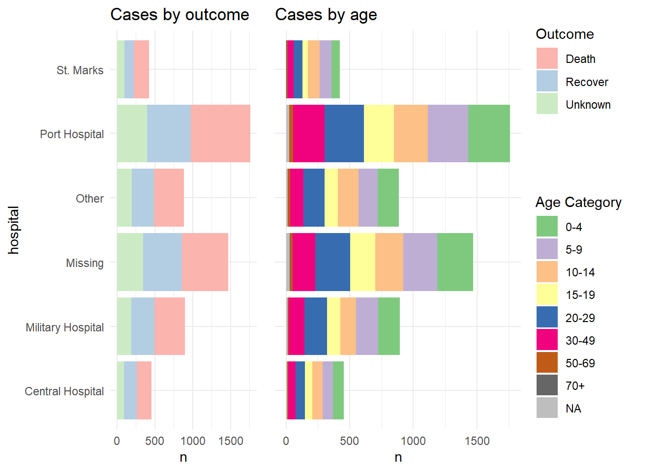
This solution was learned from this post with a minor fix to align legends from this post.
TIP: Fun note - the “cow” in cowplot comes from the creator’s name - Claus O. Wilke.
Inset plots
You can inset one plot in another using cowplot. Here are things to be aware of:
- Define the main plot with
theme_half_open()from cowplot; it may be best to have the legend either on top or bottom
- Define the inset plot. Best is to have a plot where you do not need a legend. You can remove plot theme elements with
element_blank()as shown below.
- Combine them by applying
ggdraw()to the main plot, then addingdraw_plot()on the inset plot and specifying the coordinates (x and y of lower left corner), height and width as proportion of the whole main plot.
# Define main plot
main_plot <- ggplot(data = linelist)+
  geom_histogram(aes(x = date_onset, fill = hospital))+
  scale_fill_brewer(type = "qual", palette = 1, na.value = "grey")+
  theme_half_open()+
  theme(legend.position = "bottom")+
  labs(title = "Epidemic curve and outcomes by hospital")


# Define inset plot
inset_plot <- linelist %>%
  mutate(hospital = recode(hospital, "St. Mark's Maternity Hospital (SMMH)" = "St. Marks")) %>%
  count(hospital, outcome) %>%
  ggplot()+
    geom_col(mapping = aes(x = hospital, y = n, fill = outcome))+
    scale_fill_brewer(type = "qual", palette = 4, na.value = "grey")+
    coord_flip()+
    theme_minimal()+
    theme(legend.position = "none",
          axis.title.y = element_blank())+
    labs(title = "Cases by outcome")


# Combine main with inset
cowplot::ggdraw(main_plot)+
     draw_plot(inset_plot,
               x = .6, y = .55,    #x = .07, y = .65,
               width = .4, height = .4)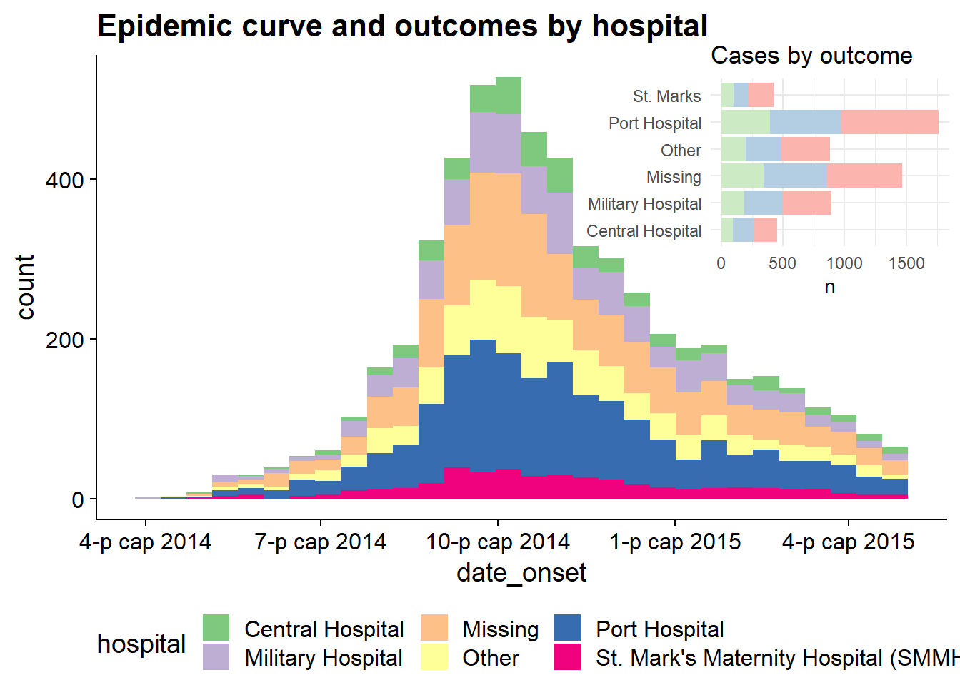
This technique is explained more in these two vignettes:
31.11 Dual axes
A secondary y-axis is often a requested addition to a ggplot2 graph. While there is a robust debate about the validity of such graphs in the data visualization community, and they are often not recommended, your manager may still want them. Below, we present one method to achieve them: using the cowplot package to combine two separate plots.
This approach involves creating two separate plots - one with a y-axis on the left, and the other with y-axis on the right. Both will use a specific theme_cowplot() and must have the same x-axis. Then in a third command the two plots are aligned and overlaid on top of each other. The functionalities of cowplot, of which this is only one, are described in depth at this site.
To demonstrate this technique we will overlay the epidemic curve with a line of the weekly percent of patients who died. We use this example because the alignment of dates on the x-axis is more complex than say, aligning a bar chart with another plot. Some things to note:
- The epicurve and the line are aggregated into weeks prior to plotting and the
date_breaksanddate_labelsare identical - we do this so that the x-axes of the two plots are the same when they are overlaid.
- The y-axis is moved to the right-side for plot 2 with the
position =argument ofscale_y_continuous().
- Both plots make use of
theme_cowplot()
Note there is another example of this technique in the Epidemic curves page - overlaying cumulative incidence on top of the epicurve.
Make plot 1
This is essentially the epicurve. We use geom_area() just to demonstrate its use (area under a line, by default)
pacman::p_load(cowplot)            # load/install cowplot

p1 <- linelist %>%                 # save plot as object
     count(
       epiweek = lubridate::floor_date(date_onset, "week")) %>%
     ggplot()+
          geom_area(aes(x = epiweek, y = n), fill = "grey")+
          scale_x_date(
               date_breaks = "month",
               date_labels = "%b")+
     theme_cowplot()+
     labs(
       y = "Weekly cases"
     )

p1 # view plot 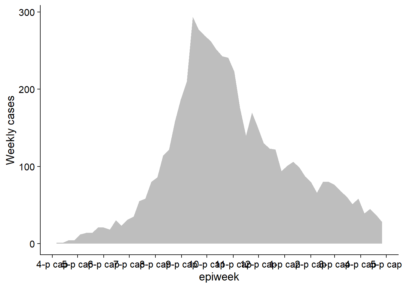
Make plot 2
Create the second plot showing a line of the weekly percent of cases who died.
p2 <- linelist %>%         # save plot as object
     group_by(
       epiweek = lubridate::floor_date(date_onset, "week")) %>%
     summarise(
       n = n(),
       pct_death = 100*sum(outcome == "Death", na.rm=T) / n) %>%
     ggplot(aes(x = epiweek, y = pct_death))+
          geom_line()+
          scale_x_date(
               date_breaks = "month",
               date_labels = "%b")+
          scale_y_continuous(
               position = "right")+
          theme_cowplot()+
          labs(
            x = "Epiweek of symptom onset",
            y = "Weekly percent of deaths",
            title = "Weekly case incidence and percent deaths"
          )

p2     # view plot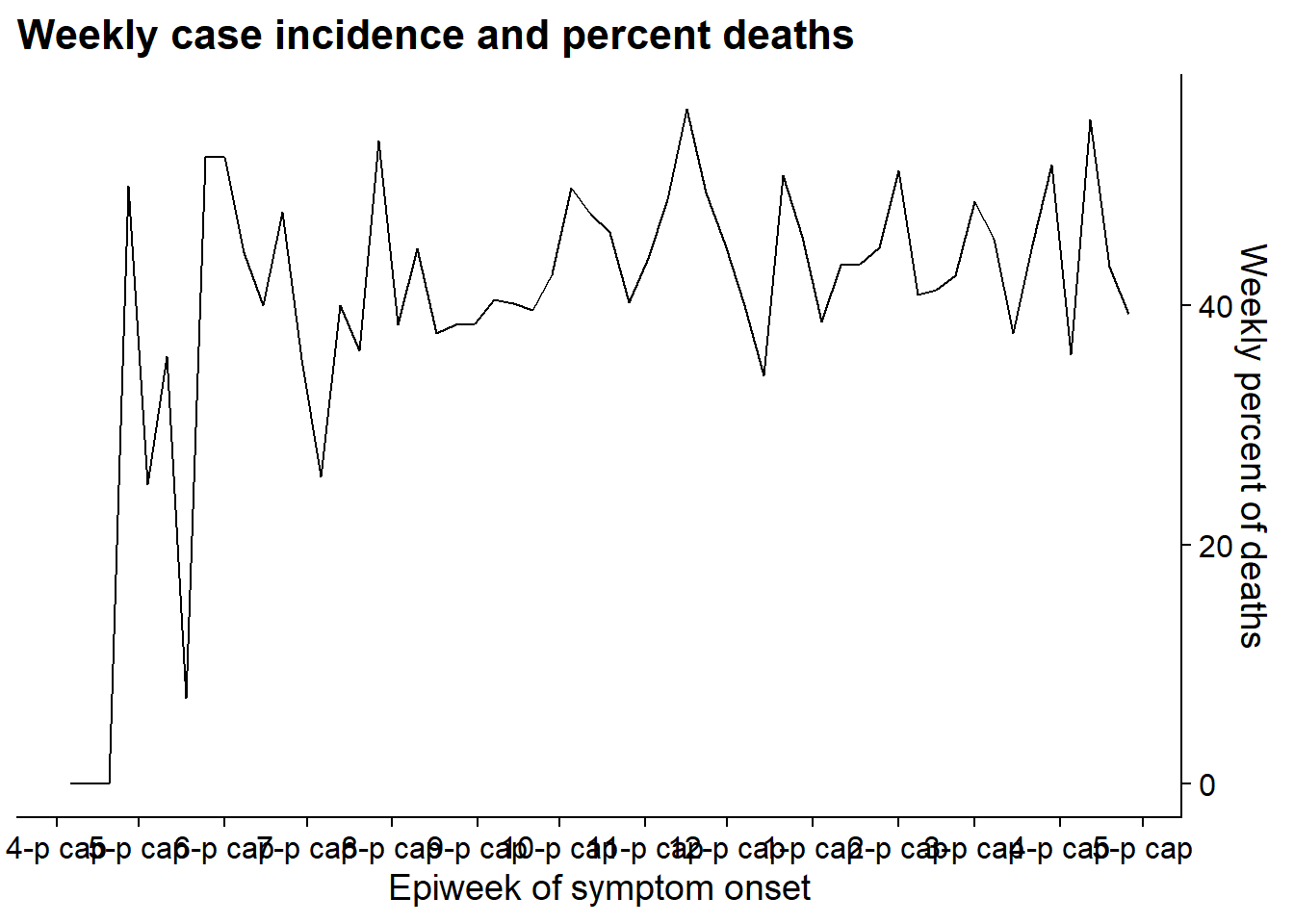
Now we align the plot using the function align_plots(), specifying horizontal and vertical alignment (“hv”, could also be “h”, “v”, “none”). We specify alignment of all axes as well (top, bottom, left, and right) with “tblr”. The output is of class list (2 elements).
Then we draw the two plots together using ggdraw() (from cowplot) and referencing the two parts of the aligned_plots object.
aligned_plots <- cowplot::align_plots(p1, p2, align="hv", axis="tblr")         # align the two plots and save them as list
aligned_plotted <- ggdraw(aligned_plots[[1]]) + draw_plot(aligned_plots[[2]])  # overlay them and save the visual plot
aligned_plotted                                                                # print the overlayed plots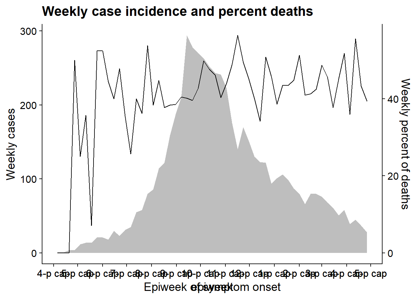
31.12 Packages to help you
There are some really neat R packages specifically designed to help you navigate ggplot2:
Point-and-click ggplot2 with equisse
“This addin allows you to interactively explore your data by visualizing it with the ggplot2 package. It allows you to draw bar plots, curves, scatter plots, histograms, boxplot and sf objects, then export the graph or retrieve the code to reproduce the graph.”
Install and then launch the addin via the RStudio menu or with esquisse::esquisser().
See the Github page
31.13 Miscellaneous
Numeric display
You can disable scientific notation by running this command prior to plotting.
options(scipen=999)Or apply number_format() from the scales package to a specific value or column, as shown below.
Use functions from the package scales to easily adjust how numbers are displayed. These can be applied to columns in your data frame, but are shown on individual numbers for purpose of example.
scales::number(6.2e5)## [1] "620 000"
scales::number(1506800.62, accuracy = 0.1,)## [1] "1 506 800.6"
scales::comma(1506800.62, accuracy = 0.01)## [1] "1,506,800.62"
scales::comma(1506800.62, accuracy = 0.01, big.mark = "." , decimal.mark = ",")## [1] "1.506.800,62"
scales::percent(0.1)## [1] "10%"
scales::dollar(56)## [1] "$56"
scales::scientific(100000)## [1] "1e+05"31.14 Resources
Inspiration ggplot graph gallery
Presentation of data European Centre for Disease Prevention and Control Guidelines of presentation of surveillance data
Facets and labellers Using labellers for facet strips Labellers
Adjusting order with factors
fct_reorder
fct_inorder
How to reorder a boxplot
Reorder a variable in ggplot2
R for Data Science - Factors
Legends
Adjust legend order
Captions Caption alignment
Labels
ggrepel
Cheatsheets
Beautiful plotting with ggplot2