22 Moving averages

This page will cover two methods to calculate and visualize moving averages:
- Calculate with the slider package
- Calculate within a
ggplot()command with the tidyquant package
22.1 Preparation
Load packages
This code chunk shows the loading of packages required for the analyses. In this handbook we emphasize p_load() from pacman, which installs the package if necessary and loads it for use. You can also load installed packages with library() from base R. See the page on [R basics] for more information on R packages.
pacman::p_load(
  tidyverse,      # for data management and viz
  slider,         # for calculating moving averages
  tidyquant       # for calculating moving averages within ggplot
)
Import data
We import the dataset of cases from a simulated Ebola epidemic. If you want to follow along, click to download the “clean” linelist (as .rds file). Import data with the import() function from the rio package (it handles many file types like .xlsx, .csv, .rds - see the [Import and export] page for details).
# import the linelist
linelist <- import("linelist_cleaned.xlsx")
The first 50 rows of the linelist are displayed below.
22.2 Calculate with slider
Use this approach to calculate a moving average in a data frame prior to plotting.
The slider package provides several “sliding window” functions to compute rolling averages, cumulative sums, rolling regressions, etc. It treats a data frame as a vector of rows, allowing iteration row-wise over a data frame.
Here are some of the common functions:
-
slide_dbl()- iterates through a numeric (hence "_dbl") column performing an operation using a sliding window-
slide_sum()- rolling sum shortcut function forslide_dbl()
-
slide_mean()- rolling average shortcut function forslide_dbl()
-
-
slide_index_dbl()- applies the rolling window on a numeric column using a separate column to index the window progression (useful if rolling by date with some dates absent)-
slide_index_sum()- rolling sum shortcut function with indexing
-
slide_index_mean()- rolling mean shortcut function with indexing
-
The slider package has many other functions that are covered in the Resources section of this page. We briefly touch upon the most common.
Core arguments
-
.x, the first argument by default, is the vector to iterate over and to apply the function to
-
.i =for the “index” versions of the slider functions - provide a column to “index” the roll on (see section below)
-
.f =, the second argument by default, either:- A function, written without parentheses, like
mean, or
- A formula, which will be converted into a function. For example
~ .x - mean(.x)will return the result of the current value minus the mean of the window’s value
- A function, written without parentheses, like
- For more details see this reference material
Window size
Specify the size of the window by using either .before, .after, or both arguments:
-
.before =- Provide an integer
-
.after =- Provide an integer
-
.complete =- Set this toTRUEif you only want calculation performed on complete windows
For example, to achieve a 7-day window including the current value and the six previous, use .before = 6. To achieve a “centered” window provide the same number to both .before = and .after =.
By default, .complete = will be FALSE so if the full window of rows does not exist, the functions will use available rows to perform the calculation. Setting to TRUE restricts so calculations are only performed on complete windows.
Expanding window
To achieve cumulative operations, set the .before = argument to Inf. This will conduct the operation on the current value and all coming before.
Rolling by date
The most likely use-case of a rolling calculation in applied epidemiology is to examine a metric over time. For example, a rolling measurement of case incidence, based on daily case counts.
If you have clean time series data with values for every date, you may be OK to use slide_dbl(), as demonstrated here in the Time series and outbreak detection page.
However, in many applied epidemiology circumstances you may have dates absent from your data, where there are no events recorded. In these cases, it is best to use the “index” versions of the slider functions.
Indexed data
Below, we show an example using slide_index_dbl() on the case linelist. Let us say that our objective is to calculate a rolling 7-day incidence - the sum of cases using a rolling 7-day window. If you are looking for an example of rolling average, see the section below on grouped rolling.
To begin, the dataset daily_counts is created to reflect the daily case counts from the linelist, as calculated with count() from dplyr.
# make dataset of daily counts
daily_counts <- linelist %>%
  count(date_hospitalisation, name = "new_cases")
Here is the daily_counts data frame - there are nrow(daily_counts) rows, each day is represented by one row, but especially early in the epidemic some days are not present (there were no cases admitted on those days).
It is crucial to recognize that a standard rolling function (like slide_dbl() would use a window of 7 rows, not 7 days. So, if there are any absent dates, some windows will actually extend more than 7 calendar days!
A “smart” rolling window can be achieved with slide_index_dbl(). The “index” means that the function uses a separate column as an “index” for the rolling window. The window is not simply based on the rows of the data frame.
If the index column is a date, you have the added ability to specify the window extent to .before = and/or .after = in units of lubridate days() or months(). If you do these things, the function will include absent days in the windows as if they were there (as NA values).
Let’s show a comparison. Below, we calculate rolling 7-day case incidence with regular and indexed windows.
rolling <- daily_counts %>%
  mutate(                                # create new columns
    # Using slide_dbl()
    ###################
    reg_7day = slide_dbl(
      new_cases,                         # calculate on new_cases
      .f = ~sum(.x, na.rm = T),          # function is sum() with missing values removed
      .before = 6),                      # window is the ROW and 6 prior ROWS

    # Using slide_index_dbl()
    #########################
    indexed_7day = slide_index_dbl(
        new_cases,                       # calculate on new_cases
        .i = date_hospitalisation,       # indexed with date_onset
        .f = ~sum(.x, na.rm = TRUE),     # function is sum() with missing values removed
        .before = days(6))               # window is the DAY and 6 prior DAYS
    )
Observe how in the regular column for the first 7 rows the count steadily increases despite the rows not being within 7 days of each other! The adjacent “indexed” column accounts for these absent calendar days, so its 7-day sums are much lower, at least in this period of the epidemic when the cases a farther between.
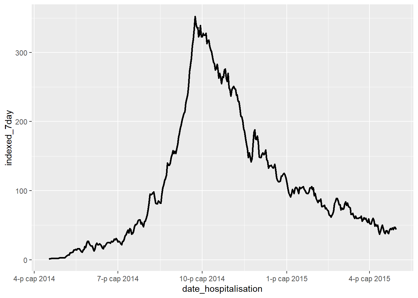
Now you can plot these data using ggplot():
ggplot(data = rolling)+
  geom_line(mapping = aes(x = date_hospitalisation, y = indexed_7day), size = 1)
Rolling by group
If you group your data prior to using a slider function, the sliding windows will be applied by group. Be careful to arrange your rows in the desired order by group.
Each time a new group begins, the sliding window will re-start. Therefore, one nuance to be aware of is that if your data are grouped and you have set .complete = TRUE, you will have empty values at each transition between groups. As the function moved downward through the rows, every transition in the grouping column will re-start the accrual of the minimum window size to allow a calculation.
See handbook page on Grouping data for details on grouping data.
Below, we count linelist cases by date and by hospital. Then we arrange the rows in ascending order, first ordering by hospital and then within that by date. Next we set group_by(). Then we can create our new rolling average.
grouped_roll <- linelist %>%

  count(hospital, date_hospitalisation, name = "new_cases") %>%

  arrange(hospital, date_hospitalisation) %>%   # arrange rows by hospital and then by date

  group_by(hospital) %>%              # group by hospital

  mutate(                             # rolling average
    mean_7day_hosp = slide_index_dbl(
      .x = new_cases,                 # the count of cases per hospital-day
      .i = date_hospitalisation,      # index on date of admission
      .f = mean,                      # use mean()
      .before = days(6)               # use the day and the 6 days prior
      )
  )
Here is the new dataset:
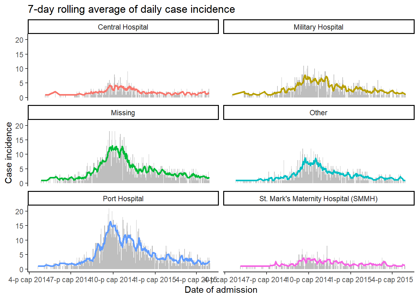
We can now plot the moving averages, displaying the data by group by specifying ~ hospital to facet_wrap() in ggplot(). For fun, we plot two geometries - a geom_col() showing the daily case counts and a geom_line() showing the 7-day moving average.
ggplot(data = grouped_roll)+
  geom_col(                       # plot daly case counts as grey bars
    mapping = aes(
      x = date_hospitalisation,
      y = new_cases),
    fill = "grey",
    width = 1)+
  geom_line(                      # plot rolling average as line colored by hospital
    mapping = aes(
      x = date_hospitalisation,
      y = mean_7day_hosp,
      color = hospital),
    size = 1)+
  facet_wrap(~hospital, ncol = 2)+ # create mini-plots per hospital
  theme_classic()+                 # simplify background
  theme(legend.position = "none")+ # remove legend
  labs(                            # add plot labels
    title = "7-day rolling average of daily case incidence",
    x = "Date of admission",
    y = "Case incidence")
DANGER: If you get an error saying “slide() was deprecated in tsibble 0.9.0 and is now defunct. Please use slider::slide() instead.”, it means that the slide() function from the tsibble package is masking the slide() function from slider package. Fix this by specifying the package in the command, such as slider::slide_dbl().
22.3 Calculate with tidyquant within ggplot()
The package tidyquant offers another approach to calculating moving averages - this time from within a ggplot() command itself.
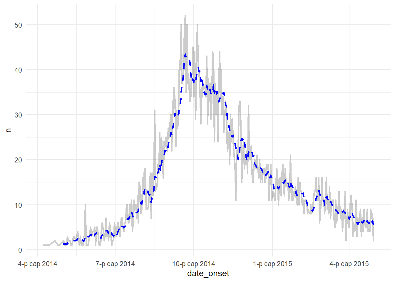
Below the linelist data are counted by date of onset, and this is plotted as a faded line (alpha < 1). Overlaid on top is a line created with geom_ma() from the package tidyquant, with a set window of 7 days (n = 7) with specified color and thickness.
By default geom_ma() uses a simple moving average (ma_fun = "SMA"), but other types can be specified, such as:
- “EMA” - exponential moving average (more weight to recent observations)
- “WMA” - weighted moving average (
wtsare used to weight observations in the moving average)
- Others can be found in the function documentation
linelist %>%
  count(date_onset) %>%                 # count cases per day
  drop_na(date_onset) %>%               # remove cases missing onset date
  ggplot(aes(x = date_onset, y = n))+   # start ggplot
    geom_line(                          # plot raw values
      size = 1,
      alpha = 0.2                       # semi-transparent line
      )+
    tidyquant::geom_ma(                 # plot moving average
      n = 7,
      size = 1,
      color = "blue")+
  theme_minimal()                       # simple background
See this vignette for more details on the options available within tidyquant.
22.4 Resources
See the helpful online vignette for the slider package
The slider github page
A slider vignette
If your use case requires that you “skip over” weekends and even holidays, you might like almanac package.